One of the greatest things about reporting on the world of 3D printing is learning about its more unusual uses. It’s obvious that 3D printing is changing the way many larger (and smaller) companies create, prototype, and manufacture today as they embrace the benefits of greater speed in production, affordability (often producing parts at a fraction of the cost), and the ability to design and print onsite rather than going through a third party. We continually follow serious developments within the industrial world, to include automotive, medicine, medical devices, aerospace, construction, art—and so much more—but 3D design and 3D printing together allow for an infinite amount of innovation. Because of that, you never know what’s coming next!
Here’s a good example: blue and white 3D printed porcelain. Delving into the world of textiles and materials, we are able to learn more about the process Olivier van Herpt, a Dutch designer, went through in creating his 3D version of the blue and white delftware which is the Netherlands’ national product—and one with a rich history too.
 Blue Delft originally came about as designers in the Netherlands wanted to make a local knockoff similar to porcelain being imported from China. Because they lacked kaolin, however, the Netherlands version came off with what may have originally been an unintended look of its own. The earthenware was exotic but still retained the oriental and decorative style.
Van Herpt began using a ceramic 3D printer as he worked to improve the creation of porcelain, eventually making 14 stackable pieces. His printer is capable of producing ceramic objects up to 90 cm high, with thin walls and a hard clay body. Van Herpt has always been on a mission to ‘push the limits of existing 3D printing technologies,’ and has created collections that are meant to soften up the hard edges of industrial design. While also enjoying working with larger pieces and alternative materials such as paraffin, clay, and more, the impactful designer enjoys bringing a human element into industry.
“The consistent flow of material is proven by the fine layers that manifest in the precision of the printing process. The unglazed surface underlines the character of the material and is shown in the structure as a result of the movement of the printer. The tiled surface indicates the digital provenance of the object applied in a precise, sinuous form,” states van Herpt in the case study regarding the project.
“The blue pattern is the translation of human interaction by the machine. Cobalt pigment is applied by hand on the clay body before being inserted in the extruder. The pattern is then reconstructed by the 3D printer, resulting in a radial gradient celebrating cooperation between man and machine.”
Find out more about the designer and his functional 3D printed ceramic objects here.
What do you think of this news? Let us know your thoughts! Join the discussion of this and other 3D printing topics at 3DPrintBoard.com or share your thoughts below.
[Source / Images:
Olivier van Herpt]


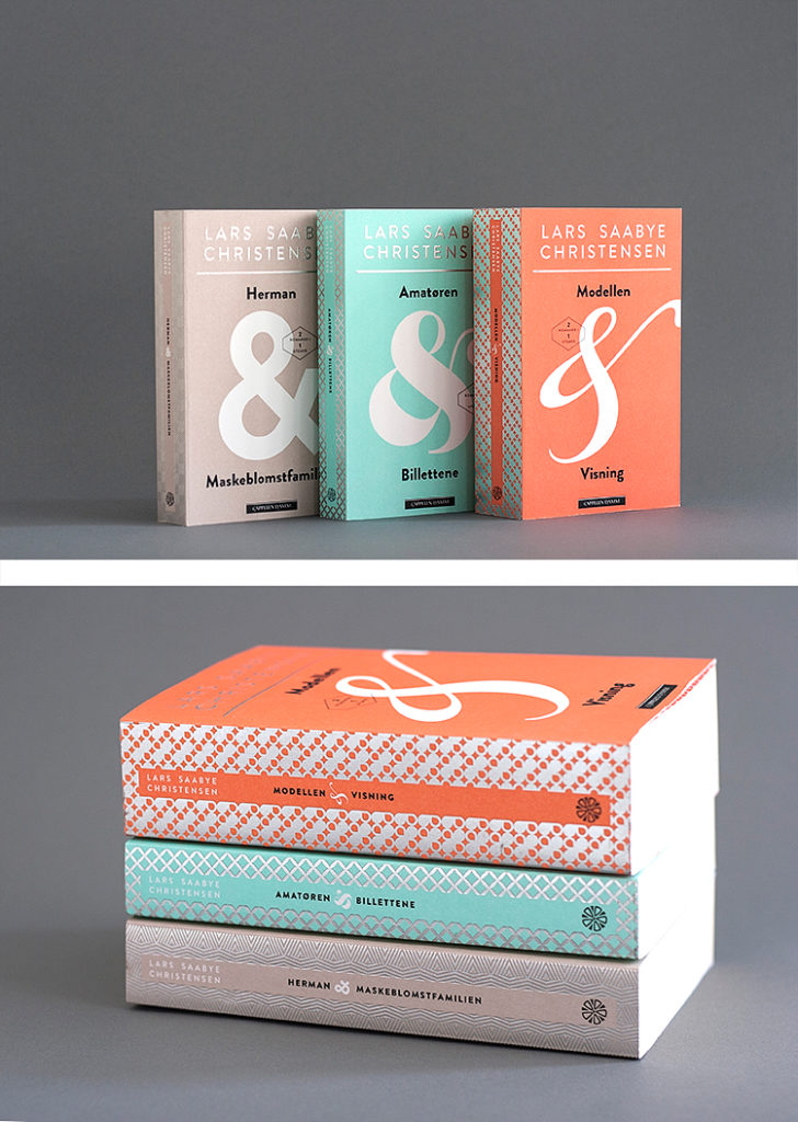
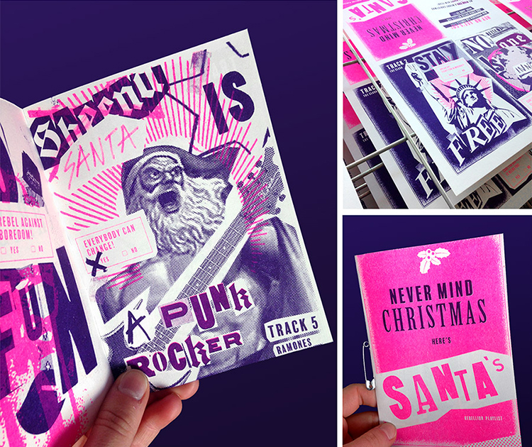 At Superultraplus, if you can’t tell already, they love well-crafted products. Their goal is to unite design, technology and craftsmanship in order to create extraordinary design solutions for their clients. By developing individual communication and design solutions for companies and cultural institutions in the fields of corporate design, as well as image building, corporate publishing, books and illustration, they have gained a huge amount of experience across the board.
 Want to become a People of Print Member? Apply


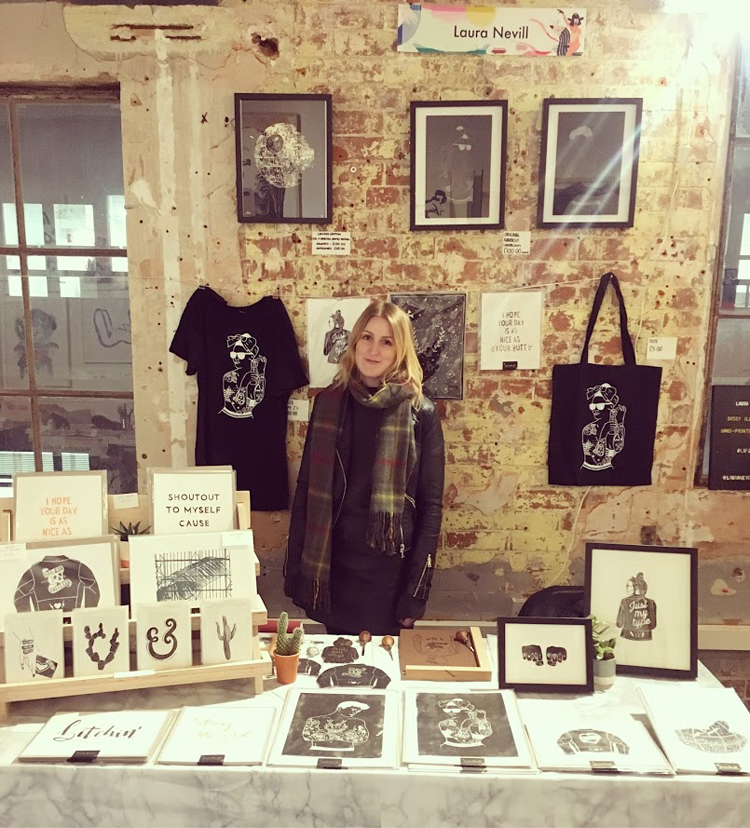 Further down the line, Nevill was lucky enough to exhibit at the London Illustration Fair in 2017 which has allowed her to further develop and expose her work to new audiences. Her lino printing process came from the enjoyment of creating something physical right through to the mistakes and unplanned successes and the serendipitous nature of hand printing meant that no two prints are ever the same.
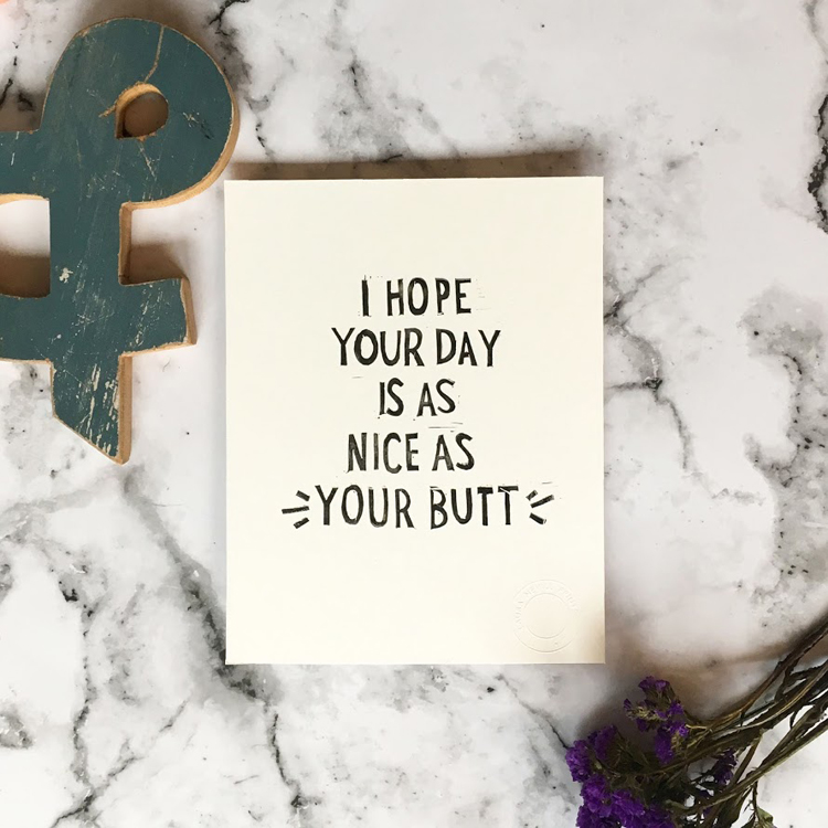 Her typical style is characterised by cheeky typographic pieces consisting of sassy quotes that aim to crack a smile on people’s faces. Her more recent collection includes a variety of illustrations alongside type which is mostly inspired by people and places that Nevill loves including the Barbican conservatory.
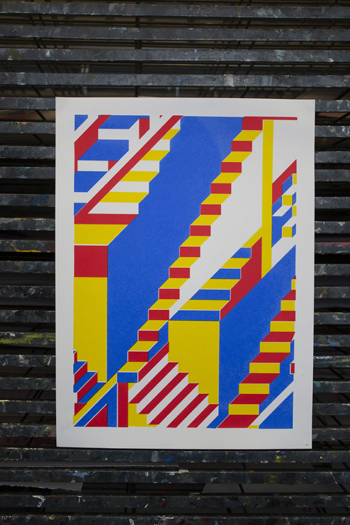
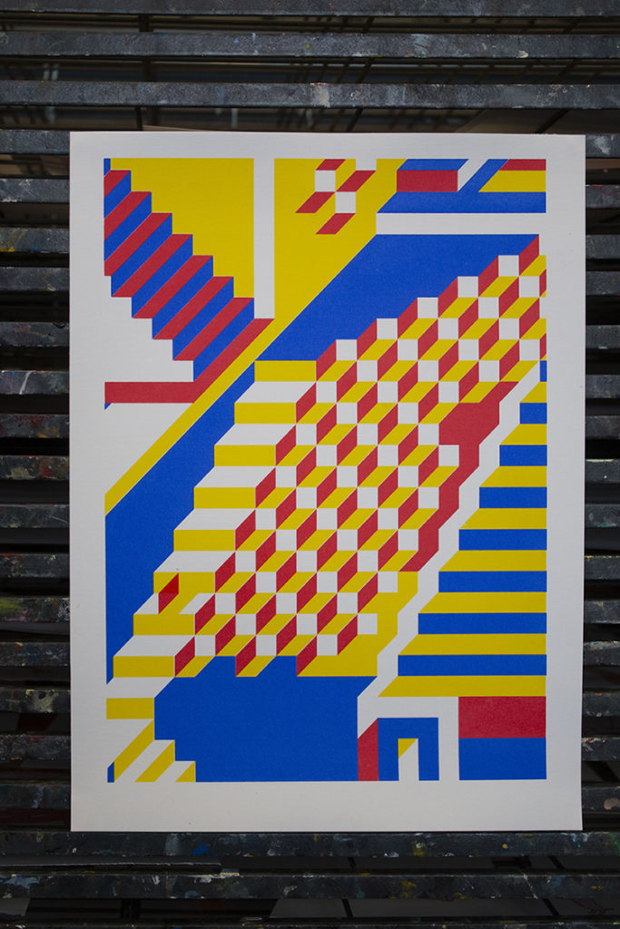
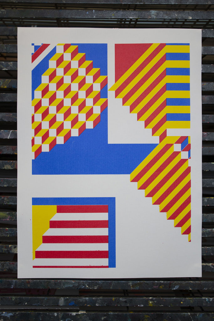
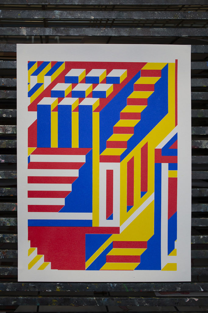 The work that we’ve decided to highlight is part of his final major project of his third and final year at the University at Leeds where he studied Graphic Arts & Design. The pieces are inspired by Burnett’s favourite artist Piet Mondrian, whose colour palette was the main feature he looked at when getting his inspiration. The print series also includes colourful stairs that lead to somewhere, but nowhere. Which were apparently inspired by the amazing work of M.C Escher and his fantastic worlds that Burnett loves so much. Enjoy!


 RSS Feed
