
|
https://ift.tt/3oXjBlq
From Skygazing to 3D Models: Chandra Observatory Discoveries Can Be 3D Printed https://ift.tt/3uuuxs3 For two decades, the orbiting Chandra X-ray Observatory has captured the hot, turbulent regions of space, like exploded stars, clusters of galaxies, and matter around black holes. It has helped scientists see the “invisible” wavelengths of objects in space and answer fundamental questions about the universe. To a flagship space telescope like NASA’s Chandra, the universe is completely different. With an eye that can reach as far as quasars at the edge of the observable universe (that’s 46.1 billion light-years away), it has captured more than 16,500 observations. Now, a collection of nine 3D objects from Chandra are available on a new platform from the Smithsonian Institution. 
3D prints showing the SN 1987A supernova remnant using the Ultimaker 3 printer. Image courtesy of Salvatore Orlando from the INAF Observatory/NASA. Through various techniques, astronomers have captured data from Chandra and other telescopes and constructed science-based simulations and 3D models of what previously had been represented as flat, two-dimensional projections on the sky. Anyone can watch the 3D models on the online Voyager platform, manipulate them, view them in augmented reality and download the 3D print-ready files. Most 3D printable models and information on how to print them are also available through the Harvard-Smithsonian Astrophysical Observatory’s dedicated site. Together, the online resources host an impressive dataset of some of Chandra’s most significant discoveries. From nebulas to supernovas, the current suite of Chandra 3D models and 3D printable files features stars in various phases of the stellar life cycle. Engaging users, the sites describe each 3D modeled object as a unique experience to understand scientific data. For example, users can go from watching the remnants of the dead star Cassiopeia A up close to holding it in their hands after printing the model. 
Stereolithography (STL) files were used for 3D printing Tycho’s Supernova Remnant. Image courtesy of NASA/CXC/SAO/A. Jubett, N. Wolk and K. Arcand. Anyone with access to a 3D printer can also choose to print the blast wave of two novas, U Scorpii and the double star system V745 Sco. Astronomers have seen U Scorpii – which is about 40,000 light-years away from us- erupt about once every decade, so this system is due for another outburst very soon, which should make for a super interesting printable structure. As for V745 Sco, located about 25,000 light-years from Earth, Chandra X-ray Observatory captured the system’s last eruption on February 6, 2014. The new 3D model of the explosion shows details of the blast wave, the mass ejected by the explosion, and the disk of cooler material, which is mostly untouched by the effects of the blast wave. For each of these 3D models and 3D printable stories revealed through Chandra’s vast dataset, users learn to experience events in an entirely new way, making this quite a unique experience, especially for institutions such as libraries and museums, as well as the scientific and education communities. 
The 3D model serves as a scientifically informed approximation for visualizing the Crab Nebula in X-ray light. Image courtesy of NASA/CXC/SAO/A.Jubett. Another fascinating 3D model and printable option available through Voyager is the Crab Nebula, which contains the remains of an exploded star located about 6,500 light-years from Earth. In this case, the structures revealed by Chandra’s X-rays include the pulsar and a ringed disk of energized material, with jets of particles that fire off from opposite ends of the energetic pulsar. The 3D structures serve as scientifically informed approximations for visualizing the nebula. Holding a printout of a star formation is also possible. About 450 light-years away, DG Tau made its stellar debut as a 3D model and printable file on both sites. 
3D Model of supernova remnant IC 443 for Virtual Reality. Image courtesy of NASA/CXC/Brown University/A. Dupuis. The inclusion of the Chandra collection in Voyager also coincides with the release of Chandra’s latest 3D model, a stunning supernova remnant called IC 443 located about 5,000 light-years from Earth. Details of the model are included in a paper published in the journal Astronomy & Astrophysics by researchers from the National Institute for Astrophysics (INAF) in Palermo, Italy. In a version for Voyager, the 3D model has been transformed to be more suitable for augmented reality and 3D printing, which requires connected structures. Developed by the Smithsonian Digitization Program Office, the Voyager platform enables datasets to be used as tools for learning and discovery. Viewers can explore these fascinating 3D representations of objects in space alongside other historical renderings, like a statue of George Washington or a skeleton of an extinct mammoth. There are also additional levels of information and interaction for the Chandra 3D models, including annotated tours pointing out key features on each cosmic object. While unable to fly to such a distant object and zoom around it, astronomers can use Chandra’s data to learn about the geometry, velocity, and other physical properties of the cosmic sources. The experience will engage cosmic fans worldwide. To 3D print the datasets, users can easily download the 3D files from either of the two sites. A full list of the Chandra 3D objects, along with information about how to view and print them, is also available here. Printing via 3DPrint.com | The Voice of 3D Printing / Additive Manufacturing https://3dprint.com May 28, 2021 at 08:36AM
0 Comments
https://ift.tt/2SzzfHR
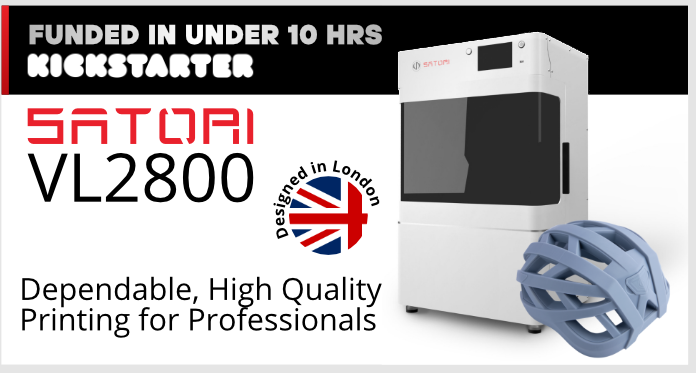
Satori Launches Kickstarter Campaign for New Large-Volume VL2800 3D Printer https://ift.tt/3vvYWaM After a long wait, it’s finally here: the Kickstarter campaign for the new large-volume, industrial-grade Satori 3D printer, the VL2800, officially launched this week, and in less than ten hours from starting had already raised more than its initial crowdfunding goal! The new Satori VL2800 MSLA system features an advanced 6K monoscreen, so artists and product designers can print large, precise models up to 27.8cm x 15.6 cm x 30 cm in size. Additionally, the London-based, female-led startup partnered up with established Chinese hobbyist-level 3D printing company Elegoo to launch its latest premium printer, the company’s second resin system following its compact ST1600.
So, let’s back up a little. When I last spoke to Satori founder and CEO Chengxi Wang, she told me that her inspiration for the new VL2800 actually came from Satori’s collaboration with industrial designer Mahdi Naim.
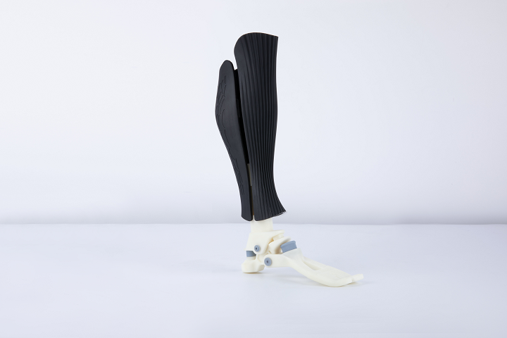
Naim collaborated again with Satori, this time to 3D print a medical-grade prosthetic leg for a social initiative in Africa on the new VL2800 printer. Wang said that the results were “beyond our expectations.” According to Satori’s newsletter, the goal here was “to make the 3D printing technology as approachable as possible, to empower global creatives and innovators with an affordable but powerful tool,” and in the case of Naim’s 3D printed prosthetic leg, it seems like this strategy worked.
Satori wanted to collaborate with Elegoo on the launch for this new printer in order to make the professional system more accessible. It’s actually rather fitting that Satori is partnering with a hobbyist printer company, as the startup itself was founded to fill a new need in resin printing that’s somewhere between hobby and industrial printers. For the price, hobby 3D printers generally achieve great results, but are less reliable, while industrial systems, as Satori explained, are “based on old technology and old patents.” Together, the two companies are offering this large-scale, premium industrial 3D printer that will be sold at a more affordable price so it’s more accessible to the innovators and designers wanting to print high-quality prototypes and figurines from their homes, studios, and offices.
This brought me to my next point. Satori successfully launched its ST1600 3D printer solely on its website, as opposed to using a crowdfunding campaign, so I wondered why they were going the Kickstarter route this time around.
She also reminded me that Satori wants “to push 3D printing awareness beyond the 3D printing community,” and explained that Kickstarter will allow the startup to do just that, at a more accessible price.
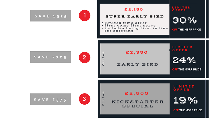
On Kickstarter, there is a discount of 30%, or £925, off the actual MSRP of the new Satori VL2800, which is £3,075. Satori is awarding its loyal community with exclusive, much more reasonable prices on this professional resin system, with a first-come, first-serve, super early bird cost of £2,150.
Obviously, the shipping cost of the VL2800 will vary depending on the ultimate delivery destination. But, as Wang told me, the startup has “a very good delivery time with Kickstarter.” The printer’s development was validated with prototype systems, and, thanks to the support of Elegoo’s efficient manufacturing capacity, is ready to produce, so the estimated delivery time—starting in September of 2021—will be much shorter than the average crowdfunding campaign.
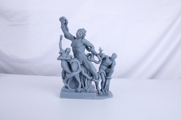
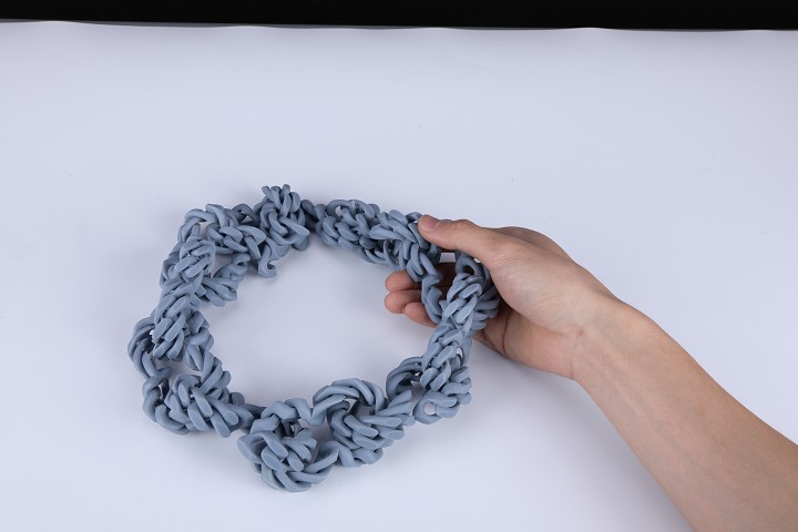
With its 278 x 156 x 300 mm build volume, the factory-leveled printer is compact enough to fit on a desk, but big enough to print a whole bike helmet in one job, or efficiently batch produce large quantities of smaller items. A 6K mono screen allows the printer to achieve faster cure times and 51 micron pixel size across the entire build platform. Resin 3D printers are great at achieving intricate details, but it can be tough to ensure high-quality, smooth surfaces without distortions, especially with large-volume systems. Satori invested in premium components, like a steel Z-axis with a self-monitoring feature for the motor and a HIWIN KK module that uses a ball screw and closed loop stepper for better stability, to make certain that its printer could deliver the goods. Satori really listened to what its users wanted when designing the new VL2800, with a focus on designers in industries like architecture, animation, and jewelry. In addition to the previously mentioned partnership with industrial designer Mahdi Naim, Satori also worked with jewelry designer and SWAROVSKI scholar Siohban Wallace of Shhh von Studio to create a large-scale, interconnected chain necklace, which was 3D printed in all its intricate detail on the VL2800.
Satori set the original Kickstarter funding goal at a little under $71,000, which equals roughly £50,154, and in just two days they’ve already raised over $100,000 (£70,830), so it’s safe to say that the VL2800 will indeed be successfully funded, not that I really doubted it for a second. With more than 30 days to go in the campaign, there are still plenty of rewards left, such as a limited edition, structural phone stand created by Mahdi Naim and printed on the Satori VL2800 for a £50 pledge. Each of the three early bird rewards includes the new 3D printer, 1 kg of premium Grey Pro resin, and some tools to get started, like gloves, resin filters, a wide blade spatula, a silicone squeegee, and more.
Printing via 3DPrint.com | The Voice of 3D Printing / Additive Manufacturing https://3dprint.com May 28, 2021 at 07:36AM
https://ift.tt/3yV7yKe
Formlabs Teams up with Autodesk to Streamline Digital Workflows for 3D Printing https://ift.tt/2Tts9VP It was a busy month for 3D printing developer Formlabs. After announcing a new $150 million funding round and doubling its valuation to $2 billion, the ten-year-old company revealed it teamed up with Autodesk to streamline digital workflow with new CAD tools for 3D printing. At the same time, the startup unveiled a new high-performance nylon material powder, which is ideal for users to print parts that need to bend or withstand impacts, such as hinges, clips, and orthotics. Formlabs users will now have access to a brand new toolset that combines the best of Autodesk’s versatile CAD package with professional 3D printing results. Formlabs and Autodesk’s Fusion 360 teamed up to streamline users’ digital workflow so they can iterate new ideas in just a few steps. The partnering businesses said they were inspired by a diverse, shared user community worldwide that is already leveraging Fusion 360 with Formlabs Form 3 printers. After this announcement, digital workflows for Formlabs 3D resin printers Form 3 and Form 3L will get even more tailored to specific goals since both platforms will be the first to be included in this brand new toolset. Introduced by the companies as a “match made in 3D printing heaven,” the software integration includes a brand new graphic interface where users can visualize and communicate how parts will fit into the Form 3 and 3L build volumes. According to the companies, designers can customize a design dashboard to align with their most frequently used 3D printing workflows. Teams can streamline file management by directly exporting a .form file from Fusion 360. This eliminates the need for downloading individual STL files, giving designers and manufacturers more reliable version control. 
Formlabs and Autodesk’s Fusion 360 have partnered for 3D printing integration, pictured here, a chess set created by Will Qiu. Image courtesy of Formlabs. Autodesk Senior Product Manager Sualp Ozel said integrating Formlabs printers into Autodesk Fusion 360 is a big step toward streamlining additive workflows, capturing both design and manufacturing intent in a single, unified platform while saving money and improving outcomes. With the central pursuit of creating synergy, the duo will enable users to design parts effortlessly using Fusion 360’s flexible 3D CAD software. The designs are then directly sent to PreForm, Formlabs’ print preparation software, and finally printed on Form 3 and Form 3L. Using the integration between Fusion 360 and Preform, companies can import scans and print parts on the fly without saving dozens of STL files for single-use parts. For example, Manchester, UK 3D printing hub PrintCity said the combination of Autodesk Fusion 360 and Form 3 enables them to quickly identify a feasible workflow and present it to their clients, no matter the size of the organization. Quote request Are you looking to buy a 3D printer or 3D scanner? We're here to help. Get free expert advice and quotes from trusted suppliers in your area. Powered by Aniwaa Other users, like Curtis Kennedy, creator of the wall-mounted massage ball Vertiball for athletes to manage their own muscle pain relief, found that reliability in both Fusion 360 and Form 3 was critical when designing each moving and gliding part of the Vertiball prototype. Vertiball’s design team performed stress analysis in Fusion’s simulation environment before committing material resources to a Form 3 prototype. The key innovation behind Vertiball is its patented industrial-strength suction cup that can attach to smooth, non-porous surfaces, so Kennedy said he needed to validate the theoretical functionality of a design through simulation before prototyping. 
Wall-mounted massage ball Vertiball for athletes, Vertiball. Image courtesy of Vertiball. Aside from enabling faster design and manufacture, Formlabs is constantly looking to provide users with high-performance materials. Their latest addition is a nylon powder, ideal for functional prototyping and small batch production. Fitting for manufacturing, engineering, and healthcare uses, the Nylon 11 Powder is the second material available for Formlabs’ Fuse 1 high-performance selective laser sintering (SLS) industrial printer. The company said materials are key to expanding the range of possible applications for businesses. Its Nylon 11 Powder was developed to bolster design and creative capabilities with low cost per part. In fact, it is ideal for expanding the accessibility and user-friendliness of Formlabs’ products since the new material was developed to require less training and additional equipment compared to other nylon 11 (PA11) materials on the market. 
Formlabs’ new Nylon 11 powder for Fuse 1 SLS printer ideal for functional prototyping and small batch production. Image courtesy of Formlabs. Ideal for creating end-use parts and functional prototypes like sports equipment, impact-resistant prototypes, thin-walled ducts and enclosures, robust jigs and fixtures, replacement parts, or prosthetics, the material promises ductile and strong qualities where durability and performance are essential. Seeking to expand the versatility of powder-based materials, the Nylon 11 Powder is one of many materials that Formlabs plans to launch for the Fuse 1, expecting to position it as the complete solution for end-use 3D printing. Now a multi-billion dollar company, Formlabs will use the funds, partnerships, and new product developments to continue growing and expanding its current portfolio to enable mass production and customization. Printing via 3DPrint.com | The Voice of 3D Printing / Additive Manufacturing https://3dprint.com May 28, 2021 at 07:06AM
https://ift.tt/3fu5ml7
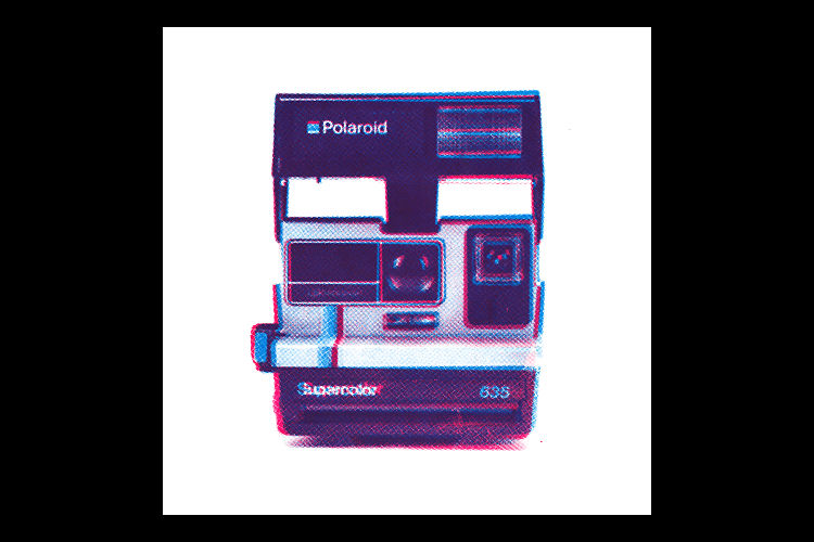
Chris Printed This https://ift.tt/3fqIYZV Christopher Goggs, who goes by the handle ChrisPrintedThis, is a graphic designer and printmaker currently based in South Yorkshire. He works on a variety of projects, from digitally printed zines, photography, and pamphlets, to lino, Risograph, and silkscreen prints. He studied Graphic Design at Sheffield Hallam University, and is currently studying his MA in Graphic Design and Art Direction at Manchester Met.
Printing via People of Print https://ift.tt/2DhgcW7 May 28, 2021 at 04:12AM
https://player.vimeo.com/video/446677665?color=FADDC9&title=0&byline=0&portrait=0
Mary Bruno: Letterpress Scroll https://ift.tt/2R1M25m Mary Bruno of Minnesota-based letterpress print shop Bruno Press recently collaborated with her pal, Richard Bresnehan, a world renowned potter, on an exciting project that combines sculpture with letterpress.
After an intense 9 month period, in July of 2020 the project was completed and one of the 6 scrolls was ensconced inside the Prophetic Messenger sculpture. A book about the process and collaboration is currently in production and will be released soon. Printing via People of Print https://ift.tt/2DhgcW7 May 28, 2021 at 03:44AM
https://ift.tt/3c0Gwaj
Polymaker and Covestro Make 3D Printing Filament from Water Bottles https://ift.tt/3bVEAjy 3D printing filament firm Polymaker is working with Covestro to make Polymaker PC-r, a recycled polycarbonate. The polycarbonate is sourced from huge 19-liter bottles made by Nongfu Spring. These bottles are used repeatedly for residential and office water throughout China. Covestro started a project in 2020 to work with Nongfu to recycle a million of the water bottles per year.
Some virgin material is required for the production of new filament, but most of it comes from recycled bottles. In turn, the resulting material the “Blue Angel and EPEAT seal.” Covestro noted, “The fact that the waste comes from one single source is an advantage. This means that no prior sorting and identification of the plastics is necessary. The plastic waste is quite pure and can be recycled in a cost-effective manner. In addition, it is available in sufficient quantities. In China, large-volume water bottles are widespread in private households and public places. These are collected and refilled again and again before finally discarded and sent for recycling.” Compared to single use plastic bottles, this is a lot more sustainable. There is another advantage to this as well: the MFI (melt flow index) is known and constant, which means that it is easier to compound the material, extrude it into filament, and print it. In the case of these bottles, collection is also known and easy, since partners often perform this work when bottles are exchanged, meaning that you don’t have to fish it from the trash.
Covestro also says that to print the polycarbonate well without warping, constant chamber temperatures are necessary. This was tested out on a FUNMAT PRO 410 from INTAMSYS. When made in this way, “the test scores show good values for tensile strength, Young’s modulus, flexural strength, and flexural modulus, which were slightly higher than standard polycarbonate.” This is a lovely example of companies working together toward more circular practices. I’m usually extremely cautious with these kinds of projects and announcements. There is a lot of greenwash and over-claim in this area. In this case, it seems like it is a solid implementation that is also realistic. By working with a traceable container whose life and condition can be approximated and by working with a substance whose values are known makes it much easier to do something like this well. Meanwhile by working directly with the water company, future bottle designs can be optimized for recycling by using a different glue for labels or dispensing with them entirely, for example. The removal of rings and caps can also be optimized. In this case there is also little chance of the polymer being contaminated or degraded beyond its useful life. They know exactly when the bottle was made, how long it was used, and how many cycles it was used for. In post-consumer waste, there is usually a worry as to what kind of substances the polymer has come into contact with or how it was treated previously. This is all avoided by this approach. If we go further still, then Covestro could see itself as a custodian of this material and, for example, plan for its traceable use for eight cycles as a consumer water bottle and then allow for a double recycling stint as a consumer electronics housing before turning it into a 3D printing material. If a QR code could then always identify the material, as well as when it was made and what additives are in it, then it could be managed for years. Rather than pitch some granulate over the fence, Covestro would be managing a polymer for decades in the most sustainable fit-for-purpose way. I applaud things like these and think we should have a lot more initiatives like this one. Printing via 3DPrint.com | The Voice of 3D Printing / Additive Manufacturing https://3dprint.com May 27, 2021 at 12:33PM
https://ift.tt/3yRxDdd
EOS and Materialise Qualify Flight Ready Polymer Sintered Parts for Airbus https://ift.tt/34p8wAo Materialise (Nasdaq: MTLS) has qualified EOS’ PA 2241 FR flame retardant polyamide 12 material for Airbus. From now on, under Airbus Process Specification AIPS 03-07-022, Airbus or its suppliers can order parts in this material from Materialise, making the service bureau the first qualified for flight sintered parts for Airbus. Previously Materialise qualified SABIC’s 9085 ULTEM material, as well, for material extrusion.
Now, for powder bed fusion (PBF), Materialise can produce parts for the Airbus ecosystem on printers such as the huge EOS P770. The PA 2241 FR is also much more economical than other flight-possible materials, since it has a comparatively high refresh rate. If you’d sinter PEEK or ULTEM, for example, you’d have to toss all of the un-sintered powder, which is already more costly than the PA 12 FR powder. This makes sintering components for in cabin, in pantry, and on the aircraft accessible. What’s more, ULTEM does not play well with jet fuel, so this could open up some more possibilities in this area, as well. For some uses, PA 12 off-gasses too much and it’s good news for the material (and its manufacturer, which is ultimately probably Evonik) that it is qualified for use in commercial aviation. The same certification also introduces possibilities in customization of aircraft cabin components for business jets and general aviation applications, which will open new markets for Materialise. As described in the “Polymer Additive Manufacturing Markets and Applications: 2020-2029” report from SmarTech Analysis, in-cabin components are becoming an increasingly attractive application for 3D printing in aerospace. While material extrusion accounts for the vast majority of hardware revenues for aerospace, PBF is expected to catch up by the end of the decade, with PBF hardware sales projected to account for $270 million in revenue by 2029.
Materialise noted that it 3D prints about 100 individual part numbers for the Airbus A350, which adds up to approximately 26,000 annually for different A350 aircraft alone. However, the Belgian 3D printing bureau isn’t stopping there. It aims to 3D print components for such Airbus planes as the A320, A330 and A340. This is an incredible achievement and many tens of thousands of hours of work have gone into making this achievement come about. The amount of work that you must undertake to flight qualify a new process and material is simply astounding. The amount of testing, validation, and process control that one must have is also huge. This is a great achievement for Materialise. Doing work on the A350 is already astounding, but by being qualified across Airbus, means their services can now be used in helicopters and many of the other products that AIrbus makes.
The business results should be encouraging for the publicly traded Belgium firm. At the same time, something like this is also a quality signifier for other people in 3D printing or looking for 3D printing services. One could easily say to oneself, “Well, if Materialise can do this for Airbus, they can make my part too.” If you want to know what vision is, know this: when I worked at Materialise over a decade ago, people were working on trying to make sintered parts for aviation applications. Tenacity is an overlooked quality in firms. Its uncharacteristic of me to be so lyrically positive, but this is a great move for our industry and we should commend Materialise for making this possible. Printing via 3DPrint.com | The Voice of 3D Printing / Additive Manufacturing https://3dprint.com May 27, 2021 at 12:27PM
https://ift.tt/3hWCzXU
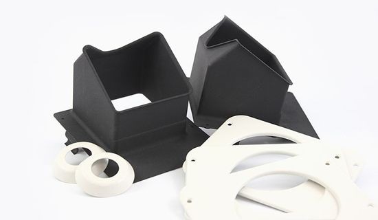
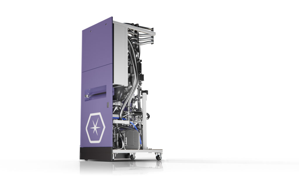
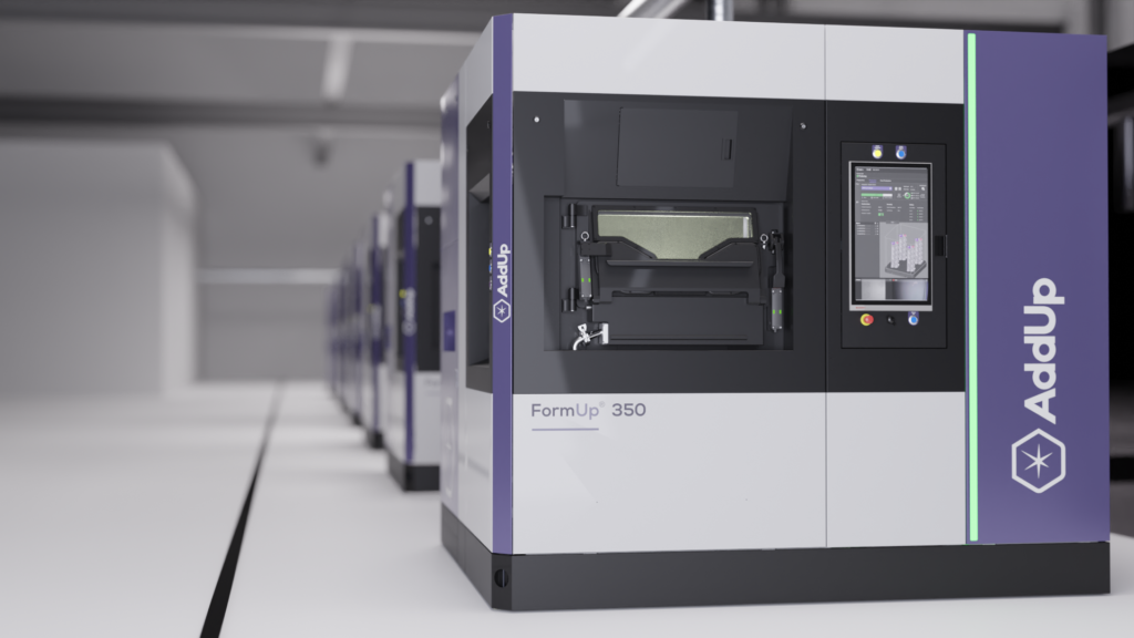
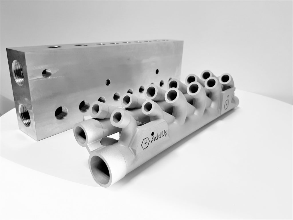
AddUp Launches FormUp 350 Modular Metal 3D Printer https://ift.tt/3frgzCX AddUp, a joint company owned by Michelin and Fives, has just launched the FormUp 350 metal laser powder bed fusion (L-PBF) machine. A variety companies attempt to improve their metal L-PBF systems by featuring ever-greater numbers of lasers. Rather than throw lasers at the problem AddUp has made a modular, production-ready machine.
Building on their previous partnership, AddUp worked with material handling giant AZO to make a powder module designed for storing, moving, recovering and sieving powder. This all occurs automatically within an inert atmosphere, preventing operators from being exposed to fumes and smelting residues. This includes an “automatic passivation filter system that ensures safe waste disposal.” The firm disclosed that it has over 40 machines installed at its own site right now, with which it is running its NCore software to run production files of over 80 GB in a single run. The use of AddUp Dashboards allows for tracing and analyzing production data, including 80 different production parameters and automatic editing of “production conformity reports.”
In-process monitoring is made up of a system that continuously measures laser power and fusion temperature. Real-time analysis of powder spreading looks for defects on the surface of the powder bed “in less than a second”. If any defects are caught, the powder is recoated once more. Additionally, the FormUp 350 offers the ability to swap out the powder coating device for a scraper or roller, depending on the needs of the customer. The recoaters can also bidirectionally recoat and the company says that recoating is 40% faster because of this.
Quote request Are you looking to buy a 3D printer or 3D scanner? We're here to help. Get free expert advice and quotes from trusted suppliers in your area. Powered by Aniwaa The company boasts of reduced inerting times, a quicker cool down time of “2 hours to cool down from 200 to 65°C”, better monitoring, and quad-500 W Ytterbium continuous fiber lasers with a laser spot size of 70 µm. Each of the four layers can cover the entire build platform. The company’s real-time in layer monitoring helps visualize problems as they occur. OPC-UA and MQTT gateways, meanwhile, mean that you can easily connect the printer to other monitoring devices. AddUp is not often found in metal 3D printing lineups. The company is not bombastic and has not announced a dozen-laser system with much aplomb. It seems that it has worked on improving a real production device. By focusing on changeover and reducing the time of parts in the machine, it has improved the economics of using its equipment. Better monitoring, better control, and a focus on letting users play with all 160 parameters of their 3D printers makes their systems more open and usable. There are also four different configurations: Starter, Efficiency, Productivity and Advanced. With 40 of its own machines doing production, AddUp can learn from the actual shop floor. Real experience and reams of data shape the future development of its equipment. The company is not trying to leap a lightyear ahead, but instead make steady progress with a new and more mature generation of 3D printers. One claim the company made stands out to me: “one hour or less” between production runs. Some other printers may have changeover times of up to eight hours. By focusing on making a better production machine, AddUp will make fewer headlines. A lot of what they’ve done, however, is exactly what production people want. Increasing uptime, monitoring, and optimizing machine utilization are exactly what businesses making millions of parts want to have. AddUp’s equipment deserves wider consideration. By focusing on making the 350 easier to live with, increasing yield, and improving the economics, they’ve made something that will be a better printer for many who need one. For this reason alone, it should tempt people to look beyond their existing suppliers and perhaps consider AddUp. Printing via 3DPrint.com | The Voice of 3D Printing / Additive Manufacturing https://3dprint.com May 27, 2021 at 12:21PM
https://us-wd.gr-cdn.com/blog/sites/5/2021/05/1313/21-restaurant-website-design-ideas-and-examples.png
21 Restaurant Website Design Ideas and Examples https://ift.tt/3vq7FLt Since the pandemic began, one thing has become clear in the restaurant industry: having a solid online presence is critical for every restaurant business. Digital ordering and delivery have grown 300% faster than dine-in traffic since 2014. As the demand for online ordering and takeout continues to grow, your restaurant has to stay visible to potential customers looking for mouth-watering menus online. Square’s Future of Restaurants report also shows that 67% of consumers prefer to use a restaurant’s own website or app rather than a third-party site. So, having a website is a step in the right direction. If you’re looking for web design inspiration for your restaurant, this article covers some great restaurant website design examples to help you get started with building your own. Table Of Contents Did you know? You can build a website for your restaurant business using the new GetResponse Website Builder. It’s an AI-driven website creator packed with ready-made templates and intuitive UI that’ll help you create a website for your business in minutes. Here are 21 of the best restaurant website designs we’ve seenWhy’s this a good example to follow?Quay’s website is a modern fast-loading masterpiece complete with the right features and functionality — stunning images of signature dishes and the restaurant’s interior, online reservations, and a gift shop. The restaurant’s contact information, opening hours, and social media handles are also prominently displayed in the footer. The website includes an enticing newsletter subscription form for customers interested in Quay updates. Key takeaway from this exampleIncluding an email subscription form on your restaurant website is almost always a smart move. According to Getresponse email marketing benchmark figures, the Restaurants and Food industry have one of the highest email open rates, next only to non-profits. That’s an opportunity for restaurant owners to engage and stay connected with customers. Why’s this a good example to follow?This Mexican restaurant/distillery uses a playful theme, beautiful pastel color scheme and subtle animations on its website. The homepage features a slideshow of the restaurant’s interiors which highlights the dining experience. The website is equipped for online ordering and reservations and includes a live chat option, so customers can get answers to their questions right away. Key takeaway from this exampleConsider adding a live chat software to your restaurant website — 92% of customers feel more satisfied when they use the live chat feature compared to other communication options like voice (88%), email (85%), or Facebook (84%). Why’s this a good example to follow?Jimmy The Greek is simple, loads quickly and highlights the most important information for website visitors. The homepage slideshow features mouth-watering images of well-plated dishes accompanied with excellent copy. A section on the homepage zooms in on the JTG gift card which is available at all the restaurant locations. Key takeaway from this exampleOne important use of your website is to provide relevant information to your website visitors. And since the restaurant industry has been particularly hit by the pandemic, customers will be interested in the safety measures you are taking to protect them. So your website should always have up-to-date information about opening hours, safety protocols, and any other details that are relevant to diners. Why’s this a good example to follow?This website uses a left sidebar to immediately draw attention. The menu-themed sidebar includes links to all the important pages on the website, including newsletter signup, gallery, accessibility, and safety guidelines related to the COVID-19 pandemic. Girl & The Goat also uses a pop-up form to inform website visitors about their latest promotions. Key takeaway from this exampleWell-designed popup forms ensure your promotion gets maximum views from website visitors and they can boost email conversion rates. Exit popups can boost conversion rates by up to 17%. Why’s this a good example to follow?This website features a creative slideshow with smooth scrolling effects. The design is minimalistic with no clutter. The homepage contains only two sections and the footer, highlighting the most important information for website visitors. The website is also e-commerce-ready and has a functional online store. Key takeaway from this exampleKeep things simple. Minimalistic design, unobtrusive animations and website effects ensure a pleasant user experience. Why’s this a good example to follow?Bevri’s website shines the torchlight on their food using stunning professional images. The food is at the center of a restaurant’s activities, and the website does a good job of highlighting Bevri’s Georgian cuisine. Available delivery options are also prominently displayed. For social proof, they include a video review and a list of awards from Tripadvisor. Key takeaway from this exampleInvest in professional images when creating your website. High-quality professional photos of your food and drink ensure that potential customers form a good first impression and increase their chances of patronizing your eatery. Two-thirds of consumers say that the quality of a product image is “very important” in selecting and purchasing a product. Why’s this a good example to follow?This sushi restaurant’s website is a clean minimalistic site with clear navigation. The header menu only lists the restaurant’s two locations — Mexico and Boston. Website visitors can view the menu and make reservations at either location using the dropdown menu links. They also top it up with social proof by featuring reviews from the New York Times, Eater and Bravo. Key takeaway from this exampleCustomer reviews are super important in the restaurant industry. According to Bright Local’s Consumer Review Survey 2020, out of all industries, consumers read restaurant reviews more than any other industry. Why’s this a good example to follow?This website has a warm, welcoming ambiance and features great storytelling. This restaurant highlights several employee photos, creating a sense of community and giving the business an approachable feel. Beautiful cartoon images ensure a consistent overall fun feeling that ties in with the restaurant’s signature product — pizza. Key takeaway from this exampleThe dining experience starts with your online presence. Use your website as a window into your physical location by creating a welcoming ambiance and pleasant user experience. Why’s this a good example to follow?This Awwwards-nominated website features stunning food photography, elegant typography, and breath-taking animations. Customers can order online, make reservations, or purchase gift cards. The contact phone number is prominently displayed in the header for easy access. Key takeaway from this exampleWhile you can definitely get a DIY website using a website builder, hiring a web designer to build a high-end website is also worth it, especially if you wish to highlight a fine dining experience. Research by Stanford University credibility experts showed that the average consumer pays far more attention to the superficial aspects of a site, such as visual cues, than to its content. And nearly half of all consumers (46.1%) assess the credibility of a website based on the visual design appeal, such as layout, typography, font size, and color schemes. Why’s this a good example to follow?This website is all about highlighting the fine dining experience. The slow-moving GIF on the restaurant’s interiors ensures an immersive experience for site visitors. The about and team pages feature great storytelling that emphasizes the restaurant’s “noble ambience” and “exclusive atmosphere.” Key takeaway from this exampleWhen it comes to restaurant web design, the experience is as important as the food. Highlighting experiences is a smart strategy because 78% of millennials would rather spend money on an experience, such as a restaurant or other activity than buying a store product. Why’s this a good example to follow?Michi Ramen’s website is a delight to view and navigate. It’s simple and has good contrast and a bold typography. There’s a brilliant how to order section which shows customers how to order their ramen. A prominent call to action button leaves no ambiguity — the restaurant wants more online orders. Key takeaway from this exampleAccording to Nielsen, small font sizes and low-contrast are the number one complaint from web users as it relates to reading online. Use bold typography and good contrast when designing your new website. Why’s this a good example to follow?Le Bernadin’s is a long one-page website that showcases all the website pages in one continuous scroll. Stunning images of the restaurant dishes and interiors emphasize the fine dining experience. The website is e-commerce ready and the business knows its digital marketing onions. Website visitors can book online, buy gift cards, or order books written by the restaurant owner. Overall, the website communicates elegance and poise. Key takeaway from this exampleOne-page websites are great at improving user experience because website visitors can access all the information they need on one page. If you are not ready to invest in a website, you can also use well-designed landing pages to promote a special offer or event. Why’s this a good example to follow?This restaurant website is another example of experience-focused minimalistic design. The homepage features only an autoplay image slider that spotlights the restaurant’s interior and exteriors. The navigation menu includes links for reservations, social media, and contact pages. Key takeaway from this exampleAccentuate your restaurant’s best-selling features, whether it’s the experience or your dishes. Give potential customers a feel for what they can expect by creating an experience-focused website. Why’s this a good example to follow?This website works because of its clear navigation menu and well-presented sections. The top-level header shows directions, links to the restaurant’s social media pages and Tripadvisor review page. The restaurant has a newsletter and includes an email subscription form before the footer. Key takeaway from this exampleYour website can serve as a landing page linking to your other important pages online, such as business directories and social media pages. Why’s this a good example to follow?This minimalist website features seamless parallax scrolling and great use of white space in the hero section. An arrow points the user in the right direction. Key takeaway from this exampleDirection cues, such as arrows and human gestures are helpful to website visitors, especially on websites that follow an unconventional design pattern. Why’s this a good example to follow?This video-focused website starts off with an immersive video in the hero section and features other videos that highlight the food preparation process and dining experience at Le 28. The website copy changes based on the time of the day. For example, site visitors see the message below when they visit the website a few minutes before opening hours. Key takeaway from this exampleWebsite users spend 88% more time on pages with videos compared to pages without videos. Borrow a leaf from Le 28 and use videos to showcase your restaurant’s unique offerings. Why’s this a good example to follow?The highlight of this website is the beautifully designed card-based menu that shows the prices of the restaurant’s specials. Website visitors can order online or purchase gift cards directly from the website. Overall, the website is easy to navigate and is replete with images of mouth-watering meals. Key takeaway from this exampleFind creative ways to present your restaurant’s menu. Well-designed sections will keep website visitors engaged and nudge them to take action. Adobe found that 38% of people will stop engaging with a website if the content or layout is unattractive. Why’s this a good example to follow?The website of this 40-year-old-plus restaurant has a vintage feel. The design highlights its Mediterranean cuisine and halal-certified dishes. The website features a 3D interactive tour of the restaurant’s interiors, providing website visitors with a super immersive experience. Key takeaway from this exampleVirtual tours are a smart way to boost website engagement and restaurant patronage. Customers aged 18 to 34 are 130% more likely to book a place if there is a virtual tour. In addition, 67% of consumers want more businesses to use virtual tours. Why’s this a good example to follow?The standout feature on Arethusa Al Tavolo’s website is the gorgeous immersive video that tells the story of their supply chain and it ties in neatly with the homepage copy: diary & seed to table. It makes the brand feel authentic and trustworthy. The navigation menu becomes sticky as users scroll, so it’s easy to navigate to any part of the website. Their website covers all the bases — online reservations, email marketing integration, contact information, and business hours. Key takeaway from this exampleUse videos to tell your brand story by taking website visitors behind the scenes of your food procurement and food preparation process. If you’re taking actions to help the environment, you should highlight this. According to the National Restaurant Association, 51% of consumers say the availability of environmentally friendly food would make them choose one restaurant over another. Why’s this a good example to follow?This one-page website shifts from the norm by leaning heavily towards text content, but the approach is well-executed. The introductory text on the homepage feels like a personal letter from an old friend so it’s not off-putting. Images further down the page also compensate for leading text-heavy content. Website visitors can quickly navigate to different sections of the website without leaving the page. The left footer sidebar shows all the important information — business address and hours, google maps address, social media and online reservation links, plus a gift card CTA — all without feeling overloaded. Key takeaway from this exampleWhile stepping away from conventional website design can make your website unique, ensure you do it right. Focus on the user experience and use consistent design elements. Why’s this a good example to follow?Sushi Nakazawa’s homepage is both welcoming and reassuring. It features a bold photo of the smiling chef and not much else, creating a thoroughly immersive experience. Navigation menus and reservation details fly out from either side of the screen while the background stays consistent. The minimalist navigation menu highlights only what’s important, such as the menu, the restaurant’s other locations, gallery, Instagram and contact pages. Key takeaway from this exampleUsing well-shot images of a staff or team member can help to boost engagement on your website. Eye-tracking studies by Nielsen show that website users pay close attention to photos of real people compared to stock photos of models. Summing it upCreating a website for your restaurant is important as more consumers make orders online and search for places to dine. In summary, here are the points to keep in mind:
Overall, the most important function of your website is to attract potential customers to your restaurant. Keep this in mind and ensure that every element on your website nudges your visitors towards that goal. Feeling inspired and ready to build a website of your own? See the GetResponse Website Builder in action and try it for yourself today. Printing via GetResponse Blog https://ift.tt/2Xap2TD May 26, 2021 at 11:30AM
https://ift.tt/3hW1ISw
How To Create a Simple and Effective About Us and About Me Page https://ift.tt/3oU1oVP What’s the purpose of an “About Us” and “About Me” page? Is it about you, or your visitors? Is it filler copy pushed out just before you launched your site, or a carefully planned story that brings people in and makes them want to help your cause? Hopefully, you’re in the second group. You’ve thought long and hard about your About page. Editor’s note: This article has been updated on 05/26/21 by Irek Klimczak to include relevant and fresh information. Table Of Contents About Us or About Me? It’s all about the visitorLike every page on your website, the about page should have a clear business goal. Whether it’s an About Us page sharing the brand story or About Me page building your personal brand, you’re designing it to influence visitors decision-making process. It’s best to craft a storyline that’s aimed at your target audience. Use your About page as the document that defines who you are and how you’re different. It’s a positioning statement, a mission statement – even a worldview. All in one. Or maybe not. Unfortunately, About us pages tend to be woefully neglected. Most of them are a mere 1-2 paragraphs, apparently typed out fast just before a site was launched. And that’s too bad. Because for most sites, the About us page is the second-most visited page on your site. Yup – after the home page, the next busiest page is your About Us page. A lot of people are looking at those two flimsy paragraphs you wrote so long ago. And they are making the decision about whether to stay on your site or not based on what they read there. Despite the dire warning, this is actually good news. If you’ve got a weak About us page, improving it just means your business will do better. And if you’ve already got a good about us page, making it into a thing of beauty will kick things up a notch. Look at the about us and about me page like your potential customers wouldThe first thing to do to improve your About Us page is to change your viewpoint. Instead of looking at your page the way you would, look at it the way your site visitors would see it – or better yet, the way your ideal customers, readers, or clients would see it. Not sure how to do that? Sometimes the best way to force yourself into this is to imagine you’re about to speak to these people. Imagine you’re standing just off-stage, about talk to a room full of them. What would you say? If that’s too stressful to imagine, scale it down. If you were about to sit down and talk to your ideal customer over coffee, what would you tell them about yourself? Focus on Why, What and HowYou can try using Simon Sinek’s Golden Circle for your about page content. In order to do that answer the three simple questions: Why – Why are you doing what you are doing? For example, why are you in business, why did you develop your product or service? This section will explain your company values and according to Sinek might be the main incentive to buy from you. How – How will this help your potential cutomers? For example, what problems are you solving for your target audience, what challenges are you helping them overcome? Developing this section is basically about writing down a solid sales pitch. What – What are you offering? For example, what is your product or service, what are the features and benefits of it? If well written, this section will turn website visitors into curious customers. Whether you decide to go with the Golden Circle concept or not, make sure you emphasize what makes your brand unique. Showing your unique selling points will make your about page one of your most effective marketing assets. Clear value proposition will make your about us or about me page one of the most important pages on your website. Here’s an example from Magic Spoon of a short and sweet about page. It shows you that with an outstanding product, well written copy, and a help from a skillful graphic designer you can gain instant credibility. Work with your team and customers to find areas where you stand out from competitors.
The answers to such questions not only will help you create a great landing page but will help you clarify your strategy for success. Consider separate About Us pages for different types of visitorsThe first stumbling block people run into at this point is defining whom they’re talking to. If you’ve got multiple audiences (aka “marketing personas”) that you work with, then there’s the challenge of talking to all those groups at once. If you’ve got big aspirations, you may have other audiences to consider:
Some companies don’t specifically have pages dedicated to those four groups – but many do. Beardbrand, for example, has broken out their About Us page into four different pages – including one for media inquiries. Fellow divides their About page into five categories: Jobs, Wholesale, Collaborations, Customizations, and International Retailers. Their Jobs page is a great example of how you can recruit new team members by sharing brand values and company mission. 
Visual Website Optimizer has a separate page for its partners. Larger companies and organizations, like the Economy League of Greater Philadelphia, go so far as to have separate information pages for their Board of Directors, their investors, and their staff. Not sure who your visitors are? Use live chats to ask them exactly what they needIt’s great if you’re in the league of sites that want to attract investors and media people. But usually the problem people run into here is that they never defined their audience well enough in the first place. Of course, it’s a good idea to do that before you launch your site (or even go into business), but this still happens. A lot. Again, don’t fret. We’ve got you covered. You can use GetResponse chats and enable it on your About page. This way, If your understanding of your audience is hazy, you’ll be able to reach out and ask website visitors a few questions:
If you had to explain this site in just a few words, what would you say? For instance, “It’s This Old House meets small business marketing”. Or “It’s social media marketing for minimalists.” Just answering those questions will go a long way to help you write a better About page. In fact, you could probably just lay out those questions in FAQ (Frequently Asked Questions) format, and you’d have a better About us page than most sites. Here’s a webinar recording on how to Connect and Convert in Real-Time with Chats. Watch it and see how easy it is to apply live chat to your own page. As you write those answers, always be thinking about how your audience will view them. Remember: They’re always asking themselves, “What’s this got to do with me? How can this help me?” Also, try to use a conversational tone as you write for them. Write like you’d talk to them if you were sitting over coffee. Stiff, formal words rarely convince. Format your about page for scannersThe same rules of website copy that apply to product pages and blog posts apply to About Us pages, too. Most people won’t read your About Us page – they’ll scan it. So use all the standard conventions web writers use for scanners: These are a time-tested, simple way to direct different groups of visitors to different parts of the page. So if you don’t really want to have multiple About us pages – no worries. Just break your About us page into sections. We’ve done this on our own page. Got any sentences with lots of commas, listing multiple items? Those might work better as bullet points. Bullet points are also good for listing company goals, or as a punchy way to show how your company is unique. We’ll talk more about these in a moment, but please – have at least one visual element on your About us page. Online readers get turned off by too much text. Again, we’ll get to this in more detail in a moment, but do include a call-to-action on your About us page – either to join your email list or to complete a contact form. Just like on other pages, use testimonials to gain credibility. If you support your brand storytelling with ideas written in the first person coming from real people, it might turn your about page into one of your sales channels. The about page is a great hub for all things your brand. Make sure you describe you company culture and mission statement but also make sure that you share links to your social media profiles along your core values. Include photos and videos on your about pageAs mentioned just above, it’s essential to have at least one photograph on your About us page. And please – don’t make it a stock photo. At the very least, there should be a photograph of your Founder (or Founders), like Copyhackers has done here: Notice the layout of this About us page. It lets you get to know the Founders in a very simple way – by showing how long they’ve been copywriting, by what they think the world needs more of, and other concise but revealing information. Then they go right into testimonials. It’s short and simple, but this page gets the job done. Of course, the photos help, too. Without them, this page wouldn’t work nearly as well. Here’s another great About page example from Sean Carroll’s own website. It starts with a photo and a short bio of the author. Below, there’s a section with links to social media profiles and other platforms related to Carroll’s work. Next comes an interesting section called Latest and Greatest – nice job! It’s divided into three columns offering visitors instant access to Sean’s recent projects:
This website is more than a personal blog. It’s an idea hub full of. You can read a great article, listen to a podcast, binge on a video series, buy a book, and subscribe to a course. Running awesome projects and sharing valuable content are two best ways I know to elevate personal brand. Creating a website with an awesome about page seems like a great idea for all who want to improve the world through ideas. If you just can’t bear to have a photo of yourself, consider these alternatives:
This is the classic About us page photo. It’s an excellent way to give a snapshot view (sorry for the pun) of who your company is. This one’s ideal for local businesses, but it’s also good for any business that even occasionally has clients or customers come to their home base. Got more than one location? Great: Show photographs of those locations, too.
These can be of employees or of customers. Ideally, they’ll be casual, with good lighting, and done on a day when everyones’ desks are relatively clean. These types of photos are also super-important for prospective employees, so keep that in mind as you take them.
Some company cultures fit with this better than others. But I have seen detailed About us pages that had nothing but pictures of employees’ dogs. Every about us page needs a few photographs. Real photographs – not stock photos. Include a way to opt-in to your email listFunny thing about About us pages… they’re also great for list building. If you don’t believe me, try it. Add one (or even two) opt-in forms on your About us page. You can squeeze them in between paragraphs, or add just one opt-in box at the bottom of your About us page, like Fizzle has done. Track the sign-ups from this specific page by copying your default opt-in form, then renaming it with something like “About page”, so you’ll recognize it. You may be surprised – some sites get up to 10-20% of their opt-ins just from the About us page. Email marketing tipYou can use the content on your about page in your welcome email. It’s a good idea to use the very first email to jump straight into the inbox with your unique story and company’s mission. Also, re-using your website copy in your marketing assets can help you develop a consistent writing style resonating with your potential clients. Here’s a welcome emails series from LandCafe.pl – an ecommerce selling artisan coffee beans. As you can see the first email in the series is a short and sweet version of an about page. It briefly explains where the coffee beans are from and why LandCafe.pl (The owner enjoys driving a Land Rover and coffee – how cool is that?). If you are interested and want to read more, you can click the link to a great post explaining the details. This example shows how the about page might be linked to your email marketing communication. And that when it comes to web design and email series design – it’a a good idea to start with why. About page in an online storeHere’s one of the about page examples I really wanted to share with you. The about page of Uncommon Goods – an online marketplace with hand picked creative, original gifts and experiences that go beyond the ordinary. Their about page is divided into six self-explanatory segments:
There’s also a testimonial from a target customer before the first and second section of the about page. Together with the online store at the top and the footer with a web form asking for your mailing address this about page offers all the necessary site functionality. ConclusionIt’s time to treat your About us page as if it was a core element of your site – because it is. You’ll never have a better opportunity to really show who you are as a company, or even as an individual. Your About us page needs to have enough information so people can really feel like they’ve gotten to know you by the time they’re done reading it. That doesn’t mean it has to be a 5,000-word essay, but it does mean you give enough information so people feel they can trust you. And the more they trust you, the more they’re likely to do business with you. Do you want to build an about us or about me page fast?If you want to build a great looking about page, use our brand new Website Builder. Here’s why Website Builder is the tool for you:
Printing via GetResponse Blog https://ift.tt/2Xap2TD May 26, 2021 at 11:30AM |
Categories
All
Archives
April 2023
|


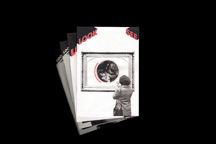 As an undergrad Chris was fascinated by different analogue printing processes, and has gone on to explore this further in his work as a postgrad. Currently, he is working on setting up a home screen print studio along with working on the fourth edition of his zine LOOKSEE which is centred around ‘Creative Voyeurism’ (the act of looking or being looked at in the name of art).
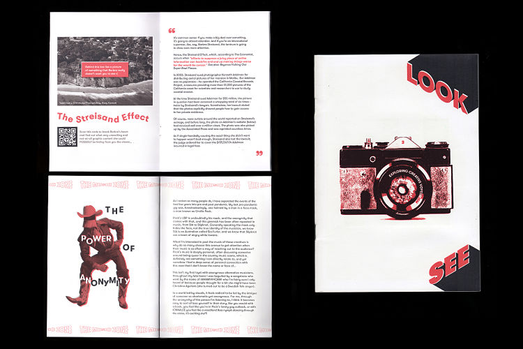
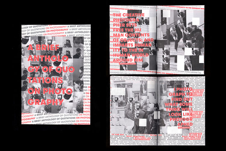 The zine aims to collect and discuss various artistic and voyeuristic topics, all based on a different quote from Susan Sontag’s book On Photography in every issue. In addition, the zine also collates the print, illustration, and other design projects that Chris has been working.
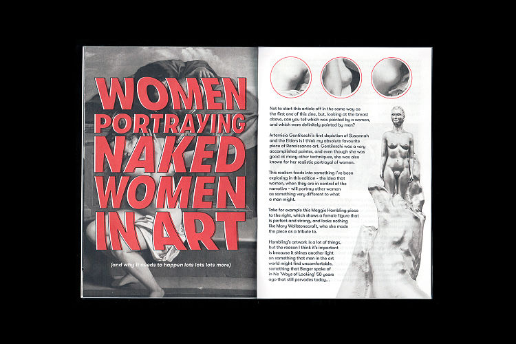
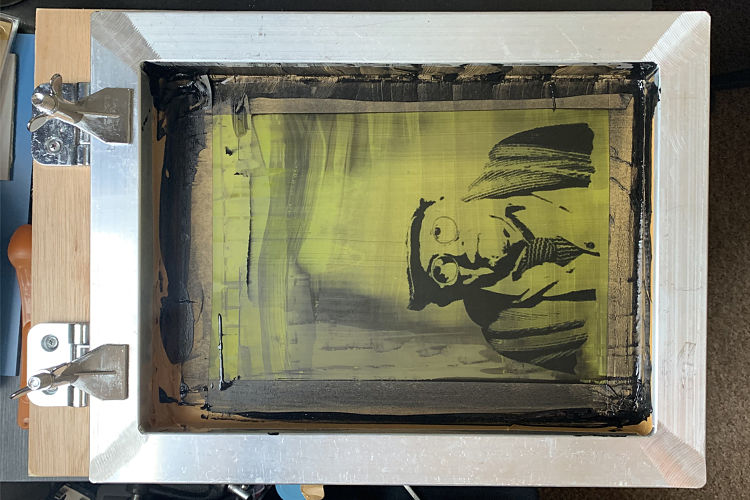
 When he isn’t working on zines or in the studio, Chris enjoys exploring DIY ways of creating print work at home, or without the use of professional kit. His latest endeavour uses hydroponic grow lights, putty erasers, and an Ikea chair, which are currently working hard to help expose and print his designs as silkscreens.
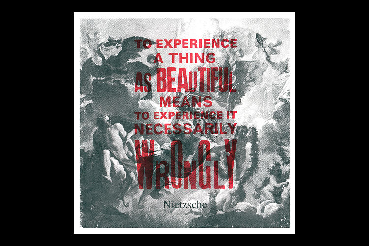
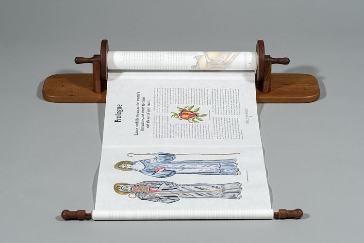
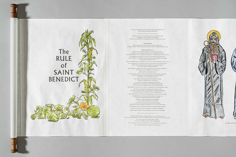 Richard, who also teaches at Saint John’s University in Collegeville, Minnesota, was tasked with creating a new sculpture garden on the campus of the university. He invited Mary to participate in a part of the sculpture project, named Prophetic Messenger, commissioning her to created a letterpress print of the Rule of Saint Benedict in the form of a scroll.
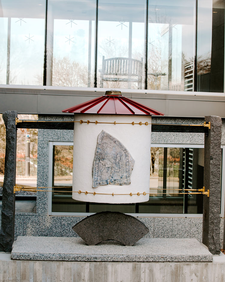 Mary worked with a text designer on the layout, creating 32 13″X19″ pages which they then printed over the course of 3 months with polymer plates from Boxcar Press in New York. She then designed and hand carved all 18 images out of linoleum blocks. Once the images were printed on the pages Mary added hand-colouring, including gold leaf to the first and last page images. The pages were then glued together and attached to the cherry wood scroll holders made by a local wood craftsman. Bags and ceramic pots were also made to house the scroll.


 RSS Feed
