|
https://ift.tt/2DTrkeW
Using a Tiered Content Distribution Strategy to Scale Your Pinterest Traffic https://ift.tt/2AC0AfQ Pinterest has become a very effective platform for both branding and performance marketing. Nearly 90% of Pinterest users have made a purchase after discovering a brand on the image sharing site. However, as with most social media platforms, you get out what you put into it. If you want to scale your Pinterest traffic, then you should seriously consider leveraging other content distribution networks. Using a Tiered, Multi-Channel Distribution Network Could Help Your Pinterest Strategy Too many marketers take a very fragmented approach to increase their brand visibility and traffic volume. They recognize the validity of the individual marketing channels utilized in their strategy, but they struggle to get any traction by reviewing each network in isolation. They develop a marketing strategy for each social network, which won’t be nearly as effective as if they had a single, consolidated strategy. Pinterest is no exception. When you are developing any social media strategy, it is important to recognize that they whole is greater than the sum of the parts. Your strategy will be much more effective once you start integrating your various social media platforms. When you are planning to utilize Pinterest in your social media strategy, there are a couple of things that you need to keep in mind. Other social networks can help increase your repins You can increase the visibility of your Pinterest posts by getting other accounts to repin your content. Unfortunately, it can be difficult to get enough visibility to earn repins at the beginning, even if you have an established Pinterest account with a large number of followers. Using other social networks, content distribution platform and influencers can help you get more pins. This will help your content rank higher in the Pinterest feed. Backlinks from other platforms can drive organic search traffic to your Pinterest posts Most Pinterest posts have a shelf life before they stop driving much traffic. The average post usually drives less traffic within a month after it is first published. However, there are ways to generate sustainable traffic from them indefinitely. One strategy is to make sure that your Pinterest posts rank for longtail keywords that continue to drive relevant users. If your Pinterest posts rank for relevant search terms, then you could also earn more repins as well. There are a variety of things that you can do to optimize your Pinterest content for search engines. You can start by renaming the files of your images to include longtail keywords and making sure that the descriptions of your posts are carefully optimized. However, there is a limit to the benefits that you will get by tweaking the copy of your Pinterest profile. If you want to get search engine traffic to your Pinterest content, then you should try building backlinks to your Pinterest page from other sites. These can include web directories, image sharing sites and blogs in your niche. According to the founder of R-TT Web Directory, a couple of links can make a significant difference in your SERPs. Layering your marketing messages strengthens your branding Every marketer understands the importance of branding repetition. The average consumer needs to be exposed to a branding message at least seven times before they convert. This principle is the reason that brands using PPC marketing use Google Display ads to introduce their brand to customers and then use remarketing strategies to reach the same people on the search network to convert them at later. You can apply the same principle to boost conversions with Pinterest. Your marketing strategy may have a funnel that looks like this:
Many marketers are surprised to learn that Pinterest has a conversion rate of 2.9%. This is surprisingly good for a platform doesn’t usually enable you to reach users with clear buyer intent. However, conversion rates differ significantly. You might be able to increase them by introducing your brand for your visitors in your first Pinterest post. The post Using a Tiered Content Distribution Strategy to Scale Your Pinterest Traffic appeared first on Social Media Explorer. Social Media via Social Media Explorer https://ift.tt/2onGYog November 30, 2018 at 03:55PM
0 Comments
https://ift.tt/2P83UUZ
11 Outdated SEO Tactics You Need to Retire https://ift.tt/2TZh8Hn Just like most aspects of marketing and technology, search engine optimization has evolved over time. Marketing strategies that were effective for your company five or ten years ago may not be as effective today. The same applies to SEO. Search engines have changed the way they rank websites. If your company hasn’t been staying up to date with the latest trends, your SEO strategy is outdated. I see this problem all too often in my consulting work. Many companies still employ old strategies that no longer work. That’s what inspired me to write this guide. The outdated tactics on this list vary in terms of how they will affect your business. Some of these are ineffective but harmless, while others could potentially hurt your SEO ranking. Every business with a website needs to read this guide. Use it as a reference to see if you’re still using outdated SEO tactics and possibly hurting your SEO game. 1. Exact match domain namesExact match domains were popular for a while. With this strategy, websites were able to move up their search rankings very quickly. In some instances, rankings climbed in just weeks or even a few days. As the name implies, the whole idea behind an exact match domain is that your website matches the keywords you’re targeting. For example:
But Google adjusted its algorithm to make exact match domains obsolete. When it made this update back in 2012, the influence of exact match domains dropped nearly immediately:
Now, an exact match domain has the same chances of ranking as high or as low as any other domain name. In fact, some of these exact match domains have a greater chance of being flagged by algorithms or manual reviews. Low-quality sites won’t be ranked high just because their domains are exact matches to the targeted keywords. Furthermore, it’s difficult to brand a company with an exact match domain. For example, think about Amazon. Imagine if it started with a domain like
That’s just not brandable. This strategy is less trustworthy, and it will make it increasingly difficult for you to build links. Instead, you want to make it as easy as possible to increase your brand exposure by having a domain that’s brandable. Don’t use exact match domains. 2. Link directoriesFor the most part, link directories are useless. There are some exceptions for niche-specific high quality directories. This strategy worked before search engines become powerful. People could find what they were looking for by using sites with directories. These were easy for site owners to install and manage, and they increased in popularity. However, a link directory doesn’t provide actual value to website visitors. That’s when search algorithms got adjusted to ignore link directories. Now, having a link directory on your site can get you penalized if you have low-quality links. The same goes for article directories. Marketers started to use software to submit articles to thousands of directories. But this low-quality content didn’t provide any value to people. It was a quick and simple way to build links. Today, link and article directories are usually perceived as poor content, and they won’t help increase your search ranking. 3. Flat URL architectureBy default, WordPress will set up your pages with URLs like this:
It may look simple and clean for your visitors, but it’s not helping your SEO. If you don’t change these defaults, it will be challenging for search engines to understand the hierarchy of your website. SEO crawlers and bots will rate all your pages with the same level of importance, but that’s not what you want. You need search engines to recognize the importance of each page compared to its relationship within other pages. You can manually change your defaults to something like this instead:
Then, the hierarchy of your site architecture will make more sense.
Removing the flat URL structure will make it easier for crawlers to index your site, which ultimately will improve your SEO ranking. Search engines will be able to learn the value of each page within your site. I recommend making these adjustments sooner rather than later. If you change your architecture, you’ll also have to change all of the redirects which can potentially hurt your ranking. 4. Automated link buildingLinks clearly play an important role in SEO. Once this was discovered, many marketers tried to take advantage of link-building software to maximize their domain exposure on as many other sites as possible. They did this so their sites would be recognized by search engine algorithms. As a result, their links got randomly posted on forums, blog comments, link directories, and guestbooks. While I’m an advocate of using automation to improve your operational efficiency, this isn’t where you should be using that strategy. Link building is only effective if it’s high quality. You can’t automate this process. You have to build strong relationships and create valuable content. For alternative methods that work, check out my post on the process of consistently building backlinks every week. 5. Keyword stuffingWhen search engines weren’t as complex as they are today, keyword stuffing worked. Sites would just put dozens and dozens of keywords throughout new content. The problem with such keywording is it’s unnatural because it was only being done to improve the search relevance of the page. This doesn’t work anymore. As algorithms became more advanced, keyword stuffing lost its power. Now it just looks like you have low-quality content. You can potentially be penalized for keyword stuffing as well. A recent study from SEMrush showed the most important ranking factors:
While keywords make the list, they’re not nearly as important as the other aspects of SEO are. In fact, 18% of domains that ranked for high-volume keywords didn’t have any keywords in the body. Only 3% of backlinks had anchor text with keywords. I’m not saying you shouldn’t include keywords in your content. But you need to make sure that you’re using them sparingly and that your content is written to read naturally. You’re much better off publishing valuable content without lots of keywords than low-quality content with too many keywords. 6. Keyword variation pagesDo not create a separate page for each variation of a keyword you’re trying to rank for. This strategy won’t work. Search engine crawlers are smarter, so you don’t have to do this in order to target these variations. Google’s AI system, RankBrain, can even detect and rank sites for keywords not displayed within the content. For example, let’s say you create a landing page dedicated to your B2B audiences about boiler services. RankBrain will understand that this page will also be relevant to users who search for things like:
You don’t need to have a separate page for each one of these keyword phrases. Having too many pages on your site will make your site navigation more difficult than it needs to be. For this example, you’d just need to have one page. Then, you’d include a subheader for each one of these variations. This strategy will make your content more relevant and improve your site navigation. 7. Paid linksThe last thing you want to do is violate Google’s webmaster guidelines. Buying links can improve your ranking, but not if you get caught. For this reason alone, I don’t think paid links are worth it. Some of you may have bought a few links without getting penalized in the past, but don’t think that means you’re invincible. Sure, you might be careful with the way you’re conducting your operation, but what about the seller? According to Google, both the buyers and sellers are guilty. It describes such practice as a link scheme:
If someone is selling to you, they’re probably selling to other sites as well. All Google needs to do is catch one person, then follow the trail of links. If an unnatural pattern of inbound links is identified and leads to another buyer, it can get traced back to the same seller you’re using. It’s very easy for you to get caught. Build quality links the right way, and don’t try to take any shortcuts. 8. Building several interlinked sitesSome of you may own multiple businesses and websites. This seems like a good way to build links among them, right? Not necessarily. Interlinking sites need to be relevant to each other. If you have a website selling camping equipment, it wouldn’t make sense to link to your other business offering credit loans. You’re not rewarded for the total number of links you build. Relevant links hold more weight. You might not be penalized for this, but it limits your opportunity and resources you can use for promoting your primary site. However, there are certain times when this can be done properly. For example, let’s say you have a commercial contracting company and a plumbing company. These are relevant to each other, so interlinking them would be fine. I’ve seen some instances when people create multiple websites just for their link building strategy. This won’t work. It’ll be difficult for you to manage this many sites for this purpose alone, so each one won’t have a high authority ranking. Google will recognize this pattern, and your SEO ranking will suffer. 9. Prioritizing quantity over qualityPublishing ten pieces of new content a day is useless if they are all low-quality. You’re much better off sticking to a publishing frequency you can handle without letting the quality suffer. Write for people, not for bots. Writing for bots is unnatural. As I said before, these new algorithms and site crawlers are becoming so advanced that they can distinguish between poor quality and high quality content. Look at your blog for example. How long are your posts? These are the average lengths of blog posts published over the last four years:
As you can see, the majority of these posts have 500-1,000 words. But that doesn’t mean that’s your sweet spot. Longer blog posts are slowly trending upward each year. For the most part, I would recommend going longer over shorter. But don’t force a long blog post for the sake of increasing your word length. By nature, some topics will be longer or shorter than others. But it’s definitely better to publish five 1,000-word posts a week as opposed to 50 100-word posts a week. Those 100-word posts won’t be high quality. You can’t possibly address a topic properly in that length. 10. Irrelevant guest postsGuest-blogging is another great way to build links, but you need to make sure you’re doing it properly. Irrelevant posts won’t help you. Instead, you should only be guest-blogging on sites that will increase exposure for your brand. You want to reach a new audience that falls within your target market. The only way to do this is by publishing relevant content. For example, I’m a content marketing expert. I have no business submitting my posts to cooking magazines. It’s irrelevant to my personal brand, website, and target audience. As I discussed earlier, Google will identify irrelevant links and potentially punish both parties. Take this into consideration when managing guest posts on your site as well. You won’t want to publish irrelevant guest submissions for the same reasons. 11. Ignoring local SEOIt’s a misconception that you always need to focus on the big picture. Many companies are just trying to get traffic and ranking by targeting mass audiences as opposed to their actual target market. This is especially important to local business owners. If you have a local business, you should be prioritizing traffic from people in the area. Don’t put too much emphasis on generating traffic from people out of your market. Sure, traffic can improve your site ranking, but local SEO will be much more beneficial to your overall strategy. Here’s a recent study from Search Engine Land looking at the factors of local SEO:
Use this graph as a reference. Are you making the right effort to improve your local SEO strategy? If you’re ignoring these areas, it’s a big mistake. ConclusionSEO has changed. It’ll continue changing in the future. If you are still using the outdated tactics on this list, it’s time for you to put those behind you. You need to start implementing new tactics. I’m referring to things such as voice search and mobile-first indexing. I’ll be coming up with more in-depth guides on those topics in the near future. But for now, just worry about retiring the strategies on this list. They’re a waste of your time and could potentially be hurting your ranking. What are some new SEO strategies your website has had success with? Social Media via Quick Sprout https://ift.tt/UU7LJr November 30, 2018 at 10:01AM Revenue Optimization: Maximizing ROI on Your Ads https://ift.tt/2TW0Lvn Want your Facebook and Google ads to generate more revenue? Curious how Google Analytics data can help you find website optimizations that will help? To explore how optimizing the customer journey helps you boost sales, I interview Tanner Larsson. More About This Show The Social Media Marketing podcast is designed to help busy marketers, business owners, and creators discover what works with social media marketing. In this episode, I interview Tanner Larsson, an eCommerce optimization expert who focuses on revenue and the author of Ecommerce Evolved. His consultancy is Build Grow Scale, and he hosts an event called Build Grow Scale Live. Tanner explains how marketers can analyze their whole customer-acquisition process to optimize revenue. You'll also discover how analytics data can identify four revenue leaks that are easy to fix. Share your feedback, read the show notes, and get the links mentioned in this episode below. Listen Now Here are some of the things you'll discover in this show: Revenue Optimization Tanner's Story In 2001, Tanner owned window cleaning and Christmas light businesses that were doing well, but he was bored. So he began learning about online marketing and sales with eBay and quickly became a PowerSeller. Although he loved selling online, the technology for eBay sellers was still so basic that he spent lots of time doing things he didn't like, such as weighing packages and printing labels. Tanner then left eBay for ClickBank, an affiliate platform for informational and digital products. Inspired by people selling how-to business courses, he created one about building a window cleaning business. When he didn't get rich from this course, he realized the online space wasn't a magic place for making money. It was simply another business medium. Tanner then began learning about online marketing and sales tactics. He not only loved implementing everything he learned, but also needed a new way to make a living. After almost going blind, he had a cornea transplant, which involved a long, restrictive healing process. Because he couldn't go outside or pick up anything over five pounds, he had to sell his window cleaning business. After shifting to online sales, Tanner realized he preferred selling physical widgets, gizmos, and gadgets online. When you're selling an informational product, you have to go above and beyond to convince someone they need to buy it. Selling a physical product is easier for him because he can simply provide the supporting information. Today, as a founder of Build Grow Scale, Tanner focuses only on eCommerce. The scope of his work has included online stores, sales funnels, and hybrid solutions. Through all of his big wins and losses, he's tested everything and learned to focus on a data-driven approach to eCommerce. Some big losses with a Shopify store were especially useful in shaping Tanner's thinking about eCommerce. At first, the Shopify store took off, selling tens of thousands of products per week. But after a sudden change, he was writing $200,000 checks each month to keep the business afloat because the cash flow couldn't keep up with the growth. After Tanner figured out what wasn't working, he started looking at data in a different, deeper way. Although his principles are based on eCommerce, you can use them for selling more than physical products. They would also work for visual products, services, and so on. Listen to the show to hear more about Tanner's experience selling on eBay. 3 Mistakes Marketers Make When Acquiring Customers When marketers try to acquire customers, Tanner often finds they make three big mistakes. First, they're too focused on acquiring a customer and the first sale. Specifically, they want to cover all of their expenses and extract a profit from the first sale. This approach is a recipe for disaster and makes staying in business more difficult because you generate real profit from subsequent sal... Social Media via Social Media Marketing Podcast helps your business thrive with social media https://ift.tt/1LtH18p November 30, 2018 at 05:03AM
https://ift.tt/2U3eEYL
Revenue Optimization: Maximizing ROI on Your Ads https://ift.tt/2TW0Lvn
To explore how optimizing the customer journey helps you boost sales, I interview Tanner Larsson. More About This ShowThe Social Media Marketing podcast is designed to help busy marketers, business owners, and creators discover what works with social media marketing. In this episode, I interview Tanner Larsson, an eCommerce optimization expert who focuses on revenue and the author of Ecommerce Evolved. His consultancy is Build Grow Scale, and he hosts an event called Build Grow Scale Live. Tanner explains how marketers can analyze their whole customer-acquisition process to optimize revenue. You’ll also discover how analytics data can identify four revenue leaks that are easy to fix. 
Share your feedback, read the show notes, and get the links mentioned in this episode below. Listen NowListen now: Play in new window | Download Subscribe: Apple Podcasts | Android | Google Podcasts | Stitcher | TuneIn | RSS Here are some of the things you’ll discover in this show: Revenue OptimizationTanner’s StoryIn 2001, Tanner owned window cleaning and Christmas light businesses that were doing well, but he was bored. So he began learning about online marketing and sales with eBay and quickly became a PowerSeller. Although he loved selling online, the technology for eBay sellers was still so basic that he spent lots of time doing things he didn’t like, such as weighing packages and printing labels. Tanner then left eBay for ClickBank, an affiliate platform for informational and digital products. Inspired by people selling how-to business courses, he created one about building a window cleaning business. When he didn’t get rich from this course, he realized the online space wasn’t a magic place for making money. It was simply another business medium. Tanner then began learning about online marketing and sales tactics. He not only loved implementing everything he learned, but also needed a new way to make a living. After almost going blind, he had a cornea transplant, which involved a long, restrictive healing process. Because he couldn’t go outside or pick up anything over five pounds, he had to sell his window cleaning business.
After shifting to online sales, Tanner realized he preferred selling physical widgets, gizmos, and gadgets online. When you’re selling an informational product, you have to go above and beyond to convince someone they need to buy it. Selling a physical product is easier for him because he can simply provide the supporting information. Today, as a founder of Build Grow Scale, Tanner focuses only on eCommerce. The scope of his work has included online stores, sales funnels, and hybrid solutions. Through all of his big wins and losses, he’s tested everything and learned to focus on a data-driven approach to eCommerce. Some big losses with a Shopify store were especially useful in shaping Tanner’s thinking about eCommerce. At first, the Shopify store took off, selling tens of thousands of products per week. But after a sudden change, he was writing $200,000 checks each month to keep the business afloat because the cash flow couldn’t keep up with the growth. After Tanner figured out what wasn’t working, he started looking at data in a different, deeper way. Although his principles are based on eCommerce, you can use them for selling more than physical products. They would also work for visual products, services, and so on. Listen to the show to hear more about Tanner’s experience selling on eBay. 3 Mistakes Marketers Make When Acquiring Customers
Second, marketers often don’t leverage their data in the right way. Most people collect data by installing the Google Analytics tracking pixel on their site but never touch the data it generates. Tanner understands this because he used to hate data. However, he simply didn’t understand the information that was available and how much it could help his business. Third, marketers don’t optimize the customer journey or analyze the details of all of the different customer journeys. A customer may be on social media before they visit your site, and one journey is the process you create to move them from impressions to clicks to your site. The journey that drives traffic from social media to the website often gets the most focus, but the site or store journeys are just as important. These journeys begin when a customer lands on the site, and end with the time and fashion in which they leave. For example, people who bounce and people who buy have different customer journeys that are likely being neglected. When you optimize the customer journey through the site and store, you improve the entire conversion process and eliminate friction points or disconnects at each step. When Facebook or Google ads aren’t converting, marketers tend to focus on improving the ad targeting. However, finding the point on the website or store that needs to be optimized can be the change that truly improves conversions. Because marketers know their product and website so well, they often don’t see the roadblocks or friction points that appear on the site during the sales process. By using data to optimize your customer journey, you can see where you’re losing sales and not even realizing it. Listen to the show to hear my thoughts about leveraging the full picture your data can provide. 7 Sections of the Customer JourneyTo explain how to optimize the customer journey, Tanner breaks down what he considers the seven sections and where marketers often make mistakes at each section. Home Page: Although website visitors can arrive via different landing pages, many arrive via your home page. A common misconception is that your site doesn’t need search because you have only one product, sell a service, or something else. However, data shows almost every site can benefit from having search functionality prominently displayed on the site because customers don’t just search for products; they search for answers. Then, you can collect data about search (which helps you improve your site) by turning on Site Search tracking.
You also want to look for other issues on your home page, including complicated navigation, no clear value proposition, and sliders. Sliders are banner images that rotate right below the navigation. Although sliders are popular, they’ve lost in every website test Tanner and his company have run. Because sliders occupy valuable website real estate, this content can waste two-thirds of the screen. Sliders often contain meaningless copy or product shots that aren’t clickable. You don’t want to dedicate the most important space on a website visitor’s screen to this type of content. When you remove the sliders and move up important content, your site can start converting significantly better. Tanner also emphasizes reducing clutter on the home page. On many websites, so many things are going on that the eye doesn’t know where to go. As you examine the customer journey, make sure the home page design helps visitors focus on what you want them to see and provides intuitive navigation. Category and Collection Pages: On a website that sells products, these pages organize and potentially display your offerings. Most online stores use the default filters, which don’t necessarily line up with the product types that the store sells. When these pages are poorly organized or lack useful filters, visitors have difficulty finding the product that interests them. To understand how useful filters can be, check out the left column of Amazon, which has awesome filters such as only Prime and only four stars and up.
Search Results Page: When your website offers search, you can manipulate the results visitors see in a way that optimizes the experience for the customer. If someone’s search term doesn’t produce any results, you can show a default response instead of nothing. The layout of search results is also important. A garbled or unclear layout confuses visitors. However, you can streamline your search results page so visitors can easily skim the results and find what they need. To visualize this, notice how easy it is to skim Google search results pages. Search results often pull in the generic metatext from the pages that appear in the results. However, this metatext is usually SEO bait that isn’t optimized for sales, readability, or anything the customer cares about. Instead, make sure the search results provide information that shoppers or visitors will find useful. The results need to send people where they need to go. Product Pages: Some of the biggest sales leaks happen on the product page, which is a sales page for a specific product. It might be a direct landing page or a page in a store. If you’re selling a physical product online, showing the wrong images on the product page can create problems. Because website visitors can’t touch a product, the images need to help them see it as realistically as possible. The images might be poorly done or the wrong kind. If you show too many images, visitors can feel overwhelmed. A product page also needs to answer questions on the page instead of directing customers to FAQs (frequently asked questions). When you send people to an FAQ for more information about your product, the visitor has to leave the product page for the FAQ page and sort through all of those questions. Also, people abandon FAQ pages at a much higher rate than they do product pages. Answering a common question about your product or service on an FAQ page is like hiding the answer. Instead, answer these questions on the page that sells the product so customers have the information they need when they need it. I ask Tanner what he thinks about video on product pages. Tanner says you need to consider how useful the video is to customers. When a video shares critical information the customer needs to move to the next step in the process, place the video above the fold on the product page. But a testimonial or hero-shot video belongs below the fold so it doesn’t slow the page’s download time. Cart: You need to sequence each page in the cart carefully, keeping the customer focused only on the next step you want them to take.
In many carts, customers see an option to pay with Amazon or PayPal immediately after adding an item to the cart. This sequence creates two problems. First, it pushes a buying decision before people have committed to pay or decided how to pay. Second, customers who click one of these options may leave your site before entering contact information that lets you follow up. Collecting a customer’s contact information before they leave your cart is important because that info enables you to follow up with people who abandon their cart. Without that data, the only thing you can do to bring them back is dynamic cart retargeting. Instead, ask for an email and phone number before showing a payment option. You can suppress third-party payment options until customers reach the payment information page. Organize this page so customers can select a payment option and then enter their credit card number. Of all of the cart changes you can make, suppressing those buttons makes the biggest impact. Some third-party payment options pop up without taking customers away from the cart, such as Stripe or PayPal Checkout (formerly PayPal Express). With these tools, you typically have a single-page cart process. In this case, Tanner recommends asking for the customer information first, and asking how customers would like to pay at the bottom of that page.
Checkout: After a customer adds an item to the cart, they’re ready to go to checkout. If you don’t have a cart, you skip right to checkout. With both the cart and checkout, poor abandonment recovery is the top issue. In the global eCommerce industry, abandonment totals $4 trillion per year in losses, and 30%-60% of that is recoverable. High-ticket services or offers are significantly more likely to be recovered through a sales pipeline that automates abandonment follow-up. With this in mind, make the email field (not the name field) the very first one customers fill out on your order form or checkout page. After the email field, ask for a phone number only if you’re doing SMS follow-up. Otherwise, suppress the phone number field because each field you remove from your order form increases checkouts by 4.5%. The checkout page also needs to be congruent with the rest of your website, which fosters trust with your customers. Say your company has a beautifully designed website but the checkout page is an ugly Infusionsoft order form that doesn’t look anything like the site customers just left. That change in look and feel makes customers afraid the transaction isn’t safe. The checkout page also needs to offer support for customers who have an issue. In the header of the checkout page right next to your logo, show a customer support phone number and email. Making these contact options visible never increases your customer service volume but does improve customers’ trust in the checkout process significantly, boosting completed checkouts by 17%. If you use a live chat agent, you can add that to the checkout page, too. Tanner recommends keeping it minimized to avoid distractions. Let the customer pop it up if they want to chat with you. Order Confirmation Page: Most businesses aren’t managing customer expectations on the order confirmation page.
After you accept customers’ money, you need to give them information about what happens next and what they need to do, if anything, after the sale. You can create a video or do whatever helps your customers feel comfortable. The order confirmation page also offers the perfect moment to present an additional offer or start educating customers in a way that moves them toward the next escalation in your sales process. When you work on optimizing the customer journey, don’t jump into all of these areas at once. Tanner recommends you first analyze your site, starting at the home page (where the customer arrives at your site) and continuing through the checkout page. After you finish the analysis, begin implementing actual changes where money changes hands—the checkout page. Then work your way forward to the home page so that every optimization builds on the preceding one. If you start at the home page but have a big problem in the middle or end of the journey, the home page changes won’t help you increase conversions. Listen to the show to hear how moving a video about Social Media Marketing World to the bottom of a page improved sales. Revenue Optimization Versus Conversion Rate OptimizationTanner and his team at Build Grow Scale coined revenue optimization because they needed a term that accurately captured what they do. Conversion rate optimization (CRO) emphasizes conversions, which is one step away from what people want. Revenue optimization emphasizes people’s actual end goal: more money in their pocket. Attend Largest Social Media Marketing Conference—in San Diego Compared to CRO, revenue optimization is a more holistic approach to optimizing the site because it focuses on the entire customer journey, not just the front end. In fact, Build Grow Scale goes beyond the seven sections of the customer journey by digging into the website’s back end. Also, with CRO, changes begin at the front, whereas Tanner begins changes at the end. Revenue optimization and CRO also focus on slightly different outcomes. With CRO, you focus on conversion and lowering customer acquisition costs, which results in surface-level changes. In other words, you optimize the whispers instead of the shouts by optimizing what you see and testing what you think. For instance, change the color of a button and test how that impacts conversions.
With revenue optimization, Tanner and his team focus on presenting the right information at the right time to streamline the entire customer journey and remove all obstacles along the way. Because you test these changes with a direct focus on revenue, you avoid the problem he had with CRO, where conversions went up but revenue didn’t. Listen to the show to hear Tanner share more about the downsides of CRO. How Data Can Identify Website OptimizationsTanner then explains how you can use data to increase revenue. His suggestions are based on the work of eight full-time developers and data engineers at Build Grow Scale who spend about 500 hours per week running split tests on more than 24 websites. To collect the data that helps you find these optimizations, you need to use Google Analytics and Google Tag Manager. No other data source can match the power of combining these tools. They not only collect data, but also give you access to cool filters, goals, and more that help you interpret that data. Tanner and his team use Google Analytics and Google Tag Manager to track every link, button, page, video, image, and so on. They also conduct user testing and use sites like Hotjar that record user sessions. After collecting all of this data, they pull reports to combine different data points and analyze what’s happening.
To illustrate how you can collect and analyze data, Tanner shares four simple ways data can show you optimizations that boost revenue. These examples are all based on the same website that sells one product for $89. He shares how these not-so-obvious optimizations had a massive impact on the site’s revenue. Each optimization you make builds on previous ones. Analyze Search Data and Make Your Search Feature Prominent: By default, Google Analytics turns off the Site Search Tracking feature, which provides valuable data. To turn it on, open your account manager and turn on the Site Search Tracking feature. The more prominent your search feature is, the better, because Site Search traffic data can help you improve your bottom line. When people search your site, you can extract the terms buyers use from Google Analytics and use those terms in your copy, ads, SEO, and so on along with your product name. You might also learn that buyers search for terms or your product differently than you expect. On Tanner’s example site, a Site Search report showed that 7% of the traffic used the search tool—a seemingly minor amount of traffic. However, when his team cross-referenced that group with an eCommerce report, they discovered that the 7% of people who searched accounted for 20% of the site’s revenue and had a conversion rate of 14.75%, double the site’s normal 7% conversion rate.
Based on these findings, Tanner’s team optimized the site so that more people use the search feature. To make the search feature more prominent, they changed a little search bar on the left so that it now spans the top of the website. Now, around 13% of people use search, and those who do continue to convert at the higher rate, which has generated more revenue for the company. In fact, sales have increased every time Tanner and his team have been able to increase the percentage of people who use the site’s search function, whether it’s mobile or desktop search. Identify Underperforming Browser Segments: People use many different browsers, including Chrome, Safari, Firefox, and Edge. Mac users tend to use Safari or Chrome. PC users tend to prefer Firefox and Chrome. Some older people still think Internet Explorer is awesome. With these differences in mind, check for browser segments that underperform every month. You need to know which browsers and which versions of those browsers your visitors use. Then, for each browser version, check whether users convert (or become leads, consume content, etc.) at a lower rate than your site’s average conversion or compared to people who use other browsers. Although these data points seem geeky and boring, the impact of optimizing an underperforming segment is exciting. And everybody has underperforming browser segments, so you’re guaranteed to find them. That’s because browsers constantly push new updates, which can conflict with your site’s existing code. Conversely, older browsers sometimes can’t handle updates to website code.
You need to find underperforming segments because a browser conflict reduces the page’s performance. To start, filter a Google Analytics report by device to separate mobile and desktop because they perform differently. Then click the lowest-performing browser segment to see how each version of that browser is performing. To illustrate, click Chrome to see how every version is performing. Typically, you’ll find that most browser versions are converting just fine, but a couple of them are significantly underperforming. After you identify those versions, share that data with your website developer or technology team. They’ll use a tool like BrowserStack to look at the website with that browser version and figure out what the problem is.
The problem might be a code conflict happening under the hood or a display issue, like a button or image that doesn’t appear correctly. If the site layout doesn’t look right in that browser version, visitors may not trust that your site is safe. When Tanner and his team looked for underperforming browser versions for his example site, the store had a conversion rate of around 7.11%, and 63% of website visitors used Chrome. The report showed Chrome users were converting at 6%, or 1% less than the site’s average. After identifying the issue and fixing one underperforming browser segment, the average conversion rate increased to 8%. With the increase from 6% to 7%, the website made 125 additional sales and added about $11,000 in revenue per month. Over the year, this optimization grew revenue by about $134,000. Identify Underperforming Screen Resolutions: Your screen resolution is the pixel size of your screen, such as 1920 x 1080 pixels or 1366 x 786 pixels. All resolutions should have the same conversion rate, so you want to look for resolutions that have a conversion rate that’s lower than the site average. A low rate indicates your site looks squashed, something isn’t lining up, mobile usage isn’t working, or something like that.
For each main browser, you look at the average conversion rate for different screen resolutions. Typically, two or three resolutions will drive most of your traffic, and of those, one or two will be underperforming compared to the other resolutions. Usually, an underperforming resolution has a display issue. For instance, an image or text covers up an Add to Cart button. By fixing the problem, you can make some amazing revenue gains. For the example site, the 1366 x 768 resolution was underperforming, and about 13% or 14% of the website traffic used that resolution. After the display issue was resolved, the average conversion rate rose to match the rate for the other resolutions. By leveraging and mining this data in Google Analytics, the team was able to identify a change and add 185 sales and about $16,000 in revenue per month. For the year, this optimization added about $200,000 of revenue. Find High-Traffic Pages With Low Conversion Rates: For this optimization, you start by looking at traffic for every landing page on your website. In the report, you start with a list of all of the landing page URLs. Although you can sort these by source (such as ad traffic, organic, etc.), the report should simply list all of the pages but keep mobile and desktop users separate. In this report, look for pages with a large number of sessions but a low conversion rate (or other key performance indicator, such as opt-ins). Because Google Tag Manager enables you to track people through the whole sales process, you can see the rate at which people convert for each landing page. To visualize this, someone who lands on the About Us page will convert at a certain rate.
After you identify an underperforming page, look at the page like a customer and note disconnects or anything that seems out of the ordinary. Then, with a tool like Hotjar, create screen recordings and watch hundreds of consumers use your site. Notice where they click, what they do, and how long they spend in certain places. Patterns, bugs, and confusing areas will pop out at you. Through sites like UserTesting, you can pay people to go through your site as a consumer who’s never seen it before. They record the whole process and explain what they’re thinking as they go through it. By watching these recordings, you can identify parts of your site that seem intuitive to you but aren’t for users. After you identify and fix any issues you discover, you can run a split test. By analyzing this data for the example site, Tanner and his team discovered that the About Us page was significantly underperforming: 13.2% of traffic entered via the About Us page, and the page had a conversion rate of 2.41%. Tanner finds that many people neglect their About Us page because they don’t think of it as a money-making page. However, people do convert off of the About Us page.
Tanner and his team were able to increase the conversion rate for the About Us page to 6.6%, which wasn’t quite as high as the site average of 7% but was still a good gain. As a result, the site added 340 extra sales and about $30,000 per month in revenue. For the year, that one optimization added up to about $363,000 per year of revenue. The changes Tanner and his team made to the About Us page are especially interesting. The original About Us page featured a huge story about the company’s founding and how they built the product. The story was well done, and the text was broken up nicely. However, the page had several issues. To reach the product, users had to scroll back to the top. To fix this problem, Tanner and his team added Shop Now buttons throughout the copy, so that one always appeared on-screen as users scrolled. The About Us page also featured a video that told the company’s story. People were watching the video, but it was at the bottom of the page. Tanner and his team moved the video up and placed it left-justified next to some text. Then, at the bottom where the video was, they added a collage of lifestyle images that showed people using the product and a Shop Now button below the collage. Although these four optimization examples require looking at conversion rates, Tanner emphasizes that the fixes aren’t focused on conversion, but on increasing clarity across the entire customer journey. Anytime you do that, you win big. Listen to the show to hear Tanner share how he changed from a spreadsheet avoider to a data geek. Discovery of the WeekIG:dm is a desktop app that lets you manage Instagram direct messages from your desktop computer instead of your phone.
Some marketers prefer to manage social media on desktop because scrolling through Instagram on a phone can be addictive and distracting. On desktop, quelling the distractions is easier. However, the desktop version of Instagram doesn’t let you answer and send direct messages; you have to use your phone. IG:dm adds this feature to macOS, Windows, and Linux computers. After you download and install the software, you can use it to log into Instagram. All of your direct messages appear on the side so you can jump back into any of those. When you send messages, you type text or share a GIF, image, or video. However, you can’t do other Instagram tasks like comment on posts. It’s a single-feature app. IG:dm is a free download available via the app website. Listen to the show to learn more and let us know how IG:dm works for you. Key takeaways mentioned in this episode:What do you think? What are your thoughts on revenue optimization? Please share your comments below. Attend Largest Social Media Marketing Conference—in San Diego 
Social Media via Social Media Examiner https://ift.tt/1LtH18p November 30, 2018 at 05:03AM
https://ift.tt/2zzr95H
Choosing the Best Social Media Platform for Business https://ift.tt/2E3JiMB  Choosing the Best Social Media Platform for Business Businesses that aren’t on social media are missing out on one of their biggest platforms. Social media’s reach has surpassed the billion-user mark, and Facebook alone has an active monthly user count of over 2.2 billion people. These users include a business’ target market, and this is a market that expects:
If a business isn’t using social media, some potential customers may overlook the business. Facebook accounts, for example, allow you to determine if a product or service is worthwhile because of reviews that exist on the company’s page. But your business may perform better on Twitter than Facebook, or Instagram may be a better fit. If a business’ finances don’t allow for a solid social media plan for all platforms, it’s important to use the advice of an SEO company in Mississauga and choose the best performing platforms for the business. Facebook is a BeastIf you own a business, it’s almost impossible not to be on Facebook. The platform is too big to overlook, and with 2.2 billion monthly active users, you have to sign up and create a business page. The largest demographic of any platform, Facebook allows you to:
Facebook is the one platform that businesses shouldn’t ignore. Other platforms may be ignored, but Facebook can’t be ignored without losing a lot of potential for your business. Twitter is IffyTwitter was slow to innovate, and while the platform still has its niche, a lot of businesses join the platform and leave shortly after. You need to put a lot of effort into Twitter to build your following, and this means tweeting often and engaging with your audience. Putting the size of Twitter into perspective compared to Facebook, Twitter has 326 million monthly active users. Should your business target Twitter? It depends. Twitter’s users are:
So, if your demographic is 70-years old, Twitter may not be the best option. Instagram and YouTubeInstagram and YouTube are media powerhouses, and they work very well for companies that sell products and services. If a business sells pastries, for example, the accounts for these platforms may include videos of the pastry-making process. Instagram may also have pictures that show off your best creations. Products, and their uses, can also be shown on both of these platforms better than on Facebook and Twitter. When users go on their YouTube or Instagram accounts, they’re doing so with the understanding that they’ll consume visual content. Both platforms are massive, and Instagram has grown to over 1 billion users, with 72% of teens using the platform every day. And with over 95% of U.S. Instagram users on YouTube, too, they’re two platforms that work very well together. YouTube is available in over 75 languages, and 9% of small businesses use YouTube. With over 1.9 billion monthly active users, YouTube is a must-choose platform for social networking. Users are 55% male and 45% female. Social Media via Social Media Explorer https://ift.tt/2onGYog November 30, 2018 at 01:10AM
https://ift.tt/2FLQM8U
Laura Loomer's IRL Twitter protest has become ... a Twitter meme https://ift.tt/2SmEZPN Far-right personality Laura Loomer, who was banned from Twitter last week for an Islamophobic tweet about Minnesota representative-elect Ilhan Omar, has handcuffed herself to a door at Twitter's NYC headquarters in protest. This incredible Mad Lib came to pass Thursday afternoon, when Loomer, armed with flyers and a sign with her own tweet printed on it, staged a protest outside the office. (She only handcuffed herself to one door, ostensibly to avoid a fire hazard. Thoughtful!) Since Loomer's protest began, she has lost her sign, gotten her sign back, lost her megaphone, yelled a lot, and claimed that she no longer has the key to her handcuffs. Several users streamed the bizarre event on Periscope — including one affiliated with Loomer herself — although there were reportedly only a few people watching Loomer IRL. On Twitter, she got a bit more attention, i.e. a lot of people made fun of her.
Friends, there are two types of joy available online these days. One is big cow joy, and the other is Laura Loomer handcuffing herself to Twitter joy. We're not saying this is the healthier of the two, but boy, is it fun. Please enjoy. Social Media via Mashable https://ift.tt/2DCFv97 November 29, 2018 at 04:20PM 4 Ways to Organize Your Ad Stack for Optimal Revenue https://ift.tt/2TXmbZ1 4 Ways to Organize Your Ad Stack for Optimal Revenue Beginner networks like Google AdSense limit what you can achieve as a publisher. Moving on to more sophisticated advertising partners helps you increase your ad revenue, and organizing your ad stack is a great place to start. If you’re unaware of how to balance multiple ad networks, there are ways to configure your ad stack to have the best impact on your revenue. The way you should organize your stack is based on you – the publisher. While some strategies may work for a ComScore 1000 publisher, a blogger with a smaller audience may require a different approach. Organizing Your Ad Stack to Boost Your RevenueLet’s take a look at four strategies to organize your ad stack to optimize your revenue no matter how big or small of a publisher you may be: 1. Build Up Your Bid DensityBid density is the number of partners bidding on an ad placement you have available. The goal is to get your bid density as high as possible to increase the demand for your advertisement inventory. Partnering with multiple ad networks will make your inventory available to more buyers. When you have more buyers in the pool, the competition for your inventory increases. As a result, buyers place higher bids to beat out their competition, which will in turn increase your CPM. If you are currently working with AdSense alone, taking on more ad partners will help you create the competition you’re hoping to stir up and increase your bid density for optimal revenue. 2. Sort Ad Networks by CPMWhen organizing your ad stack, take a look at the CPMs from each ad network and place your highest CPMs first. While most higher CPMs carry lower fill rates, arrange your ad stack with your highest CPMs first to take advantage of the higher payback. Monetizing all of your page views may be your top priority, but your revenue will suffer in the long-run. Organizing your ad stack with your CPMs in mind will allow you to optimize your revenue, and you won’t have to sacrifice any page views in the process. While adding new ad networks to your roster, you should maintain a Google Adsense account. Adsense is a great resource to find $1 CPMs with a 100% fill rate, and using these options to fill in the gaps will provide the guarantee you need to monetize your remaining page views. Let’s say you have a $3 CPM at a 30% fill rate, a $2 CPM at a 40% fill rate, and a $1 CPM at a 100% fill rate. If you place your higher CPMs first, your $1 CPM will act as your insurance policy and monetize the remaining page views you left unfulfilled. 3. Arrange Multiple Fill RatesMultiple ad networks increase your bid density and CPMs, but they also bring in a higher revenue based on the way you set up your fill rates. A great way to optimize your ad revenue is by filling up your page views with differing fill rates (and differing CPMs). While these offers may have lower rates, sorting them together will bring in more capital. Including multiple ad networks with varying fill rates and CPMs will exceed the amount of revenue you would bring in with online one ad partner filling 100% of the inventory. This is because they aren’t competing with another ad partner for the inventory. Set these different ad partners up in a waterfall scenario where each partner has a minimum CPM rate they can bid. If they don’t buy the inventory at or above that rate then the next ad partner is shown the inventory to purchase at or above a lower CPM rate. You usually will use a partner like AdSense or Media.net as the bottom ad partner since they will fill 100% of the inventory. Rather than fulfilling your fill rate with one CPM, strategically fitting multiple ad networks together increases your revenue no matter how low your fill rates may be. 4. Offer Different Types of ImpressionsWhen it comes to purchasing advertising inventory, some networks value certain types of impressions over others. In this case, using that to your advantage when organizing your ad stack will bring in more capital than you would expect. Some ad partners may be after a video ad, while others are looking for mobile placements. It’s up to you to partner with multiple ad networks to avoid all of your buyers going after the same inventory, and provide several advertisement options to a wide variety of buyers. How Do You Choose the Right Ad Partner?The tips we provided to help you organize your ad stack for optimal revenue all include multiple ad partners and networks, but how do you know if you’re choosing the right ad partner? Here’s a list of things you should consider before choosing which networks to work with:
While you’re trying to increase your revenue, it is important to always keep your audience as a top priority. When choosing ad partners/networks, be sure they have an impressive list of advertisers to buy your inventory. It’s also imperative to choose advertisements that match your audience’s needs. Be sure to avoid placing invaluable or worthless information in front of them. That could lead them to find your site untrustworthy. When trying to increase your ad revenue, taking on higher CPMs will be the first step in the right direction. But there are some things to consider when looking into prospective ad networks. We’ve discussed how using higher CPMs first in your ad stack organization will benefit your income. However, when you are looking for the right ad partner, the highest CPMs won’t always be the North Star to follow. There will be times when the quality of the ad surpasses the CPM the buyer has to offer. It is up to you to decide if the quality is worth the risk. The amount of impressions quality ad content brings in can increase your revenue even if the ad comes with a lower CPM. Choosing an ad partner that pays on time will save you tons of headaches – but since 2008’s economic crash, publishers have been dealing with a lot of late payments from advertisers. When you’re trying to increase ad revenue, it is imperative to partner with an ad network that makes on-time payments. It would be beneficial for you to find out if your new ad networks are still managing their payments manually or if they’ve taken on new technology to handle their publisher payments. Ad Stack Balancing ActHow you organize your ad stack is unique to who you are as a publisher. Whether you’re a small or large publisher, experimenting and playing around with different techniques will help you find out which strategies will best suit your advertising needs. Using these tips that we’ve provided can get you started – and once you find where you fit, you’ll be able to organize your ad stack accordingly and watch your revenue come flying in. Social Media via Social Media Explorer https://ift.tt/2onGYog November 29, 2018 at 07:52AM
https://ift.tt/2rbTRF9
How to Track Awareness, Completion, and Engagement Goals With Google Analytics https://ift.tt/2E3L1RZ
In this article, you’ll learn how to assess the effectiveness of the customer journey on your website using awareness, completion, and engagement goals. 
#1: Define Goals Along the Customer JourneyBefore you open Google Analytics, you need to choose which goals to track. In online marketing, the most obvious goal is an end result such as a purchase or sign-up. However, customers rarely head straight for your shopping cart or sign-up page. They take several steps along the customer journey to reach that final result. When you choose which goals to track, you need to identify these milestones as goals, too. To visualize, think about the customer journey for a product on an eCommerce site. Customers might come through a category page to the product detail page and then add the item to their cart. From there, they can check out or continue shopping. In this case, the main goal is the checkout page, and the goals along the way might include visiting the product detail page and maybe even clicking the Add to Cart button.
As you choose the milestone goals along the customer journey, you need to be careful to avoid choosing the wrong goal for the wrong purpose. When you choose the wrong goals, measuring your marketing becomes more difficult than it needs to be. To ensure you choose the right goals, think about whether a goal is a necessary milestone in the customer journey and whether you have goals for each stage in the journey. You can easily determine whether a goal is necessary. In the eCommerce example, if a customer must see the product detail page to add that product to their cart, that’s a necessary step. Similarly, customers must add the product to their cart to reach checkout. Because these milestones are necessary steps in the customer journey, the product detail page and cart page are good goals. You also need to monitor three main types of goals: awareness, engagement, and completion. Awareness GoalsAn awareness goal reflects the first phase of the customer journey. In the checkout example, the awareness goal is viewing the product detail page. If you’re trying to capture leads, your awareness goal might be someone on Facebook or LinkedIn clicking an ad or link to a blog post. In both cases, the customer becomes aware of your product or business. An awareness goal can also be more specific such as a customer seeing a particular offer you’re making. In this case, the customer might land on an opt-in offer to become a lead or land on a sales page to purchase something. To illustrate, someone who watches or clicks this Facebook post that promotes a Workshop Wednesdays lead magnet from MeasurementMarketing.io might become aware of the lead magnet.
If you need help figuring out whether a customer action is an awareness goal, try thinking about awareness from an offline perspective. In the offline world, awareness might happen when someone walks by and sees a shoe store. Seeing the store is an awareness goal because the person is now aware the shoe store exists. That’s all the awareness goal is supposed to do. Engagement GoalsAlthough engagement goals are often skipped, they’re an important part of the customer journey because engagement is how a customer transitions from awareness to completion. In the offline world, engagement might be someone walking into the shoe store and trying on shoes. Similarly, online customers need to engage with the product you want them to buy or the action you want them to take. In the checkout example, adding the product to the cart is the engagement goal. In Google Analytics, you can track when a customer clicks the Add to Cart button or when they see the actual cart page as an engagement goal. If you’re trying to get a lead, look for an action prospects need to take in order to move from awareness to sharing their information with you. On a blog post page, maybe it’s clicking a button to learn about your lead magnet such as a free white paper or free tool. In this example, you see the information page for the Workshop Wednesdays freebie:
Completion GoalsCompletion goals are the ones marketers naturally think of as goals. In the offline world, completion is when the person buys a pair of shoes. In the online checkout example, someone reaches the checkout page. In the lead generation example, someone shares their email address or other contact information with you. Then they see a landing page, such as this one for people who sign up for Workshop Wednesdays:
#2: Set Up and View Goals in Google AnalyticsGoogle Analytics is a fantastic tool that’s built to track goals. To track your awareness, engagement, and completion goals for a customer journey, you create destination goals, which are based on the URLs customers visit. For instance, Measurement Marketing Academy is my flagship product, and I’ve set up several goals in Google Analytics based on the customer journey. The awareness goal is the sales page. The engagement goal is the cart. The completion goal is the purchase, and in Google Analytics, this goal is based on the thank-you page customers see after they buy an Academy subscription. After these goals are set up, you can view your performance in the Google Analytics Source/Medium report (assuming you’ve set up the traffic sources correctly). Through this report, you can quickly discover what’s working and what’s not. To see this report, click Acquisition in the Google Analytics sidebar. Click All Traffic and then Source/Medium.
When the Source/Medium report is visible, you can see how well different traffic sources help you reach your goals. The traffic sources are listed on the left. On the right, in the Conversions area, you can select any of the goals you’ve set up from the drop-down list. Then, in the Conversion Rate column, you see how well traffic from a specific source converts for the selected goal. #3: Forecast Traffic and Optimize Your Marketing for Each GoalAt this point, you can begin tracking how your customer journey is going. With the right goals set up in Google Analytics, the Source/Medium report will help you start forecasting how you can reach your goals and measure actual traffic against these forecasts. The ability to see how different traffic sources perform is powerful because you’ll discover which traffic sources are good for achieving certain types of goals. You’ll see that certain traffic sources are better at achieving awareness goals, engagement goals, or completion goals. From there, you can determine how to invest or adjust your marketing to meet each goal along the customer journey. Two examples illustrate how the report can help you reach your goals. The first uses the Source/Medium report for the Google Merchandise Store demo account. The second example uses the Source/Medium report for Measurement Marketing Academy. If you use the demo account, you can navigate to the reports shown in this article to see the data yourself. Attend Largest Social Media Marketing Conference—in San Diego Google Merchandise Store ExampleIn the Google Merchandise Store demo account, you can find each type of goal if you focus only on the checkout process. The awareness goal is when the customer enters checkout. Because the customer has to register for an account before making a purchase, the registration is a necessary engagement goal. The completion goal is when customers make a purchase.
Awareness: To focus on the awareness goal, choose Goal 4: Entered Checkout from the Conversions drop-down list in the Source/Medium report. For the current date range, about 1% of the people who become aware of checkout come from the google/organic source. However, the mall.googleplex.com traffic has a 5% conversion rate, meaning it’s about five times more effective. Because google/organic brings in more users than mall.googleplex.com, the number of actual completions is about the same.
From this data, you can make several inferences about how to achieve your goals. Because the mall.googleplex.com traffic source does a good job of making people aware of the checkout process, you’d likely want to choose that traffic source over google/organic if you want to scale up traffic for the awareness goal. In your forecast, you might expect the mall.googleplex.com traffic to maintain a conversion rate of about 5%. Then, over time, you can measure whether that traffic source actually maintains the conversion rate you forecasted. Because google/organic sends more traffic to your goal, you can still use that source to scale up awareness. Although the google/organic conversion rates are low, you might still net the same or more goal completions. The mall.googleplex.com traffic will simply work harder because it has a higher conversion rate. Engagement: To focus on the engagement goal, choose Goal 3: Registrations from the Conversions drop-down list. On this report, you can see that the traffic sources that performed well for awareness don’t necessarily work as well for the engagement goal. For this date range, no one from the mall.googleplex.com source registered, but people from the google/organic source did. Based on this data, you might infer that people coming from google/organic are engaged in the registration process because they’re searching for this product or coming back to the store by searching for it.
The direct/none traffic, which is the second highest traffic source, is also worth a look. Often, email traffic appears as direct/none in the Source/Medium report, especially if you’re not using UTMs and tagging your traffic properly. You might also have cart-abandonment sequences or something similar that brings people back to your site and they then engage. However, the mall.googleplex.com traffic doesn’t move anyone to the registration goal even though it brings lots of people to the registrations goal page. The lack of conversions may indicate there’s an issue with the goal’s setup. Or this traffic might be people who are already registered. Completion: To focus on the completion goal, select Goal 1: Purchase Completed from the Conversions drop-down list. Once again, google/organic has a low conversion rate but brings in the most completions. The second highest traffic and purchase source is direct/none, which again could be email traffic that’s not tagged.
Measurement Marketing Academy ExampleMeasurement Marketing Academy has less traffic than Google Analytics and is another good way to see the process of analyzing your goals. In this example, the goals follow the customer journey for purchasing the product. The awareness goal is the sales page, the engagement goal is the cart, and the completion goal is a purchase page. Awareness: The awareness goal is the sales page, or Goal 5: Academy-1-Sales. In the Source/Medium report, you can see the infusionsoft/email traffic makes people aware of the page, with an 8.8% conversion rate and 78 completions. However, the best source for awareness is facebook/cpc, a paid Facebook campaign that pushes people to the Academy sales page, which is why the conversion rate (94.81%) is so high. You can also see that a few other traffic sources help people become aware of Measurement Marketing Academy. These sources include referral traffic from the Serious and Simple Marketing website, which is a sister site for the Academy and has a conversion rate of 61.29% and 114 completions. Social Media Examiner also helps awareness with a conversion rate of 16.22% and 6 completions.
Engagement: When you examine the engagement goal conversions, the number of people moving to the cart is lower than the awareness conversions. Also, the traffic sources that drive engagement are a little different than those that create awareness. The Serious and Simple Marketing website (with a 34.41% conversion rate and 64 completions) still does a great job of getting people interested in the cart. The second best source is the infusionsoft/email traffic, which has a 2.6% conversion rate and 23 completions. Social Media Examiner is also still converting at 2.7% and 1 completion. However, the facebook/cpc traffic drops off significantly with a conversion rate of 3.9% and 3 completions.
Completion: When you look at the completion goal, which is the purchase page, email continues to convert well and generates the most sales (1.35% conversion rate and 12 completions). The Serious and Simple Marketing website is the other main traffic source driving sales (1.08% conversion rate and 2 completions). The only other source, which made 1 sale, is google/organic (0.24% conversion rate). Although the Facebook campaign did an excellent job of making people aware of the Measurement Marketing Academy, this audience dropped off at the engagement goal, and no one who visited the cart made a purchase. Based on this data, you might determine that this audience needs more education about the product’s value before they’ll consider a purchase.
To improve this campaign, you might change the funnel so that Facebook generates email leads instead of sales. This way, the Facebook campaign can continue to do a great job of creating awareness. Then, the email list can provide the bigger story the Facebook audience seems to need because email is a slower, more one-on-one process of building value. Because the email list does the best job of generating sales, the hope is that email will turn people from the Facebook audience into buyers. Watch the video: VIDEO ConclusionBy tracking awareness, engagement, and completion goals in Google Analytics, you have a framework for gathering insights and making data-informed changes to your marketing funnels. With these changes in your marketing, you can improve your ability to reach your goals. What do you think? Have you tried tracking different types of goals in Google Analytics? How did it work for you? Please share your thoughts in the comments. Attend Largest Social Media Marketing Conference—in San Diego 
Social Media via Social Media Examiner https://ift.tt/1LtH18p November 29, 2018 at 05:15AM
https://ift.tt/2ildCsJ
Change Course & Don’t Break Anything: The Journey: Season 2, Episode 11 https://ift.tt/2DOt0q6
Watch the JourneyEpisode 11 of the Journey explores how the team at Social Media Examiner attempts to stimulate sales by quickly changing course. What happens? Watch as the team leans into change. VIDEO The show opens with a less than encouraging sales report. Michael Stelzner (founder of Social Media Examiner) tells the marketing team that the previous week’s sales are the worst they’ve seen since the launch of Social Media Marketing World. With sales goals in jeopardy, he asks the team (Jennifer Ballard, Kim Reynolds and Saidah Murphy) to get to the bottom of why sales are down. Later, the team reports their findings to Mike. They’ve discovered that the last week’s emails performed poorly. Two complete sends resulted in only 6 ticket sales. Mike asks, “What do we know about buying behavior?” When Kim replies that 40% of people buy on their first visit to the website, Mike sees an opportunity: to reacquire the 60% of visitors who haven’t yet purchased. Next, the team realizes a difference in sales cycles could be at play. In previous years, virtual ticket sales began months after the all access ticket sales. This year, all ticket types were released for sale at the same time--during the initial launch. To adjust for the difference in sales cycles, the marketing team will shift plans on the fly. They have just 4 days to design and execute a campaign to re-launch the virtual ticket. Mike’s hope is that the re-launch will activate affiliates. Kim shares that while the affiliates have been great so far, the program was launched before it was 100% ready to open. The team is hoping the images, video and copy on the newly updated promo assets page will help the affiliates sell more tickets. Later in the week, Mike interviews conversion rate optimization expert Talia Wolf. He’s excited about the possibilities of working with her and checks in with Jennifer to share what he’s learned. Both Mike and Jennifer are on board with Talia’s research-based approach to optimization and are looking forward to her joining the team in late October. It’s one week later and Mike is asking for another sales report. The goal for the impromptu re-launch was to sell 388 virtual tickets. Jennifer says only 262 virtual tickets were sold and shares the bulk of those sales were from email sends. Then Mike and Jennifer visit Kim’s office for affiliate sales numbers. When they learn that affiliates sold 4 virtual tickets, Mike questions the number. Kim elaborates to say that affiliates also sold 6 all access tickets and 2 marketer tickets; 12 tickets in total. After discussion, it becomes clear that there was a breakdown in communication with the affiliates. They promoted the virtual ticket but sent people to the home page for the conference. Mike decides it’s time to back off pushing the virtual ticket and double-down on promoting the rest of the ticket options. Finally, Mike takes a trip to Los Angeles for VidSummit. He meets up with several familiar faces and spends some time talking event strategy with Derral Eves, founder of VidSummit. The show closes with Mike making a strong strategic call. After discussing The Journey’s performance with Social Team Manager Erik Fisher, he decides something isn’t working and cancels publication of the show for the next week. What does this mean for the series? How do you decide when to accelerate your marketing plans? Ever break anything? Let us know--comment below. Key Mentions: Don’t miss an episode! Subscribe to The Journey on YouTube. Social Media via Social Media Examiner https://ift.tt/1LtH18p November 29, 2018 at 05:08AM
https://ift.tt/2P8KHCA
The Best Website Builder https://ift.tt/2KGN4Mh
Quicksprout is reader-supported. That means we use affiliate links. When you click, we sometimes earn a commission. Learn more.
The best thing about using a website builder is knowing that, in a world where an online presence is absolutely mandatory, the technical proficiency to build and publish that presence isn’t. Sure, you can sign up for web hosting, implement a template, and launch your own WordPress website. But there is an easier way. We should know: We’ve built some of our own business sites with website builders. It’s easy, fast, and unobtrusive to use an all-in-one tool. Every one of our picks for the best website builders will help you get your site up beautifully and simply:
What we look for in a website builder
We also ask questions in 5 key areas
Our top picks for the best website builderWix
It’s easy to choose Wix as a website builder. It truly takes on the name. Wix’s artificial intelligence asks you a few questions and literally builds your website before your eyes — unique color palette, features, and design all in one. It’s the best tool we’ve seen to get a site that matches your vision, even if you don’t know yet how you’d articulate that vision. Honestly, building a site with Wix’s AI felt a little like getting our minds read.
To start, click create site. You’ll be asked a question: What kind of website do you want to create? From there, the AI will help you build your website. (You can opt-out and go it alone at this point, too, but we appreciated the AI’s help.)
We loved how easy it was for us to find a template that matched our vision. The AI stayed with us as we edited the page, a little pink square in the bottom (it looks like a chat pop-up) helping us pick the next thing to edit and showing us how to do it. The Wix AI matched our business to its online presence, used our logo to create a color palette for our site, and gave us a template pre-populated with our logo and address. Connecting images from existing social media accounts made it easy to pull in all the assets we already owned.
There’s a lot of variety between the Wix themes, and the personality of each theme matches its name well. The Business Advisor had a spot-on graphic of an analytics dashboard, while Astrologer features an astral hero image.
Editing your desktop site with Wix requires some patience. To change the text on a text box, you’ll need to hover precisely in the right spot. We did some deep breathing and were able to find enough inner zen to make all the changes we needed. The mobile editor has the serene helpful feel we wish the rest of the editor maintained. It’s super easy to click through the options for how your menu, quick actions, and scroll options work on your mobile page. What you change in the mobile editor doesn’t affect anything that happens on the desktop.
Wix does have a free tier, but we don’t recommend it. It has some of the most in-your-face “this was not paid for” company branding we’ve seen — an instant trust breaker. Wix free sites also have one of the most cumbersome domain structures: yourusername.wix.com/sitename so we’d be QuicksproutEditorial.wix.com/Quicksprout. Connecting your actual domain also allows you to attach a Google Analytics profile and add email accounts if you’d like ($5 / account / month, or about half that with an annual plan). Unfortunately, none of this pricing is very upfront. Wix wants you to connect your domain before you see the email pricing, for example. We found answers to pricing questions in the support center, not the user flow. Take note: all of Wix’s plans are automatically set to auto-renew. Sticker shock is real, especially if you signed up with an introductory promo pricing (at the time of publish, premium plans were a full 50% off, for example). There are many frustrated customers on TrustPilot who’re unhappy with this. It is possible to turn off your auto-renew, but you’ll need to do it more than 14 days before your plan’s anniversary — and if you do it during your 14-day free trial, your trial will be cancelled immediately. As for which paid plan to pick, you have 7 options: 4 “regular” and 3 “ecommerce.” The difference really boils down to whether you’ll be accepting payments on your site or not. If you’re not sure about how much bandwidth you need, you can always start with a smaller subscription: if you go over the limit, you’ll get a notice from Wix (with no penalty) and use that as your signal to upgrade. Squarespace
“Build something beautiful” is right. There’s no doubt that Squarespace wins the design and beauty contest here. The user interface has a bit of a learning curve and there’s not much of a Squarespace community to help you out, but the page you’ll end up publishing will be phenomenally good-looking.
But, building a website with Squarespace can feel a little like building IKEA furniture: in the showroom it’s all so beautiful and simple, but somehow it feels a little more complicated to put together than it promised. It can be hard to understand where exactly you are in the editor. We kept getting notifications that we were editing demo content, or that we would see the social logos once we connected our social media, or that we could unlock this or that feature with a paid subscription, but Squarespace didn’t go the extra step to make it easy to make that required move. It was a lot of fumbling through a beautiful interface, not exactly sure what changes were real, or where to head next. We also had some issues saving changes — an error message popped up and we had to move on, without our changes.
Unlike IKEA, Squarespace is pricier than other website builders. That all being said, we love the way sites built with Squarespace look, and think it’s one of the simplest ways to create a beautiful, contemporary site. Ucraft
We love the free Landing Page option from Ucraft: create a single, mobile-ready page and connect your domain for free. The free version doesn’t get rid of the Ucraft branding but it’s minimal and not invasive. The template has all the features we’ve identified in our anatomy of a high-converting landing page. You can drop the branding by upgrading to a $6 / month Basic Website plan, and sell up to 50 items on the $14 / month Pro Website plan. If you have more items to sell, upgrade again, but note that once you upgrade, you can’t drop back down to a less expensive plan.
We’re also impressed with the $229 Lifetime plan. If the subscription set up (and realization that if you love the site you build, you’ll be paying that monthly fee for… forever) isn’t your favorite, then this is a nice compromise. You still get the easy-to-use editor and tools of a website builder, and the one-and-done payment. Onepager
We were so surprised to name Onepager a top pick. The templates look dated and the product tour video hasn’t been updated in six years. But Onepager is so dead simple and easy to set up that we were able to publish a workable website for a local pizza shop in minutes. Yes, every webpage builder claims you can get started that fast, but with so many options, templates, and features, we’ve found that we’re distracted and deep in the weeds of perfecting our site, not publishing it. That wasn’t the case with Onepager.
The Onepager templates aren’t very modern, but they’re straight-forward and the user interface is helpful, and we were pleased with the overall look of our super-quick site. (And, as we written about before, websites with simple homepages convert better.) For a small business that just wants to stake out its territory online — as opposed to, say, building an online empire — we think Onepager fits the bill. We’d also recommend it to anyone who gets asked all the time to build a website for a friend, a family member, so-and-so’s neighbor who has a family business. For $15 a month, you can build up to 5 sites. With the $199 per month agency plan, you can build up to 150 sites with a white-labeled version of Onepager’s editor platform. The 26 other website builder platforms we considered
Social Media via Quick Sprout https://ift.tt/UU7LJr November 28, 2018 at 03:13PM |
�
Amazing WeightLossCategories
All
Archives
November 2020
|

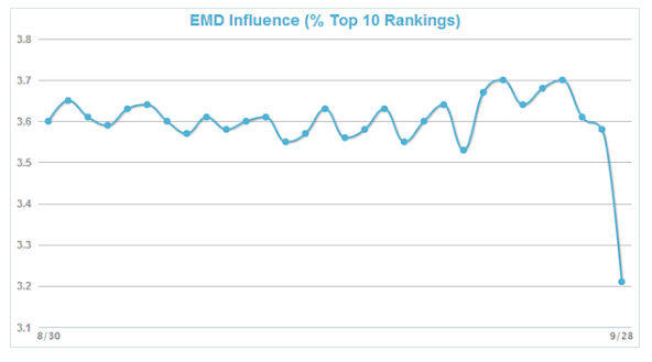
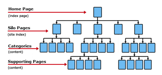
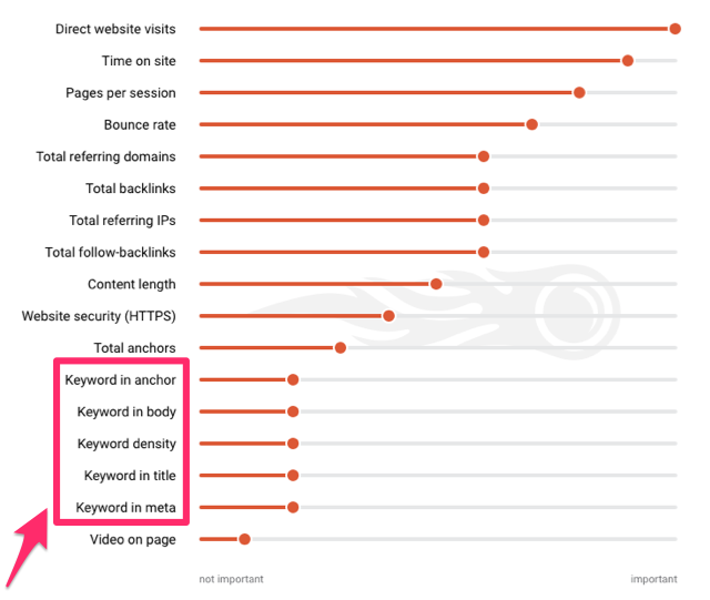
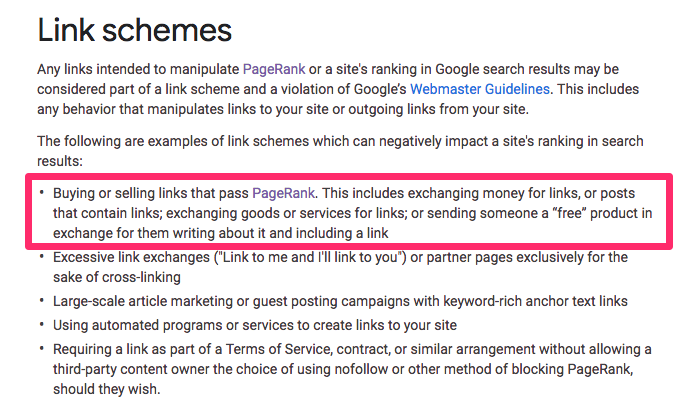
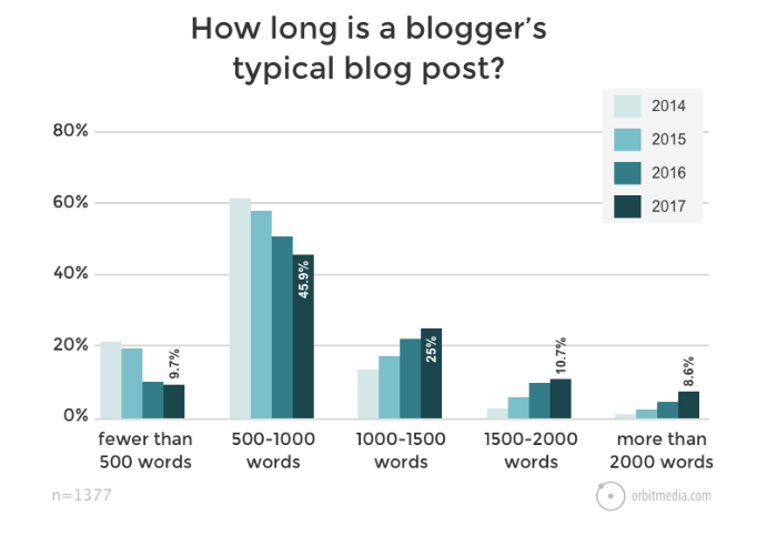
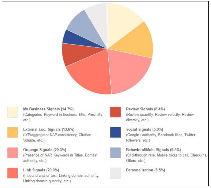


 When marketers try to acquire customers, Tanner often finds they make three big mistakes. First, they’re too focused on acquiring a customer and the first sale. Specifically, they want to cover all of their expenses and extract a profit from the first sale. This approach is a recipe for disaster and makes staying in business more difficult because you generate real profit from subsequent sales.
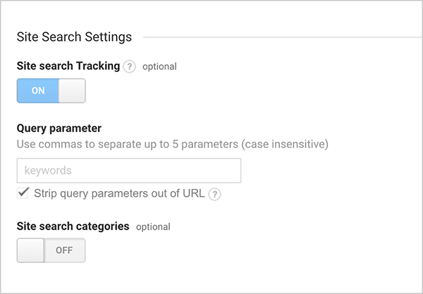
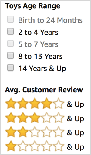
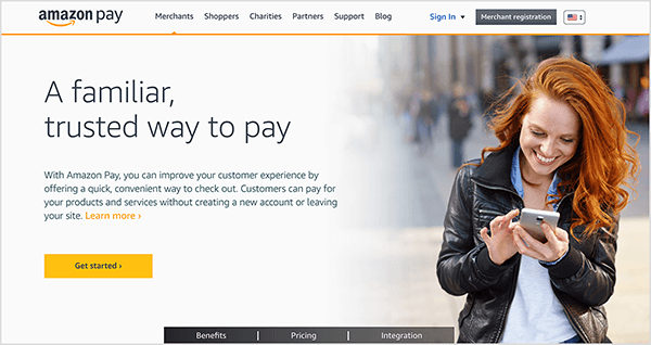
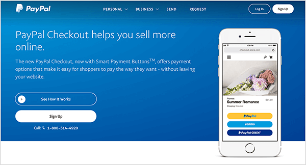

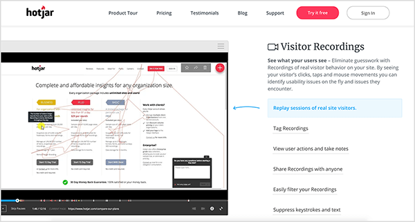
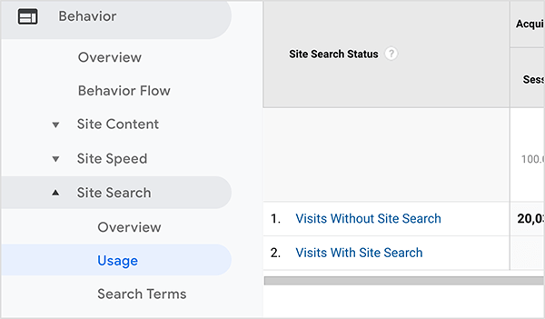

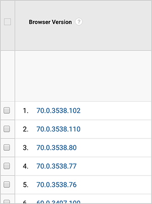
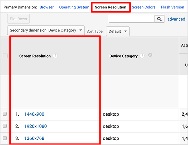
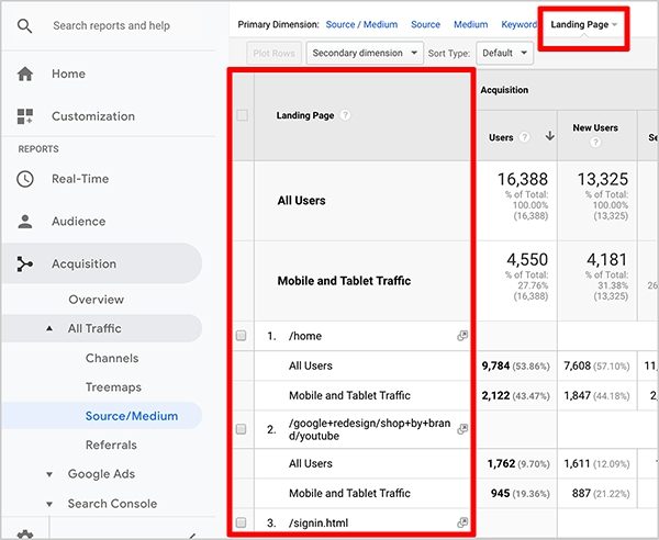


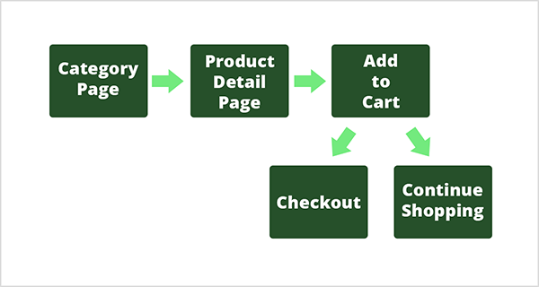
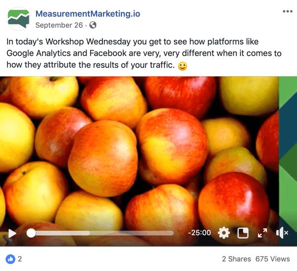
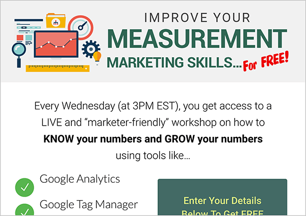
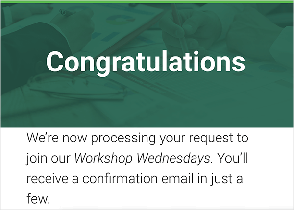
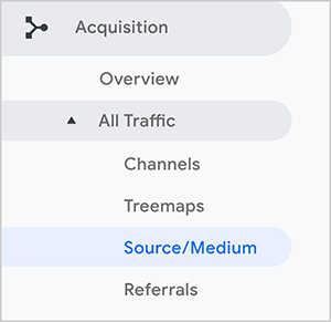
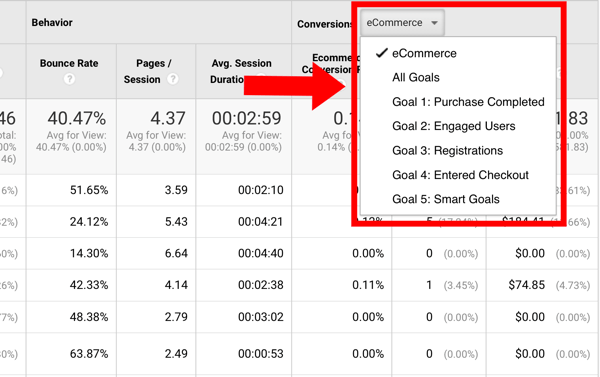
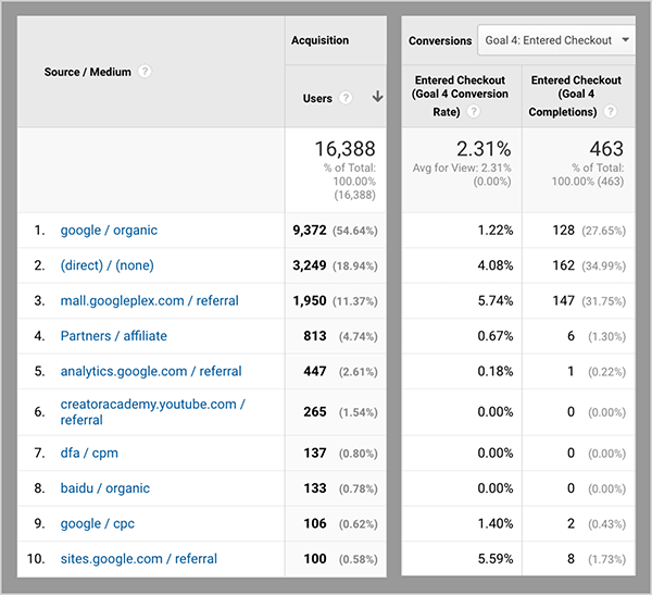
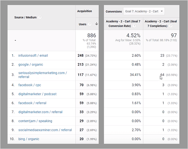
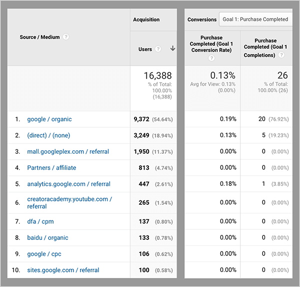
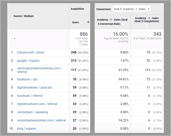
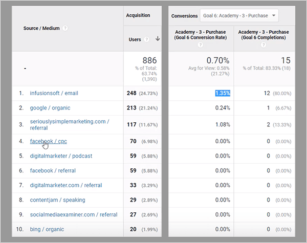

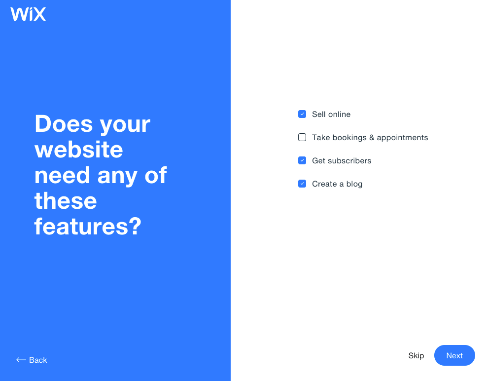
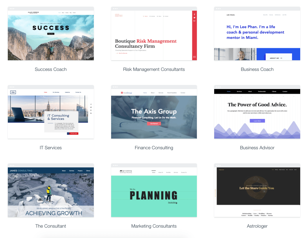
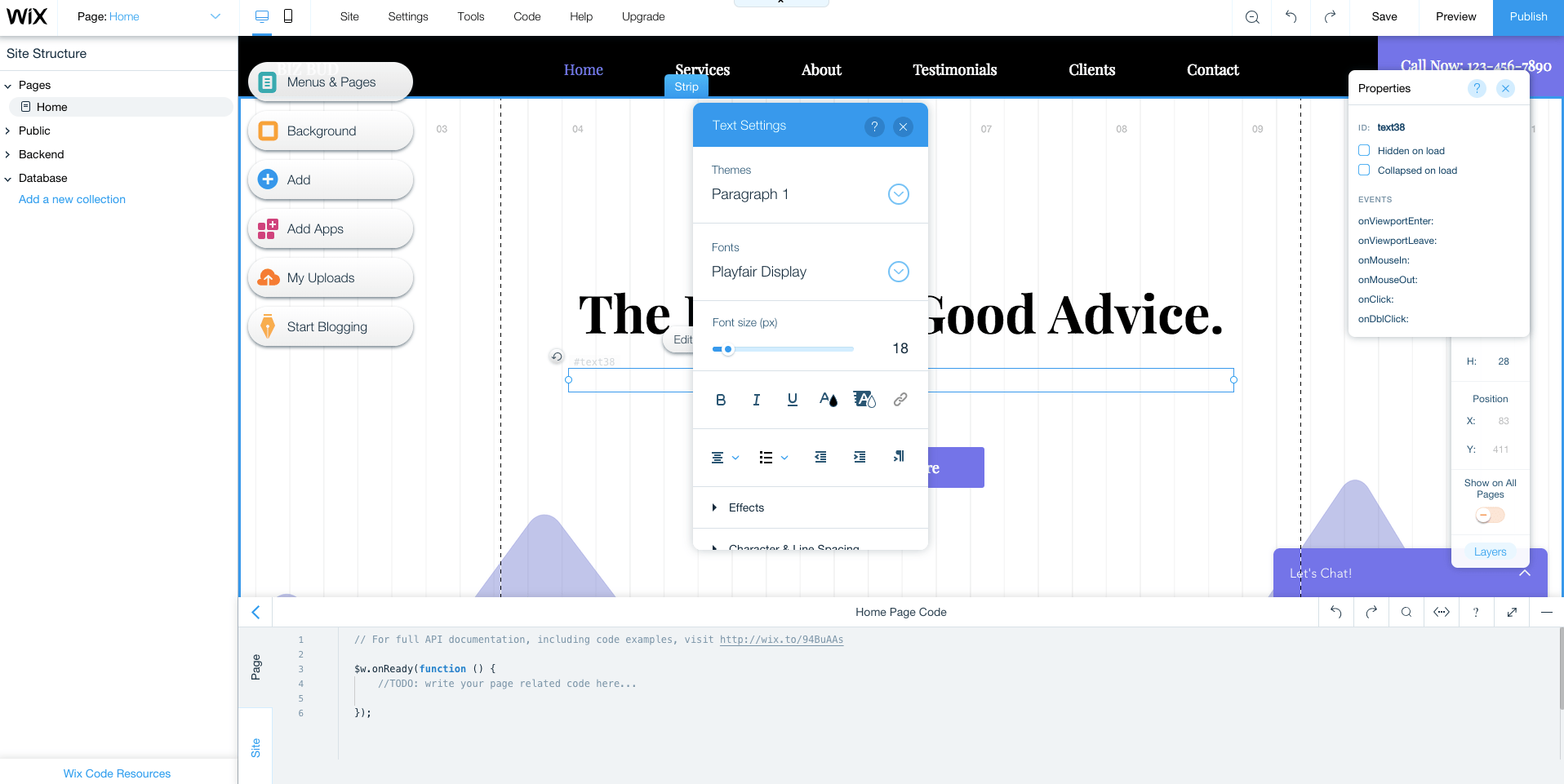
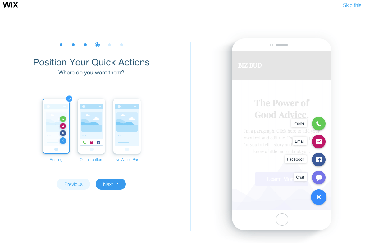
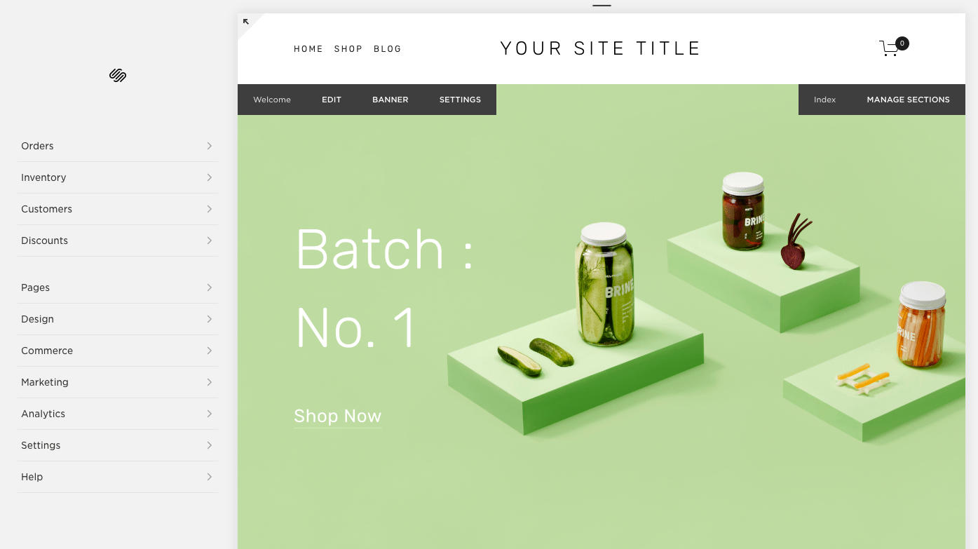


 RSS Feed
