
|
https://ift.tt/2Skc1zL
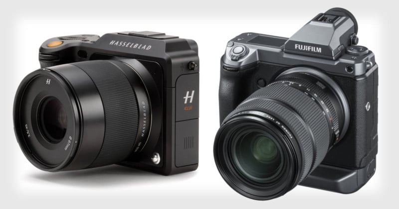
Can Hasselblad Compete Against Fujifilm in Medium Format? https://ift.tt/2Rle8mT
Hasselblad. The company that went to the moon. A company known for producing some of the most iconic cameras in history. Since 1948, when Hasselblad produced its first consumer camera, it has built a strong reputation within the industry. As with many companies, it has had a few bumps in the road, but for the most part, it remains a highly respected organization. The last decade has been relatively tough for the company. The shrinking medium format industry and a few major blunders around the Hansen years made things challenging to say the least. More recently, Fujifilm entered the medium format industry with its widely praised camera, the Fuji GFX 50S. 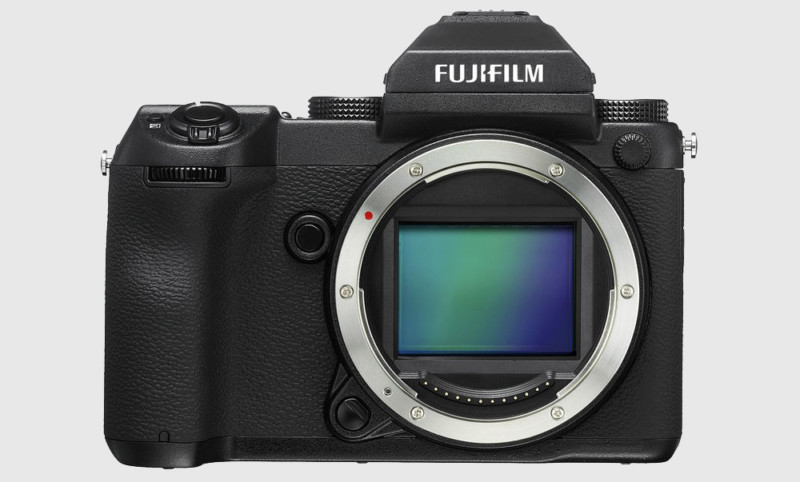
I previously talked about how Fujifilm is now the main player in the industry. With that in mind, how now can a company like Hasselblad compete? The GiantFujifilm is a huge organization. It is a company that’s currently about 3 times the size of Nikon. Individually it is larger than the whole medium format industry and DJI combined. Some of you may want to point out how its camera division is smaller than the rest of the company. While that is true, it’s important to remember that just its Instax division is set to be a billion-dollar segment in the next year. This is more revenue than what Phase One, Hasselblad, and Leica generate, combined. This is also without taking into consideration what Fujifilm’s X mount and GF system generate. Once again, Fujifilm is a huge organization. It is the largest player in the medium format industry and it has the most amount of investment potential available. With its recent deal with Phase One and the announced specs of the upcoming GFX 100S, it seems Fuji is putting its resources to good use. It seems to want to dominate the industry, and with its extensive experience in medium format, this may not be difficult for it. 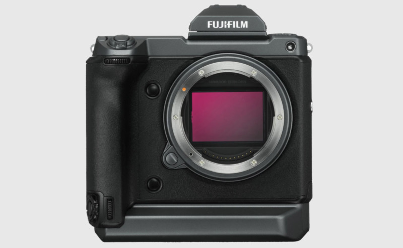
What’s interesting to me is that in some respects, Fujifilm seems to want to act as though it is the underdog when in fact it is the overlord in medium format. This is by no means a bad thing — the point is simply that competing with such an organization is not going to be easy. DJIAs of now, information relating to the acquisition of Hasselblad by DJI has not been officially confirmed. As both organizations are private companies, any information relating to the potential deal does not necessarily need to be disclosed. When news first came out that Hasselblad may have been acquired by DJI, many people considered this to be a bad thing. I was actually quite excited by the news because I was looking at the potential. DJI is a relatively young company that’s seen incredible success in a very short space of time. Its products are simply brilliant, and it has essentially cornered the whole market. If you want to buy a drone, for many people DJI is the only option. As a company, it also generates a significant amount of revenue from its drones and this has allowed it to innovate and possibly even purchase companies like Hasselblad. I believe DJI can really help Hasselblad depending on the kind of deal they have together. Having said that, I think the current manner in which DJI has been using the Hasselblad brand may not be effective. Instead of applying the Hasselblad brand to its drones, I believe it needs to rebuild its position in the medium format industry first. 
The Hansen years have taken a massive toll on the company’s brand and this takes time to redevelop. In essence, I think DJI need to help Hasselblad with developing more high-quality products before DJI can leverage the brand for marketing purposes. The most important thing to remember is that any new products that are developed must remain true to the Hasselblad brand. The last thing anyone wants to see is something like another Ferrari camera or a rehashed Sony. 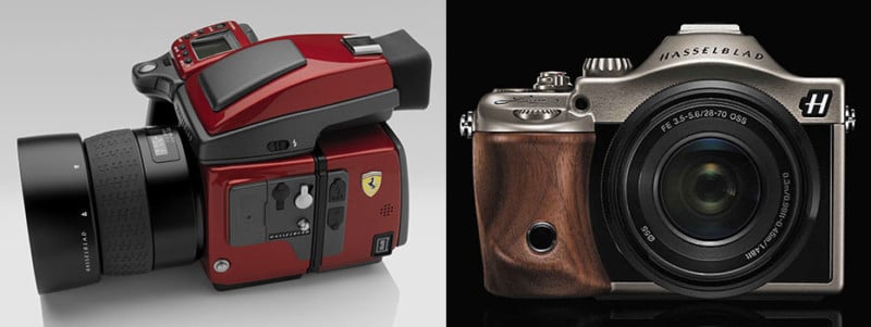
The Hasselblad brand and company means far too much to the history of photography for that to happen again. The Hasselblad X1DThe Hasselblad X1D was the first truly mirrorless medium format camera ever made. The relatively tiny form factor, beautiful design, and build quality immediately grabbed my attention. 
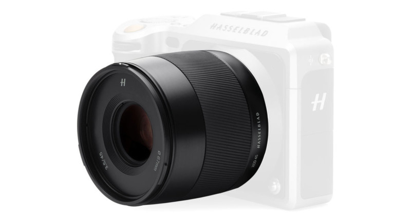
I still think the camera is stunning. The construction is fantastic the dials and the grip just feel premium to me and I think Hasselblad has something special with this camera. I also think Hasselblad rushed the camera out of the gate to try and be first. This is why when the camera was first released there were some major issues, bugs, and glitches. Reviewers did not take kindly to this and many early reviews panned the camera. Unfortunately, this perception stuck with the majority of people even after the camera had been improved with updates. Recently, however, I’ve been testing and using the Hasselblad X1D with a number of lenses. In short, I’m very impressed with this camera. There are a few minor issues — the lack of having a joystick is a bit of a pain and the start-up time is slow — but aside from that, I thought the camera performed really well. I was very surprised at how much I liked and enjoyed shooting with the X1D. Most importantly, the lenses are superb. Focus by wire is frustrating at times, although that’s more of a personal preference. In any case, the lenses that I did use were brilliant. My favorite go-to lens was the XCD 45mm f/3.5.
I found this lens was not only great at focusing but the image quality was stunning. 
Even in low light scenarios, shooting at high ISO was relatively fine. 

I absolutely loved the kind of images this camera was producing. The X1D feels like a lot of time and effort has gone into developing it. I also get the feeling that engineers at Hasselblad are enjoying developing new lenses for this mount. This is the Hasselblad I want to see more of because this is what the company is supposed to be known for. High-quality cameras and lenses that bring you joy when you shoot with them. Now you may be wondering why I’m gushing about this camera. Well, it’s because I think this camera is what’s going to help it compete against Fujifilm. Discontinue the H MountThis is not going to be a popular opinion, especially among many Hasselblad photographers, but hear me out first. Let’s face it, mirrorless is the future and most companies seem to have accepted this. The H mount will be discontinued at one point or another, and now is the perfect time to start working towards that. 
The reason I say this is because almost every company is starting to shift over now anyway. Therefore, it’s not going to seem out of the ordinary if Hasselblad did the same. Just to be clear, I’m not suggesting that Hasselblad should discontinue this mount tomorrow, but it should start the process now. Why? It’s outdated, has a huge flange distance, the current lenses for the mount are not the best and developing new lenses for this mount is challenging, especially on the wider end. I previously reviewed and discussed the H mount lenses and for the most part, they’re not that great. Developing cameras with the huge mirror box is also preventative when it comes to new and interesting features. Essentially it takes up far too much space. The alternative that I strongly suggest is that it shift over to its new XCD mount because this mount has a huge degree of potential. Hasselblad can continue supporting the H mount as it does many older cameras that have been discontinued. Support doesn’t need to go, but new developments and cameras with the mount do. The XCD mount also offers an adapter anyway, so photographers can still use H-mount lenses. This is no different from how Canon or Nikon are working towards developing their new mirrorless mounts. Ultimately, the H mount has had its time and now Hasselblad should start looking to the future with its new XCD mount. The Hasselblad V1DAs discussed above, I think Hasselblad should discontinue the H mount and continue future developments with its new XCD mount. The question some of you may be asking is how? If you remember, a couple of years ago Hasselblad presented a concept camera called the V1D. 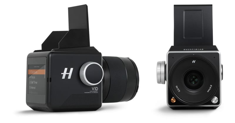
This was a beautifully designed modular camera that was inspired by its 500C series. Build quality was incredible, the grip handle could be placed on either side of the camera and it was a mirrorless body. The body was also significantly smaller than the current H6D camera which is a very useful feature. A camera that is like the V1D with the XCD mount would be an incredible option. To make this work, the square format sensor wouldn’t be practical. This camera would also need to only use the larger version of the medium format sensor. Essentially there needs to be a separation between the formats. The X1D would use the smaller variant only and the V1D type camera would use the larger version only. Both cameras can still use the same mount and certain lenses specific to the larger sensor would need to be developed. A company that has done this very successfully is Sony. Its current E-mount operates with both APS-C and full frame lenses. If you use an APS-C lens on a full frame body, the camera will allow you to shoot in APS-C mode, preventing any dark corners. Hasselblad could do something similar in order to make this work. Why This Will Help to Remain CompetitiveUsing the same mount for both systems offers a clear path for upgrading. The X1D is Hasselblad’s “entry-level” camera system. Its current flagship is its H-mount system, but there’s no proper link between the two. Having a clear path to upgrade is extremely important. When you have customers that are heavily rooted in a system, it not only prevents them from switching but also increases their chance to upgrade. Essentially, they can have the X1D as their smaller, non-modular system that uses the smaller sensor, and the V1D will only offer the larger sensor option. This helps to create a clear distinction between the two. Lenses work on both cameras, but the market position for both systems are clearer. The significantly lower price of the X1D also allows customers a feasible entry point into the Hasselblad ecosystem, without limiting future upgrade potential. Hasselblad’s major advantage over Fujifilm is the fact that it offers cameras with the larger sensor. Without having a clear upgrade path, that advantage is extremely limited. The fact that Phase One is no longer offering cameras with the smaller sensor puts Hasselblad in a great position if it can get its systems in line and together. Final ThoughtsFrom a very personal point of view, I would love to see Hasselblad thrive as a company and as a brand. To me, it is a pillar within the industry known for producing exceptional cameras for a very long time. I get the feeling that Hasselblad may yet have a few tricks up its sleeves and I can’t wait to see what it produces. The road ahead may seem difficult, especially when trying to combat a company like Fujifilm. The resources and experience that Fujifilm has give it a great advantage. Not to mention the excitement it has been able to generate with its latest product announcements. The potential backing that Hasselblad may have managed to get from DJI could be a huge help towards the future. The worst thing I believe DJI and Hasselblad can do is play a defensive strategy. Instead, if DJI is willing to invest in Hasselblad and allow it to develop interesting products like the V1D, competing will be relatively easy. In any case, the fact that we have more competition in the medium format industry can only mean good things for consumers. The price of medium format cameras has come down by a significant degree, and even Hasselblad adjusted its pricing. Companies like Fujifilm may not be the easiest to compete against, but, I’m very optimistic about Hasselblad’s future especially because of cameras like the X1D. About the author: Usman Dawood is the lead photographer of Sonder Creative, an architectural and interior photography company. The opinions expressed in this article are solely those of the author. You can find more of his work on his website, Instagram, and YouTube. Photography News via PetaPixel https://petapixel.com November 29, 2018 at 12:52PM
0 Comments
https://ift.tt/2zyF9g1
 The diffractive optics related patents continue to appear from Canon. This time we get a patent that covers both a 300mm f/2.8 DO and a 400mm f/2.8 DO. We think a slew of diffractive optics super telephotos are on the way for the RF mount and these two optical formulas may find their way to the RF mount in 2020. Perhaps alongside an EOS R version of the EOS-1D X Mark II.
Japan Patent Application 2018-189878 Focal distance: 392.58 Focal distance: 293.40 Photography via Canon Rumors https://ift.tt/2v4dYqS November 29, 2018 at 12:36PM
https://ift.tt/2RnsxiD
The post 7 Ways To Take Your Photography To The Next Level appeared first on Digital Photography School. It was authored by Kav Dadfar. It easy to stagnate as a photographer. It’s a lonely hobby where you often work alone spending hours in pursuit of one photo which may not materialize. You can begin to lose interest and become lazy. This loss of interest can manifest itself in your photos which, in turn, demoralizes you further. As with many hobbies, the great thing about photography is you can reignite your passion. So here are 7 ways to take your photography to the next level.
1. Photograph Something DifferentOne of the things many photographers are guilty of doing is photographing the same things over and over again. If you did the same thing again and again, eventually you’d get fed up with it. So, a great way to boost your passion for photography is to photograph something completely different. For example, if you are a travel photographer, spend some time photographing wildlife. If you take portraits, start photographing food. Not only will this help reignite your passion, but it can also add more skills to your repertoire. You never know, you may find a new passion you never knew you had.
2. Work On a BriefRemember when you were at school and had to work on projects set by the teacher? It required you to learn about the subject, think about it and create a piece of work to present to your teacher. The concept of working on a brief is the same. You are given a topic or subject to photograph, and you take photos that answer the brief. The project could be anything from a simple task of documenting a local event, to photographing a remote tribe in another country. Many people who take up photography as a hobby take photos of things that they come across rather than a specific brief. Working on a brief can help focus your photography and make you think about things differently. Ask a friend or family member to set you a brief. It could be on anything. After you receive the brief, go about creating a set of images that respond to it.
3. Set Yourself a ChallengeAnother way to improve your photography is to set yourself challenges. These can help diversify your portfolio. For example, you may have lots of photos but are missing some nice close-ups. So, set yourself a challenge to capture one close-up image every day. Perhaps you have a weakness in a specific area of photography? Set yourself a challenge to improve that one element. If you are a shy person and struggle to approach people to take their photo, set yourself a challenge to photograph ten people in one day. You’ll be surprised how much more confident you feel after doing so.
4. Read, Watch, FollowOne of the best ways to improve your photography is to be inspired by photographers whose work you admire. Follow photographers on social media whose work inspires you. Look at the work of the masters like Ansel Adams, Steve McCurry, and Robert Capa. Read books such as the ‘Bang Bang Club‘ and watch documentaries and movies about photography. Even flicking through photography books or magazines can help inspire you. However, remember the objective should be to be inspired, not copy someone else’s work.
5. Get a Photo BuddyPhotography is usually an isolated hobby and can be difficult to judge how well you are doing. Having someone who shares your passion can help motivate you while also giving you someone to bounce ideas off. You can learn from one another and push each other to capture better images. If you don’t know anyone who has a passion for photography, join your local camera club where you can meet likeminded individuals.
6. Rent or Buy a Film CameraThere is no doubt that cameras are better and more powerful than they have ever been. You’ll find it hard finding many photographers who still shoot in film. Still, one negative of digital photography is that it makes the decision of taking photos easy. Back in the days of film, every single photo you took cost money. Meaning, you had to be sure of what you were photographing to avoid wasting money. So you didn’t waste money, you had to think a lot harder about a scene. You had to think about your settings and if it was an interesting subject. You didn’t have the luxury of looking at the picture on the back of your camera. Try it out. Rent film camera for a day, or buy a second-hand one, and see if it makes you think differently about photography.
7. Go On a Photo TourPhoto tours are quite common these days. Tours usually entail going to a country and touring it with the purpose of capturing photos. Ranging from a few days to weeks, tours are one of the best ways to boost your photography. You are away with likeminded individuals who share your passion, and you are joined by a professional photographer who can help you with your photographic weaknesses. Nevertheless, arguably the most significant benefit of a photo tour is you are immersed in photography every day for weeks. If you keep practicing and doing something for hours every day, it’s natural for you to become better at it. So, if you haven’t tried a photo tour or workshop, give it go. It could be the best way to boost your photography skills and passion.
Like any other hobby or profession, you need to continually challenge yourself, set goals and have the motivation to create great photos. Sometimes that comes naturally, like when you are heading to a fantastic destination. At other times you have to make an effort to push yourself to be able to take your photography to the next level. The above tips should help you on your way, but ultimately it is down to you to push yourself. What do you do to improve your photography? Tell us below. The post 7 Ways To Take Your Photography To The Next Level appeared first on Digital Photography School. It was authored by Kav Dadfar. Photography via Digital Photography School https://ift.tt/29wB9CX November 29, 2018 at 12:04PM
https://www.youtube.com/embed/r33hL-6MNTE
Capture One 12 Brings a Redesigned UI, New Masking Tools, and More https://ift.tt/2TRs4H7
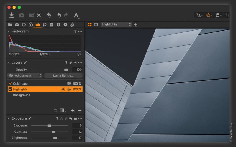
Phase One just launched Capture One 12, the latest major version of the popular RAW conversion, photo editing, and asset management software. “This release takes a top-down approach to streamline, modernizing, and improving the user interface to continue the program’s tradition of providing powerful features in a customizable, uniquely-configurable interface,” Phase One says. “With this update, we focused on creative control — updating and improving the user interface, adding powerful new masking tools, and extending the Capture One ecosystem through plug-in support,” says VP Jan Hyldebrandt-Larsen. “These updates further our commitment to ensuring that Capture One continues to be the industry’s recognized leader in accuracy, performance, and customizability.” Here’s a rundown of new features found in Capture One 12 in Phase One’s words: Powerful, Refined Interface
“Capture One 12 introduces a newly re-designed, contemporary interface, designed to make Capture One easier to use during long editing sessions and to make discovery, experimentation, and customizability easier than ever. New iconography better conveys tool functionality, and the new slider design, the spacing of the tools, and font size increase improve both the look and the usability of the program.” Revamped Menu System“Every menu item in Capture One 12 has been evaluated, categorized, and organized according to its logical function and grouped along with associated tasks, which makes it easier to find the desired controls and settings, and brings the Mac and Windows menu options into alignment.” Luminosity Masking
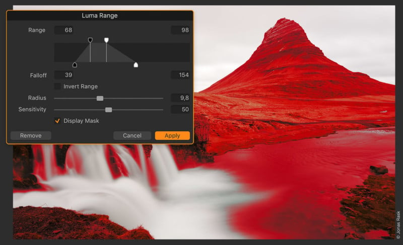
“One of a trio of new masking tools, Luma Range allows users to quickly create masks based on the brightness of pixels in an image and is the most powerful luminance masking tool of its kind. […] The masks created with the Luma Range tool are dynamic and can easily be tweaked and modified at any point in the workflow. Unlike a hand-drawn mask, Luma Range adjustments can be applied from one image to another, and the effect will be based on the luminance of each image. This functionality is a huge time-saver as it eliminates the need to create precision masks for each frame in a shoot.” Linear Gradient Mask
“Capture One 12 takes gradient masks to the next level, allowing for editable, moveable, rotatable—and best of all—asymmetric gradient masks. Using a brand-new Parametric Masking Engine, Capture One allows for adjustments in the size, shape, and symmetry of the masks with simple mouse clicks and key presses, truly redefining the possibilities of linear gradients in Capture One.” Radial Gradient Mask
“The new Radial Gradient mask tool enables quick, flexible radial masks, useful for vignette and other adjustments with a desired falloff effect. Using the same Parametric Masking Engine as the Linear Gradient mask tool, radial masks can be adjusted, rotated and moved after creation for extreme control over desired effects.” Redesigned Keyboard Shortcut Manager
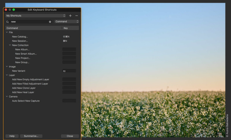
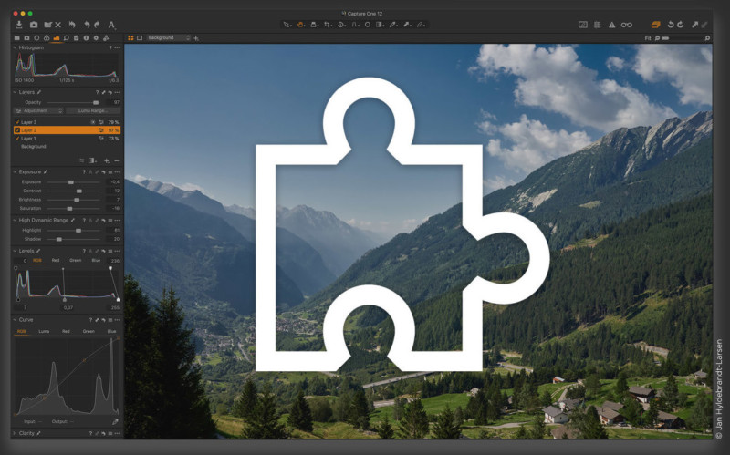
“Capture One is known for its ability to custom-assign and custom-configure virtually every task to a keyboard shortcut. With more than 500 individually-assignable and customizable commands, it’s essential to be able to find the exact shortcut, without having to hunt through hundreds of choices. Users can now search by the specific menu command, or by the assigned keyboard shortcut, making it easy to find and manage shortcuts. To unify the interface between the Mac and Windows versions the new menu system has been moved to the same location on both platforms, making it easier for workgroups to stay in sync.” New Plug-in Ecosystem
“To address the needs of photographers and creatives looking to share, edit and collaborate on their images, the new Capture One plug-in ecosystem will allow for powerful third-party extensions. The new Capture One SDK will allow any developer to create custom solutions to expand Capture One, and to transform Capture One into an open ecosystem. Users of Capture One will be able to extend the platform with the upcoming addition of plug-ins that allow for sharing, editing, and that can connect Capture One to a variety of specialized editing tools.” Copy and Apply
“When copying adjustments between images, Capture One will automatically detect changes for a quick workflow. Image specific adjustments like composition or spot removal are ignored by default, but can be manually included if needed.” Fujifilm Film Simulation Support
“Thanks to the collaboration between Capture One and Fujifilm, photographer’s using Fujifilm’s renowned X-Series and GFX-series cameras will be able to edit photos complete with Fujifilm Film Simulations. These in-camera settings have been faithfully reproduced in Capture One, to provide an identical experience when working with files, resulting in images that appear the same as if the Film Simulation picture profiles were applied in-camera.” Extended AppleScript SupportUsers of Capture One on Mac OS can take advantage of extended AppleScript support for automation and workflow streamlining. More than a dozen of Capture One 12’s areas and properties can now be directly modified with AppleScript, adding to the existing, robust AppleScript support in previous versions of Capture One.” New Camera and Lens Support“In addition to the RAW support for more than 500 cameras, Capture One also provides profiling and image correction support for more than 500 lenses. Like with the RAW file interpretation, Phase One carefully measures the optical characteristics of each supported lens and builds correction algorithms that compensate for the various optical imperfections of various designs. New camera support: Nikon Z7, Nikon Z6, Fujifilm GFX 50R, Canon EOS R, Canon EOS M50.” Learn MorePhase One has released a large number of tutorials that introduce how the new features work on its YouTube channel: Max Bridge of Square Mountain also made this helpful 18-minute video looking at the new features: Availability and PricingCapture One 12 is available now with a perpetual license for $299 (upgrading costs $149). There’s also a subscription model that costs $15 per month and up. Photography News via PetaPixel https://petapixel.com November 29, 2018 at 11:47AM
https://ift.tt/2zuGbtq
 Canon has released new firmware for its super high ISO video cameras, the ME20F-SH and ME200S-SH. Firmware incorporates the following enhancements:
*In some cases, the firmware of these lenses needs to be updated in order to enable these enhancements. Contact your Canon dealer for details. Photography via Canon Rumors https://ift.tt/2v4dYqS November 29, 2018 at 11:24AM
https://ift.tt/2TY1ufq
 (New York, New York) November 28, 2018 – ROKINON has introduced its new Special Performance (SP) 35mm f/1.2 Full Frame Lens for Canon EF mount. Designed for professional and advanced amateur Canon users, it joins the ROKINON SP 14mm f/2.4, SP 50mm f/1.2, and SP 85mm f/1.2 lenses.
The optical design of the ROKINON SP 35mm F1.2 boasts 12 elements in 10 groups and incorporates Extra-Low Dispersion, Aspherical and High Refractive lens components to ensure impressive image quality. Constructed of high-quality aluminum alloy with an ergonomically designed shape and focusing control/grip, it delivers a luxurious look, excellent durability and comfortable use Additional features include an intuitive, damped and precise manual focus control, Canon’s exposure control modes are enabled, EXIF info is registered, and a non-rotating filter mount. The new ROKINON SP 35mm F1.2 Full Frame High Speed for Canon EF mount will be available from authorized ROKINON dealers in January 2019 with an MSRP of $999.00. Photography via Canon Rumors https://ift.tt/2v4dYqS November 29, 2018 at 11:19AM
https://ift.tt/2TX35Ck
5 Things Photographers Can Learn From the Old Masters of Painting https://ift.tt/2QwmWJK
Art has arguably been around almost as long as humans have. The moment we learned to mark something for others to see and interpret, the moment art was born. Thankfully for us photographers, we needn’t go quite that far back to begin learning from the history of art. In fact, we only need to go as far as the “Old Masters.” Old Master Who?To those unsure as to who the ‘Old Masters’ were: they are the painters that worked in Europe prior to the 1800s. More specifically, it refers to the ones who were working at the top of their game, and many of their pieces will still be displayed in galleries around the world to this very day. At a time before social media and marketing, these artists had to heavily rely on simple raw talent and skill to succeed. In fact, one could argue that it was only truly great artists that did succeed back then — you couldn’t simply buy your way to popularity, nor could you hire somebody to “finish” or “retouch” your work. There were no shortcuts to success back then. You actually had to put time and dedication in to succeed. What Could We Possibly Learn from Old Paintings?The reason I mention this slightly cheeky jibe at the current state of art and photography is that I wonder how many of us will have our work viewed in a hundred years? Not many, I’m guessing. So with this in mind, any artwork we hold in high regard now from one hundred or maybe even four hundred years ago deserves some serious attention. You don’t get your work displayed and admired for centuries unless you seriously knew what you were doing, and I feel we can learn a lot from looking at their work. In this article, I aim to look at the work of some Old Masters and see what made some of their paintings so successful at the time. What did they do that caught the attention of the viewer? What tricks did they use to lead the viewer’s eye? How did they tell a story in a single frame? #1. HDRNow before you all leave in disgust at the very mention of HDR, let me explain. For those unaware, HDR stands for High Dynamic Range, which in reality translates to very little pure black shadows and very little pure white highlights in your shot. In effect, you use tools like multiple exposures or multiple lights to ensure that every part of your image is evenly lit. Done poorly, your image will look flat and visually very confusing. This technique was painfully overused in the mid-2000s and now has a pretty bad reputation whenever the term is muttered in dark corners of camera clubs across the globe. So how on earth were the Old Masters using HDR back when they were arguing over whether squirrel or badger eyelashes made for better paintbrushes? Well, painters have a unique trump card and that’s their ability to paint any area of their canvas whatever brightness they want. Leonardo Di Vinci was a master at interpreting light and he would often use his ‘artistic license’ to convey the impossible in his outdoor portraits. Take a look at ‘The Virgin and Child with Saint Anne’ below. 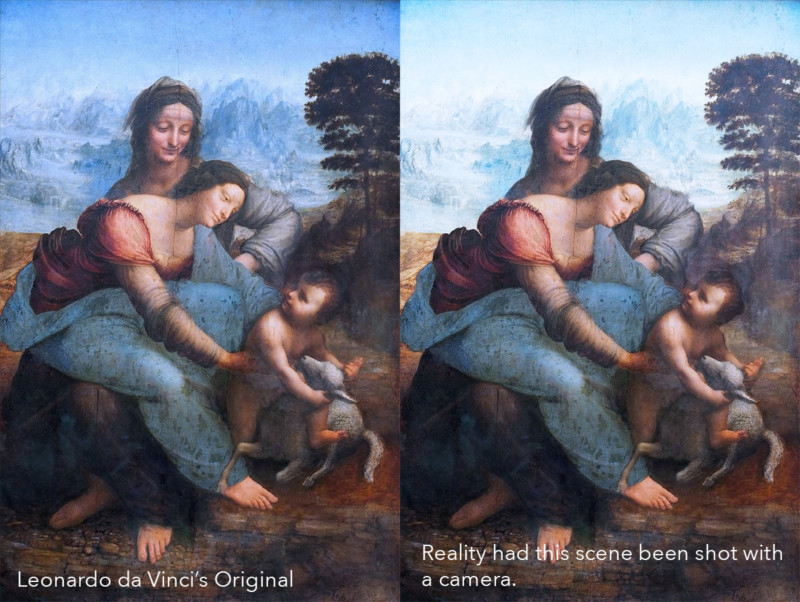
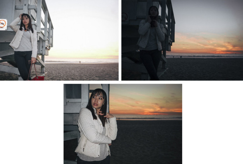
As those of us who’ve ever shot portraits outside will know, getting nicely exposed directional light on your subjects, as well as a correctly exposed background, is tough. In the left image is Leonardo da Vinci’s original painting and on the right is an interpretation of what this scene may have looked like had it been taken with a camera. Painters were masters at somehow never overexposing their backgrounds and of course that’s because they didn’t have to worry about one single exposure, they could use whatever brightness they wanted in their backgrounds. We as photographers need to bear the same things in mind because having detail in the background of an outdoor portrait is nearly always preferable to blown out highlights just like we can see in the right-hand image above. One way to get even exposure throughout your shot is to use HDR. With HDR, you take multiple shots at varying exposures and then merge them later in post. This is fine for landscapes, but for portraits, the subject will likely move between images and the multiple exposures will rarely line up. The alternative to this is to simply expose the shot for the background and then add additional lighting on the subject in the foreground to even out the exposure of the shot. In the images below (thank you to my ever-patient wife that allowed me to take these test shots to show you), you’ll see the reality of shooting outdoors.
In the top left image, we have our subject correctly exposed but the background is very overexposed. In the top right, we have the background correctly exposed to show color and detail but now our subject is very dark and underexposed. Finally, on the bottom, I added some additional lighting so that we can now get an accurate exposure on both the subject and the background, simultaneously. It’s in these instances that a little technical knowledge is required to ensure a dramatic shot compared to a very blown out background or a very dark subject. This higher dynamic range in imagery is a skill painters inherently took for granted at the time, but it’s a skill that we modern photographers must thoroughly understand if we ever hope to create evenly exposed portraits of people outdoors like they did hundreds of years ago. #2. Using Color to Separate Foreground and BackgroundIn recent years, the trend of shooting everything wide-open at f/2.8 or wider has been rampant. Don’t get me wrong, I do it too and I like the look it gives, but why? For some, the very shallow depth of field is a way of separating themselves from the iPhone generation. Before Portrait Mode, the tiny smartphone lenses couldn’t accurately create any depth of field in their images, so everything in a phone shot appeared in sharp focus. Larger lenses and sensor sizes allow for a shallower depth of field and as such, shooting everything wide-open separates your imagery from the simple ‘snapshot’. More importantly than this though, shallow depth of field is a great way to control and guide the viewer’s journey around a shot. If you want the attention to be on the subject and not the background, you make the background blurry and the viewer has no choice but to concentrate on the subject. 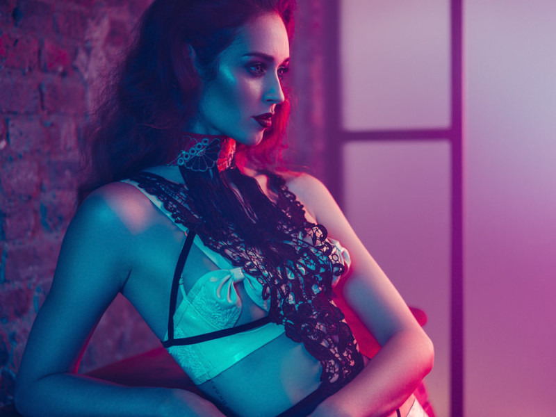
In the shot above, you’ll see that I’m using a very shallow depth of field to throw the background out of focus so as to force the viewer’s attention onto the subject. Unfortunately, the Old Masters didn’t have this ability. In fact, it’s very rare to see a painting where every aspect of it isn’t in sharp focus, it’s really only when cameras came along that this became a more creative visual element in imagery. So because painters had everything in focus in their images, they had to use different ways of guiding the viewer where they wanted them to look and they did this with color. Take a look at the two images below to see what I mean. 

In the top image, we see Orazio Gentileschi using very bold and bright colors on his subjects yet behind them we see nothing but drab, grey rocks and dirt. It might seem obvious, but this is a very powerful way of creating a clear separation from foreground to background and guiding your viewers gaze. In the image below it, we see the opposite happening. In this painting we see that Guido Reni has actually used a very bold color behind our pale subject who is also wrapped in muted and dull colors. Again, this draws the viewers attention where he wants them to look. Interestingly, in this painting we also see the opposite happening with the other subject in the frame. They are dressed in orange and the background behind them is dark and grey. It’s cleverly not quite as obvious as the mischievous Potiphar’s wife and that’s because she is still the main focus in this frame, not the recoiling Joseph. This painting is certainly one of the best examples of the use of color to separate and guide its viewer, and this doesn’t even begin to look at how certain colors are being used to tell a story here either. A truly remarkable study of color, in my opinion. So how can we apply this knowledge to our photography now? Thankfully, it’s far easier to use color to separate subjects from the background than you might think, and by no means does it mean you shouldn’t also use the shallow depth of field as well as this color separation. In fact, they often go hand in hand, especially with busier backgrounds. You’ll often find neutral backgrounds and colorful subjects in commercial fashion images as well as e-commerce, and they simply use white backgrounds to ensure maximum attention on the clothing. In the images below from Rankin and Mario Testino we can see this use of white and muted backgrounds to maximise the impact on the subjects. 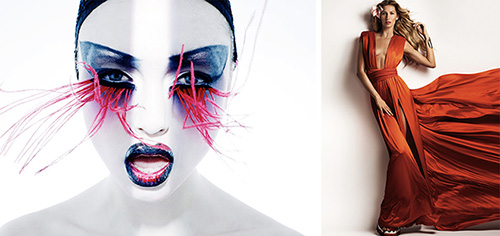
Conversely, we can use colorful backgrounds to highlight and isolate the subject and it’s this technique you’ll often see appearing in my own work. In the two images below, you’ll see me clearly using color to separate the foreground and background. On the left, a clear bold color is seen behind the model in stark contrast to her white dress and on the right I’ve colored a location in a bold blue to heavily contrast the red of the styling in the foreground. 
You can take this color separation theory one step further by sandwiching your subject between color as well. In my image below, you’ll see that I’ve artificially colored the background behind my subject, but I’ve also artificially colored the immediate foreground in similar colors as well. This technique of sandwiching the subject between color like this can be easily overdone, but if used in conjunction with a shallow depth of field, the viewer has no choice but to be engaged with the subject. 
#3. CompositesYou may be thinking that ‘composites’ is a relatively modern term, a word used to describe a puzzle of images rearranged to create an entirely separate piece. Surely this has only been truly possible with modern digital software? Well, as it turns out, composites is merely a modern word but the act of bringing multiple elements together to form a unique piece has been around almost as long as art itself. In our modern digital world, we often use composites as a way of bringing multiple images together for a number of reasons. Maybe we’re trying to create something that ultimately doesn’t exist in the real world, or maybe we’re simply trying to bring together varying exposures of a single scene that would ordinarily be near impossible to capture in a single frame. But whatever the reason for a composite, we are usually trying to create an impossible shot, a shot that simply doesn’t exist in reality. It should be no surprise then, that artists have been doing this for centuries and if it was good enough for them, it’s good enough for us. One of the core reasons for bringing multiple elements together in paintings was often due to larger paintings that had many, many subjects involved. Artists rarely got 10 important people to stand around and pose at the same time so they were often painted separately until the entire painting was complete, effectively creating an impossible shot. But multiple subjects wasn’t the only reason for composite painting like this. Below is a portrait of a man. The identity of the man is actually unclear and it may even be a self-portrait of the painter himself. This painting was made by Italian artist Paolo Veronese (Paolo Caliari) in 1576 and although it is assumed that this is what the subject looked like, the surroundings themselves are entirely made-up. 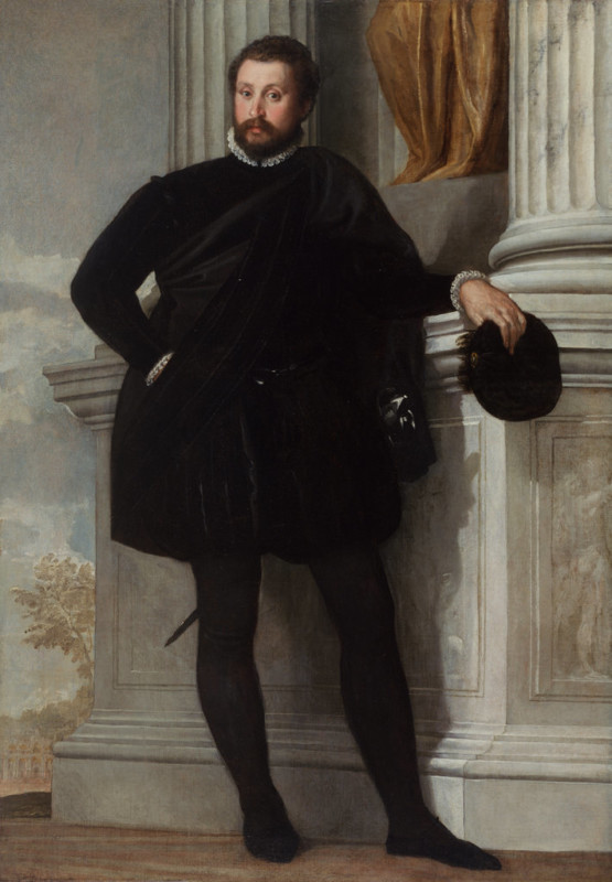
Back then it was very common to commission a portrait of yourself just as it still is today and back then, just like today, it was very common to have certain aspects of your portrait ‘enhanced’. In this instance it is believed that this painting was made in southern Italy and in that area, there were none of those trees we see present behind the subject. More importantly, though, the gentleman is confidently leaning against a plinth alongside vast, fluted greek columns. There were no such columns anywhere near this town in Italy, then or ever. This was a technique often used by artists as it gave them the ability to say something about the subject. In this instance, we see in the carved reliefs on those plinths beside him, scenes that give us hints to his profession, background or even military rank. As I said, this was a very common practice, but this image we see before us never really existed in reality. Another great example of composites from the Old Masters was in still life painting. The painting of still life subjects upon a table was incredibly popular, but it wasn’t until Jan van Huysum came along in the early 1700s and began creating impossible paintings that their popularity skyrocketed. Jan Van Huysum was nothing short of a genius with his brush and at his peak, he literally could not paint fast enough to keep up with the demand for his exquisite work. But what really stood Jan Van Huysum’s work apart, was his ability to capture fruit and flowers in unique arrangements. Up until that point, painters had painted what was in the fruit bowl or vase in front of them but in an era before the fridge, you were beholden to the seasons and what was in bloom at the time. Jan Van Huysum did away with that notion and brought together the best fruits and flowers from throughout the year into a single painting. 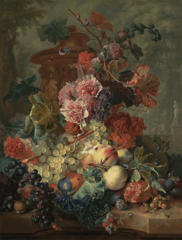
Jan Van Huysum image ‘Fruit Piece’ from 1722 simply never existed and it is an extraordinary collection of fruit and flowers that never sat in the same place at once. If you ever get the chance to see the work of Jan Van Huysum I urge to check it out as his skill is almost unbelievable. The detail in this piece is nothing short of breathtaking up close. In fact, his ability and technique were so highly coveted that he always worked alone and never allowed visitors to his studio. 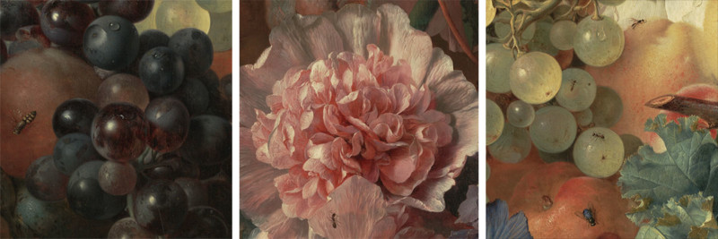
I’m sure you need little advice on where to look for inspiration for modern day composite photographers, and there are certainly many great composite artists out there to chose from right now. But here’s a few to get you started: Renee Robyn, Dave Hill, Erik Johansson. And remember, if compositing was good enough for the Old Masters hundreds of years ago, it’s certainly good enough for us today. #4. Composition and Leading LinesGranted this one should come as no surprise, but composition and lending lines have been a big part of the art world for a while now. But although you see this as obvious, strong composition is so often overlooked in modern photography in favor of simply recording what’s in front of you. I see too many current photographers get wrapped up in sharpness, megapixels and color balance to ensure they perfectly recreate what’s in front of their camera as accurately as possible. Unfortunately, none of these things will result in a ‘great’ photo, just like the perfect frame won’t make a great painting. As photographers, we need to be thinking about telling a visual story and to do that many great artists will use composition and leading lines to take our eyes on that visual journey around a frame. Simply plonking your model in the center of the frame isn’t going to cut it, and using a color checker, a $2,000 razor sharp lens, and a 100-megapixel camera will never change that. Let’s take a look at some Old Masters work and see what they did with composition and leading lines. 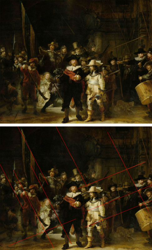
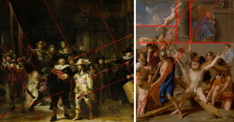
This painting of ‘The Night Watch’ by Rembrandt van Rijn in 1642 is likely one of the most studied paintings of all time, as art students across the globe discuss its art tropes and it could easily fill an entire article all by itself. But if we just briefly look at composition and leading lines alone, you’ll see how Rembrandt clearly uses shape, form, and objects to create leading lines that all lead us to the center subjects. This is one of those elements in artwork that may seem obvious once they’re shown to you, but to the unknowing viewer’s eye, this is an incredibly powerful visual tool. In the painting below, we see a slightly more complex use of leading lines. 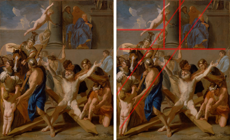
In the painting above, ‘The Martyrdom of Saint Andrew’ by Charles Le Brun we can clearly see very strong leading lines throughout this shot and if you continue to look at this image, more and more repeating shapes and symmetry begins to appear. Look again and see if the abundance of triangles starts to become more apparent. These very strong lines and balanced symmetry is incredibly hard to do in such a complicated piece and the more you look at this, the more compositional elements that start to emerge. There is of course nothing wrong with the modern images that are being produced today, but you may well struggle to find a modern image that comes close to this level of compositional complexity. As I previously mentioned, examples of striking composition and leading lines are harder to find today than you might think. Don’t get me wrong: of course it’s out there, but I think it plays less of a part in recent imagery than it has done historically. One of the most famous photographers for composition and leading lines is Henri Cartier-Bresson as his work in the 1930s is part of practically every self-respecting photo training bible out there. 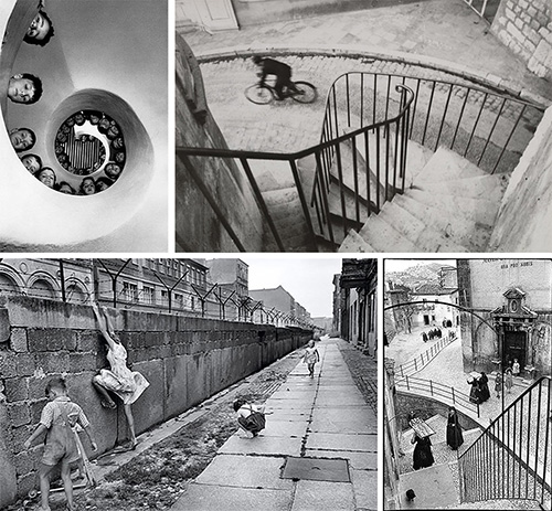
As we move further forward in time, it becomes harder to pick out striking forms of composition as so many other factors form a part of our modern photography repertoire. A great place to start though is the work of Mikael Jansson as his work will often contain many striking elements of composition. 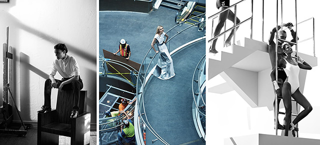
#5. ChiaroscuroLastly, we’ll take a look at one of my favorites: chiaroscuro. For those unsure of what that weird word means, chiaroscuro comes from the Renaissance period of art and is a word used to describe light and shadow. The Renaissance artists used dyed paper and then applied white gouache to create their works which resulted in a heavily contrasted image. This heavily contrasted artwork was seen again as woodcuts which resulted in only two tones being used; the ink on the woodcut and the surface it was to be printed onto. Chiaroscuro is only a word few artists would use today, but the more modern term for this heavily contrasted style of lighting, used in both cinema and still photography is ‘low-key lighting’. The key artists who later developed this chiaroscuro style was Leonardo da Vinci, Caravaggio, and Rembrandt and they were seen as the first individuals who stepped away from this HDR ‘look’ of everything being correctly exposed in paintings, and explored a stronger, almost single light style of work. Of course, back then the most prominent light source after the sun had gone down was candlelight, and it was this light source that was seemingly used in many of the chiaroscuro paintings. 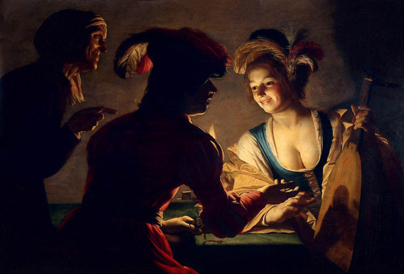
In the famous ‘Matchmaker’ painting by Gerard van Honthorst in 1625 we clearly see the candle in shot and as with so many great chiaroscuro paintings, the subjects are placed around the light source to create that stunning light to dark to light to dark tone throughout the frame. It’s pieces of art like this and it’s incredible use of the low-key lighting that should be seen far more in modern day black and white photography, but sadly this skill is being overlooked and often ignored. If you are even remotely interested in black and white photography, then please invest a little time in exploring these chiaroscuro paintings and their artists and guarantee you won’t be disappointed. Chiaroscuro was also a technique that started to get used a little more stylistically in single person portraits. In the image below ‘David with the Head of Goliath’ by Guido Cagnacci in 1645, we see a very clever use of chiaroscuro not only on the subject but on the background as well. 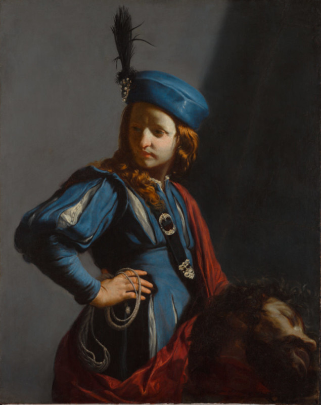
To me, this a staggeringly stylistic portrait at the time and the very clever use of light to shadow makes the image incredibly three dimensional. The diagonal shadow line behind the subject cuts through just as the light hits the face of David and then falls off to shadow again moments later before again returning to light behind him. It’s this beautiful play of light that is as elegant as it is simple. Once again, we rarely see this high-level execution of lighting in our modern image making and I feel it’s something many of us, myself included, could benefit from understanding more comprehensively. So what can we learn from chiaroscuro and begin to implement today? First and foremost, we once again need to isolate our subjects from our backgrounds and as artists that create two-dimensional images of three-dimensional objects, we need to introduce more visual depth into our portraits. I bring this up as I all too often see subjects disappearing into the backgrounds behind them and they end up getting visually lost in the frame. Take a look at the two examples below to see the difference in reference to ‘subject and background separation’. 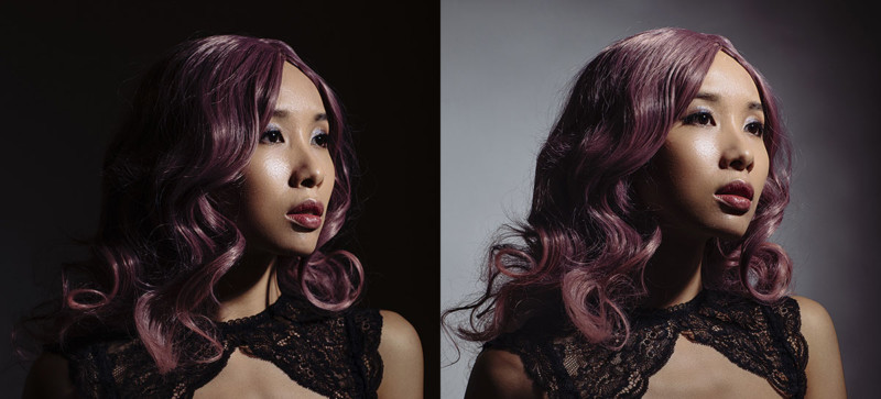
In the image on the left, you’ll see the model has no separation from the background and she appears to have no shape without that additional background light behind her. In the second image, you’ll clearly see the very strong separation that is now present that results in more shape and form in the subject as well as an added sense of depth to the shot. Both of these images were shot with a single light, the only thing that changed was how close the subject is to the backdrop behind her. As I moved her and the light closer to the background, the light fell onto her as well as the background and very quickly and easily we created the added depth to the shot with the addition of the light behind. Granted this is a very simplistic example of chiaroscuro being used in modern photography but the principles are the same. Create a sense of depth in your shot, not only on your subject but with the background as well. Closing ThoughtsThe bottom line is, the works of the ‘Old Masters’ are in galleries today and some of those paintings were painted hundreds of years ago, yet we still enjoy and contemplate them today. In a world where some images last mere seconds at most, it really is worth visiting what makes those art pieces so important to our visual culture today. Elements like a strong dynamic range, using color as a way to display depth, including impossible elements, strong composition, and engaging light and shadow were common staples in so many pieces art before. Now those incredibly powerful almost vital elements of an image, are far harder to find. I know I for one will be trying to include many of these elements into my future work and I would encourage you to do the same. After all, if it was good enough for the “Old Masters,” it’s good enough for us. About the author: Jake Hicks is an editorial and fashion photographer based in Reading, UK. He specializes in keeping the skill in the camera and not just on the screen. If you’d like to learn more about his incredibly popular gelled lighting and post-pro techniques, visit this link for more info. You can find more of his work and writing on his website, Facebook, 500px, Instagram, Twitter, and Flickr. This article was also published here. Photography News via PetaPixel https://petapixel.com November 29, 2018 at 11:12AM
https://ift.tt/2DO8qpT
World’s largest wet collodion plate created in abandoned house converted into a camera https://ift.tt/2TWstbd While the rest of the world has been concentrating on making cameras smaller and lighter photographer Ian Ruhter was making one literally the size of a house in order to make the world’s largest wet collodion plate. Ian and his team sealed up an abandoned house in California and mounted a lens in the wall to create a massive camera. The camera was used to produce a portrait of a 100-year-old local resident on a sheet of glass measuring 66x90 inches.
The scale of the camera is one thing, and the size of the finished image is another, but what is most remarkable is that the team used a process that requires the glass plate to be coated with a solution of collodion poured from a jug right before the picture was taken. The house selected was an abandoned ruin in an area called Bombay Beach, and the living room was used to form the camera. A giant hole for the lens was cut into the side of the house projected the image of the outside world into the room, and onto the massive sheet of glass for a ten second exposure. The team made a fascinating documentary about the process that shows the project from start to finish and the thinking behind it. More of the team's old-process adventures can be seen on the Silver and Light Vimeo channel. Video description:
Once the giant lens was placed on the front of the house, images of Ted, a 100 year old resident who recently found himself homeless, were projected in, breathing new life into this abandoned structure and once again making it a home. During this brief moment in time when Ted’s photograph was captured, he was present in both places. In reality, he was homeless in the outside world. However, the projected image simultaneously allowed him to be sitting in the living room where he was once again home. because the surface of the plate is highly reflective the life sized plate serves as a mirror, allowing one to reflect upon where they will be in the twilight of their life.
Photography News via Dpreview https://ift.tt/i0r8o5 November 29, 2018 at 10:53AM
https://ift.tt/2Q1SqaV
Instagram Launches AI Descriptions of Photos for the Visually Impaired https://ift.tt/2TY1Cvh
Instagram is taking a step toward being more accessible by adding auto and manual descriptions of photos for visually impaired users. “We are introducing two new improvements to make it easier for people with visual impairments to use Instagram,” Instagram writes. “With more than 285 million people in the world who have visual impairments, we know there are many people who could benefit from a more accessible Instagram.” First, there’s a new AI system that will automatically generate descriptions of photos through screen readers when visually impaired users are browsing the Feed, Explore, and Profile sections of the app. The feature uses object recognition technology that studies each photo and comes up with a list of recognized items in the image. If you’d like more control over what the descriptions of your photos are, the Instagram all now lets you add custom alternative text as well. In Advanced Settings when posting a new photo, there’s a new option called Write Alt Text.
This lets you provide a richer description than what the AI is currently capable of creating.
“These are just first steps toward creating a more accessible Instagram,” the Facebook-owned company says. Photography News via PetaPixel https://petapixel.com November 29, 2018 at 10:16AM
https://ift.tt/2Q45igM
5 Common Reasons You Aren’t Getting Sharp Photos And How To Fix It https://ift.tt/2SiIOFk Perhaps the most sought-after technical achievement in photography is sharp photos! Think about it: prospective lens buyers won’t make a purchase without first inquiring about sharpness; countless photographers analyze their photos at 100% checking for sharpness; most people who take a photo that doesn’t meet their sharpness standards will discard the image. Sharpness, it seems rules all. Of course, not everyone obsesses over sharpness — to some, it really is a bourgeois concept. But image sharpness does matter, particularly when you intend to make a sharp photo. When you excitedly transfer photos from your camera to your editing screen, it’s pretty disappointing to discover that some of them aren’t sharp. If you are like most people, you’ll probably agonize over your unsharp photos for a moment or two, wondering what went wrong. There are several possible answers to that. Below, we’ll discuss 5 common reasons you aren't getting sharp photos and what you can do about it. 1. Wrong ApertureIf maximum sharpness is what you’re after, avoid shooting either wide open or stopped all the way down. Neither extreme will provide optimal results. Lenses aren’t uniformly sharp across apertures nor across focal lengths (in the case of zoom lenses). Ideally, you want to shoot at your lens’ sweet spot. The basic rule of thumb is that the point of optimal sharpness on just about any lens is found 2.5 to 3 stops down from the lens’ maximum aperture. If, for example, you have a lens with a maximum aperture of f/1.4, the sweet spot is between f/2.8 and f/4. Or you could just spend the rest of your life shooting everything at f/8. 
Aris Ioakimidis at Pexels 2. Wrong Shutter SpeedIf your goal is to freeze motion you need to use a relatively fast shutter speed. How fast, of course, depends on how fast your subject is moving. Capturing the swing of a baseball bat might require a shutter speed of 1/1000th sec., while a shutter speed of 1/125th sec. may be enough to freeze the motion of someone leisurely walking by. 
Rodolfo Clix at Pexels 3. Camera ShakeCamera shake is caused by the movement of the camera and the result is blurry images. This most often occurs when trying to handhold your camera at too slow of a shutter speed. How slow is too slow? The reciprocal rule can help you determine that. If you are shooting with a 200mm lens, for instance, then the shutter speed you need to avoid blurry images is at least 1/200th sec. Any slower than that (not accounting for image stabilization or superhuman steadiness) and camera shake will ruin your shots. If you want maximum stabilization, use a tripod. But make sure it’s a good quality tripod. A tripod of questionable build quality won’t withstand a strong gust of wind and you’ll still be lamenting blurry images. 
Skitterphoto at Pexels 4. Focusing ErrorThe obvious culprit here is manual focus, right? Manual focus can be a fickle and frustrating venture. Focus just a little behind your subject or just a little in front of your subject, and sharpness is a wash. But while autofocus would seem to eliminate such focusing errors (and it usually does), it doesn’t always work perfectly. There are certain conditions, such as low light or very low contrast, that can render AF virtually useless. When AF isn’t cooperating, use manual focus in conjunction with whatever focusing aids your camera provides (magnification, focus peaking) to achieve sharp focus. 
SplitShire at Pexels 5. Problematic LensIn my estimation, this is the least likely offender you’ll encounter. While there are certainly differences between so-called professional grade and consumer grade lenses, it’s a stretch to say that there are many — if any — lenses being made today that are so optically poor that they are incapable of producing sharp photos. If you can’t seem to get sharp photos, your lens may need to be calibrated. Or it may simply need to be cleaned. Or you may be an unlucky someone who received a bad copy of an otherwise good lens, in which case you’ll have to take that issue up with the retailer or manufacturer. 
Tookapic at Pexels Final Thoughts On Sharp PhotosTo be sure, there is more to a photo than sharpness (this applies more comfortably to some genres of photography than others) but that doesn’t mean it isn’t important. Odds are, you expect to be getting sharp photos each time you use your camera. If you’re having trouble realizing that expectation, no need to fret. Some of the most common problems are listed above and, as you have seen, are easy to fix. Further Reading
The post 5 Common Reasons You Aren’t Getting Sharp Photos And How To Fix It appeared first on Light Stalking. Photography News via Light Stalking https://ift.tt/2kwTW5i November 29, 2018 at 10:00AM |
Categories
All
Archives
November 2020
|


 RSS Feed
