
|
https://ift.tt/3kLDRCP
Filippos Fragkogiannis https://ift.tt/35PosNU Filippos Fragkogiannis is an Athens-based graphic designer, with an MA in Visual Communication, and a BA in Graphic Design from Vakalo Art & Design College and the University of Derby. His research-based approach is rooted in semiotics, symbolism and the mechanics of visual language. Filippos’ projects centre around visual identities, posters, and print collateral, and he regularly enhances type foundries with bold imagery.
Printing via People of Print https://ift.tt/2DhgcW7 November 20, 2020 at 03:49AM
0 Comments
Leave a Reply. |
Categories
All
Archives
April 2023
|
 One of the experiences that shaped his work, and lead him towards graphic design, was his decade-long involvement with graffiti; “Tags, names, and letters were the main elements we were spraying in the streets at the time. This premeditated injection of verbal forms in public spaces has much in common with the way posters make walls speak. No wonder my early steps as a graphic designer wer making posters for school parties, graffiti stores, and rap artists’ concerts“.
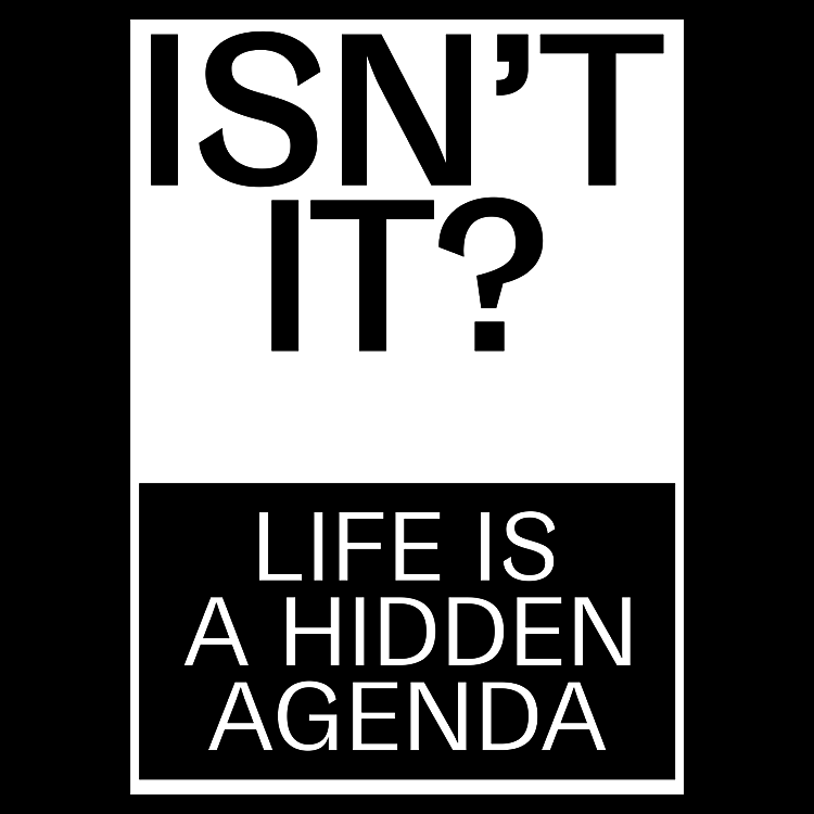 At the same time, Filippos was continually drawn to language, and its power to determine, disseminate, and establish any given information. “The way the written word can be archived, shared, printed, and reproduced inspires me. Whether it’s for advertising, propaganda, political discourse, religious proselytism, or the expression of feelings, language is a powerful tool” describes the designer. On this basis, he conceptually explores its capacities to produce designs with simple forms and condensed meanings, making as big an impact as possible.
 Overall, Filippos’ design approach can be described as sharp, transparent, and plain-spoken. It calls for the viewers’ attention and tries to earn their trust, all the while allowing for multiple interpretations. Filippos states; “I want the outcome to be direct and honest, to serve its purpose, and get the message across in a straightforward manner. I aim for easily recognisable and aesthetically appealing designs, that speak a universal language, and can reach a wider audience“. His
  Instead of adopting one style or another, Filippos follows his own creative methodology which starts with the accumulation of information, and ends with condensed meanings and abstraction. First, he conducts comprehensive research on the given subject, gathering all the necessary materials, then processes them and finds a sensible hierarchy between them. Finally, he takes out everything that seems unnecessary or redundant. For instance, for his
 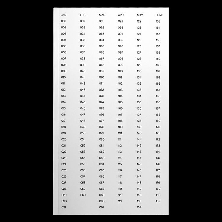 The calendar is an ongoing project, with 2021’s currently in progress, and Filippos is also working on other merch through an online platform he is creating. Together with Georgia Harizani, he is also curating the type specimen of an exciting new type that will be out shortly. “My efforts are equally directed toward expanding my online and offline outreach, introducing my work to a wider audience, and developing new collaborations with creatives and brands that are open to bold, radical, and unexpected design” says Filippos.
 RSS Feed
